I chose to focus my senior thesis on anxiety and stress, with the goal of how someone could productively navigate those thoughts. This is a topic that I've often struggled with and wanted to create a solution that could help others with the same feelings.
I created a platform called Tangled Thoughts. The goal was to create a safe space where people could vent and write down everything troubling them. The inspiration for this program came from a design process called Mind Mapping. The finished product has a digital and print solution. A digital application can access a wider range of people, while a printed book can have a more tactile therapeutic effect for others. Along with the application and book are social media posts and postcards to act as entry points.
The idea to use mind mapping came quickly and naturally since I've used it in all my design projects. Mind mapping is a visual technique for organizing thoughts and ideas. Using this technique can help you: brainstorm to create new ideas and solve problems, take notes which will help remember and understand the information, visualize how the thoughts relate to each other while seeing the complexity of the topic, and encourage lateral thinking by looking at the topic from different angles. Using this method can benefit more people than designers.
Anxiety for many people can disrupt their everyday lives, some examples can include loss of concentration, decision-making, gastrointestinal issues, tightness in the chest, loss of sleep, avoidance of everyday tasks, and more. Anxiety often, but not always, starts when a person is feeling stressed or nervous about a task they need to complete. This nervousness can build up over time without a person realizing how severe it's becoming and can lead to a disconnect between the stress and the trigger.
Mind mapping can help remake the connection of where their anxiety comes from, how it triggers them, and why they react a certain way to the trigger. Knowing this they can develop behaviors to break that cycle.
This is why I created Tangled Thoughts. Sometimes anxiety and stress can manifest into a cluttered mess in a person's head, leading them to have a hard time thinking clearly. That's where the name came from, trying to calm down and unpack all your Tangled Thoughts.
Creating a friendly and welcoming design helps balance the negative feelings anxiety can bring up. Crafting an experience that is also fun and interesting can help offset those feelings. When choosing which medium the final design would take, I decided to have both a digital and printed solution. Digital applications will always reach a wider audience because users can access the application anywhere and anytime. However, a printed solution also has worth. With people having more screen time consuming their daily lives, there is value to writing your thoughts and feelings. Using the motor functions of writing and feeling the pen on paper can be just as therapeutic as getting your feelings out. Next was narrowing down how to approach the functionality of the design.
Mind mapping is a hands-on process, where you begin by writing a central word in the middle of the page and then expand outward, creating branches to fill the rest of the space. I wanted to keep the tactile look of hand-drawn elements. This won't be difficult for the printed application but translating this to digital took more thought.
On the website, you can create and save different maps you build out that are linked to your profile. Users also have the option to share their maps publicly if they would like but it is not required. Sharing can help users relate to each other or see other insights they wouldn't have thought of otherwise. Included is an explanation about the site, help and tips for building your maps, and a link to other products by Tangled Thoughts. On the map dashboard page, users can upload images of their physical journal pages, allowing them to store everything in one location.
The printed solution became a writing journal sharing the same name as the digital counterpart. Included are markers, highlighters, and a writing utensil bag. The beginning of the book is a section with steps to help guide the audience on how to use this journal by doing mind mapping. Having this guide helps people journal with a clear goal and focus, otherwise they might spiral on negative writing like how they would when spiraling with negative thoughts. The journal pages include a "Topic" section where users can jot down the central issue on their minds. At the end of the book, there's a "Conclusion" section, along with a prompt encouraging users to upload their physical map to their digital account, if they have one.
The journal is a saddle stitch book bound by a cord that can slide off and on. This way people can add new pages and get rid of old pages. One of the pages features a QR code where the user can download and print new blank pages for the journal. Additionally, if they want to purchase more pages in the same paper stock as the rest of the book they can do so on the website. This reduces the waste of continuously buying the same journal where four spreads will always have the same forward and outward information.
After finalizing the functionality of the design, it was time to move to the visual components.
When choosing typography and color, I wanted them to be friendly and approachable. Considering the heavy topic of the material it would be a welcomed distraction for the user.
The font choices are Congenial as the primary and Adelle Sans as the secondary. Congenial has rounded letterforms with slight curves, giving an organic aesthetic that sits nicely next to the curved arrows of the mind maps. Adelle Sans pairs well with Congenial because it has rounded letterforms and similar x-heights. Both are comfortable to read both on paper and on a screen.
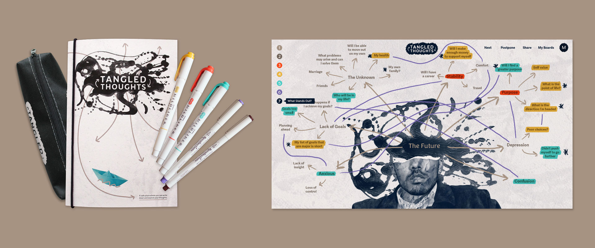
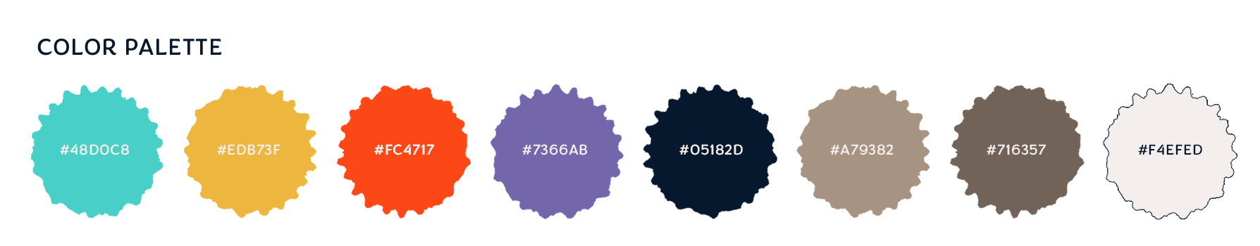
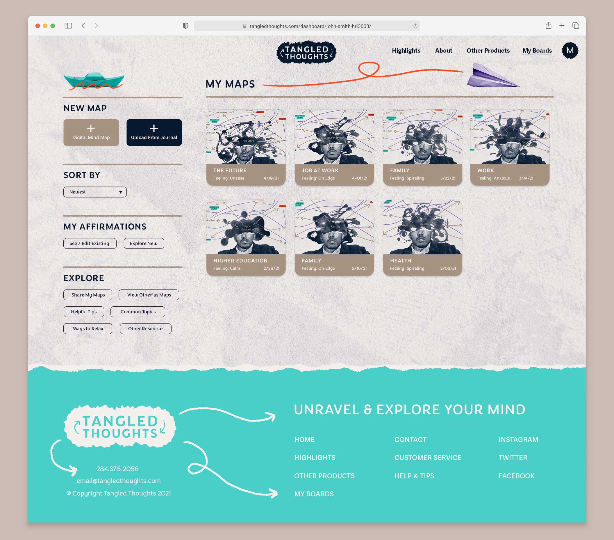
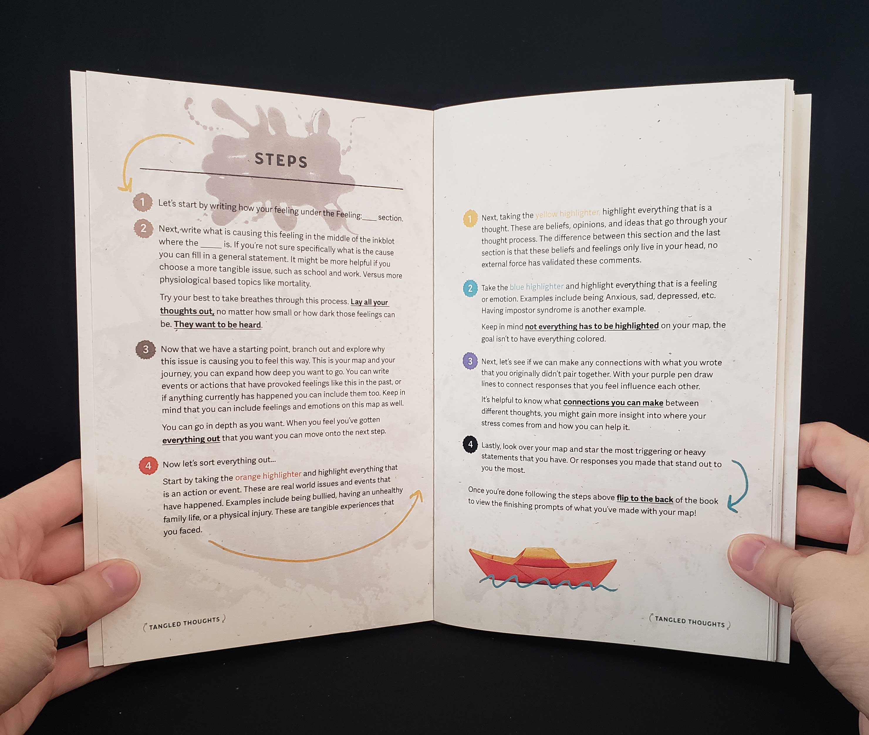
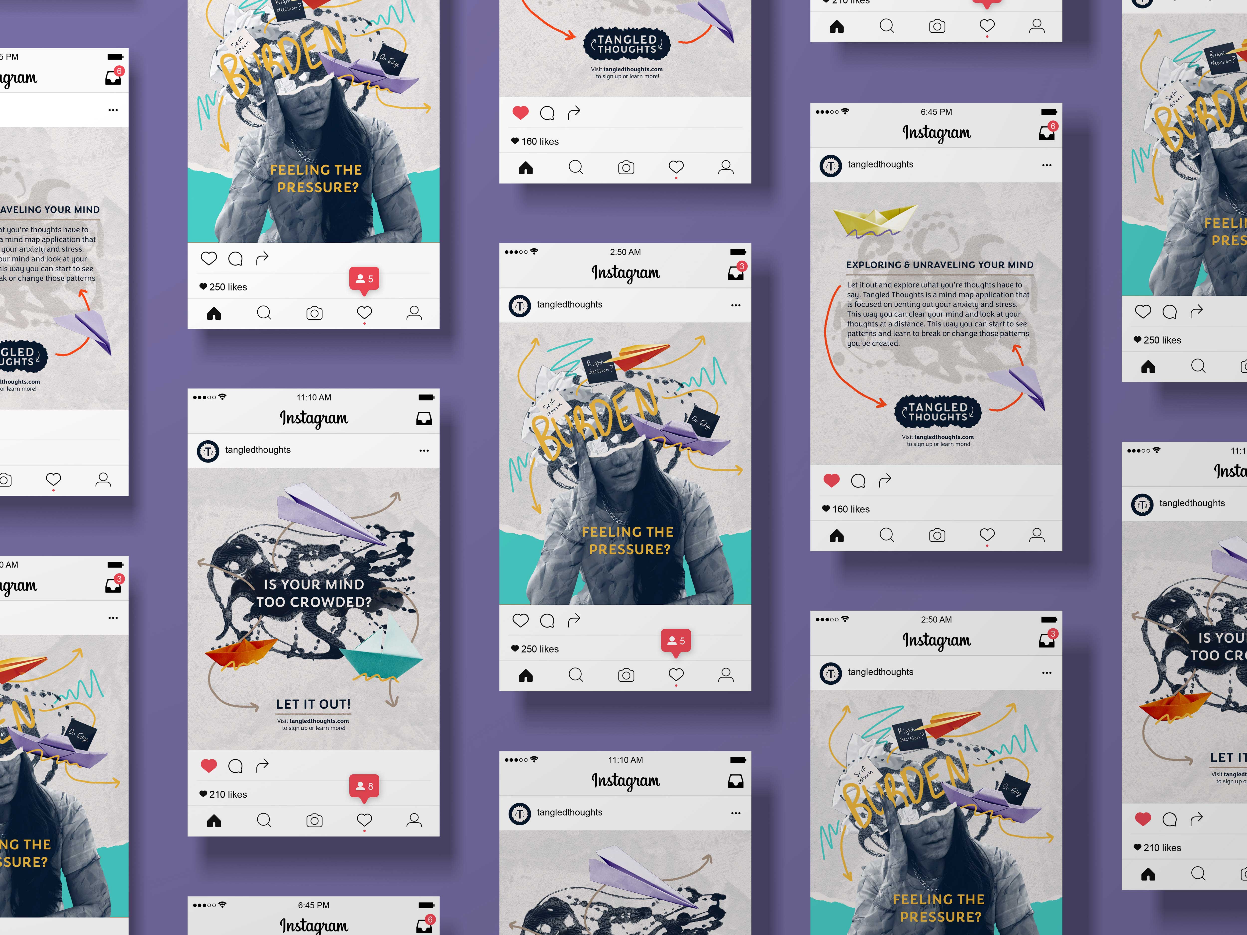
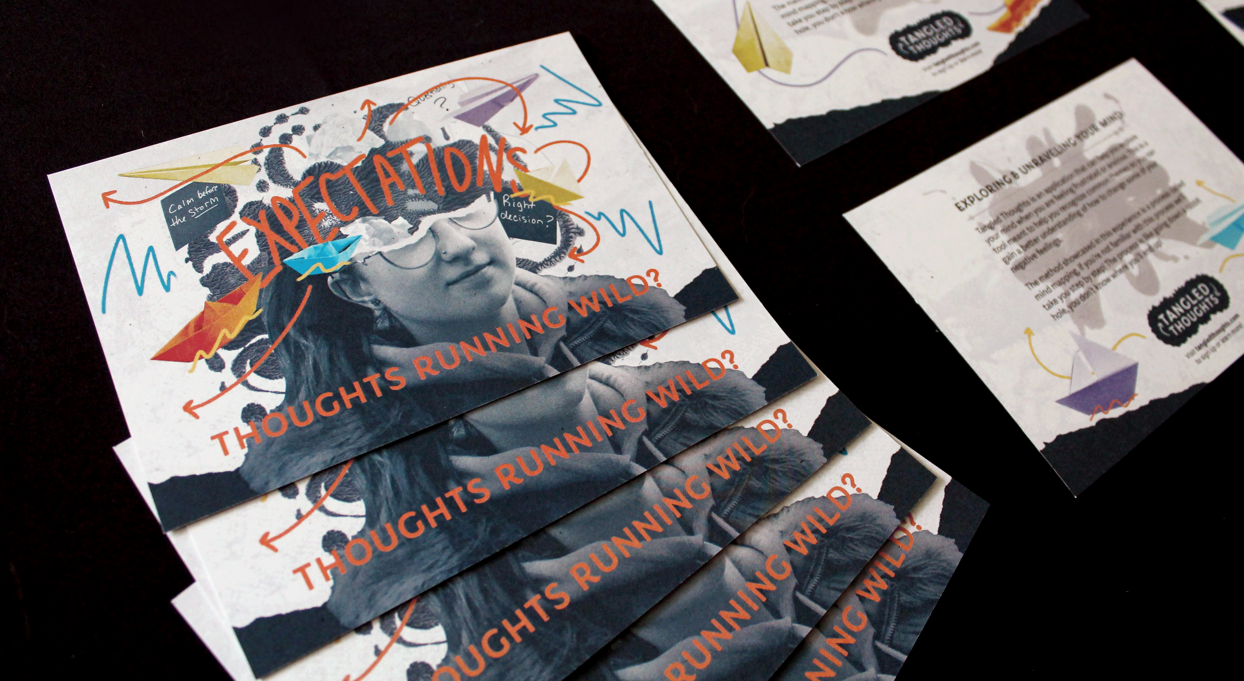
The colors selected are for approachable design, gaining attention, and organizing the mind maps. These colors include cyan blue, deep yellow, bright red, and deep lavender. To balance out these bright colors are dark blue, and a neutral dark brown-grey color. Together they create a fun and grounded experience to help navigate a person's stressful thoughts. In practical use the bright colors are utilized in different steps to help organize a person's map, for example, red is for calling out actions/events, yellow for thoughts, blue for feelings, and purple connects similar ideas across the map.
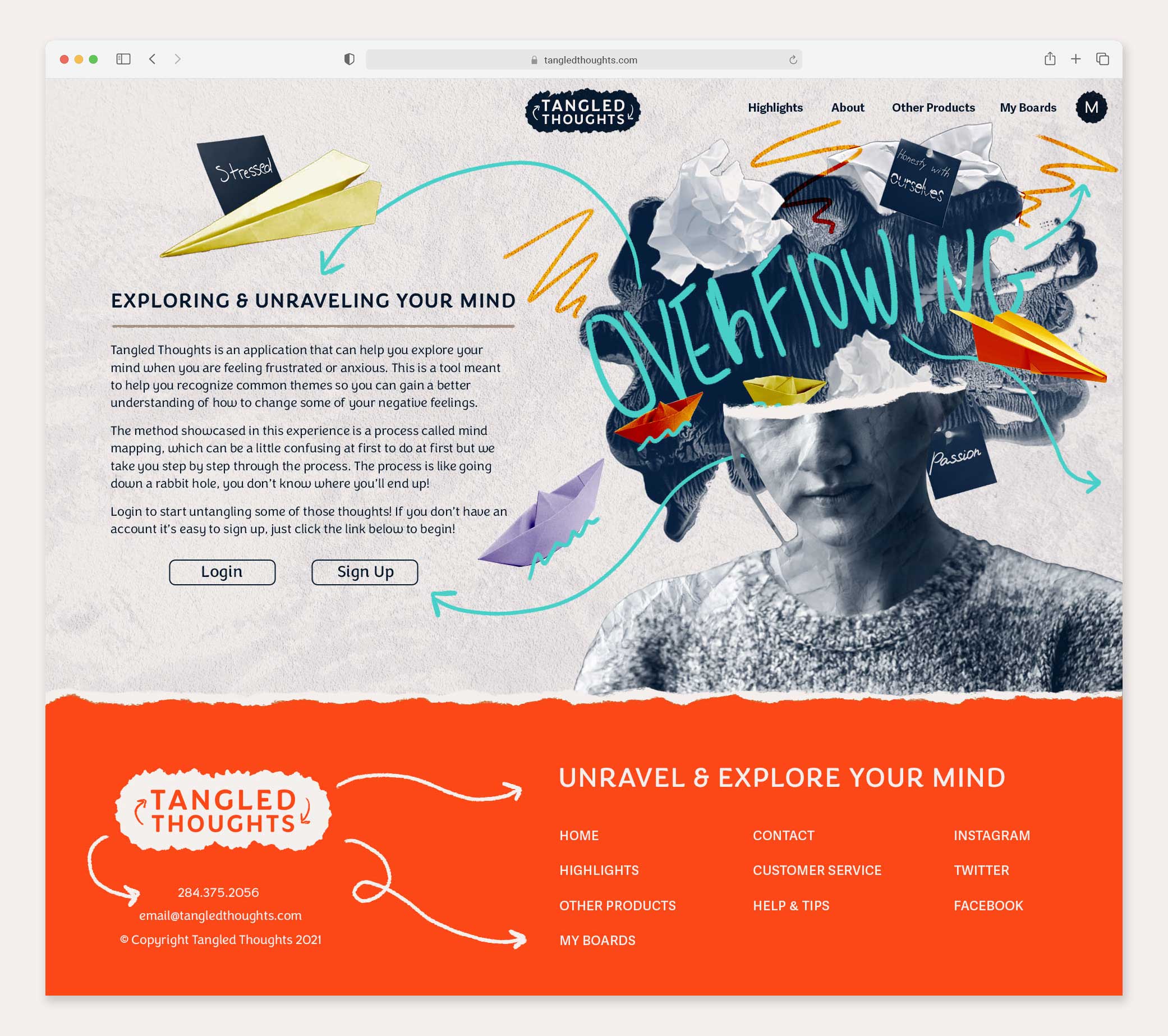
Determining how to incorporate visual elements was an interesting process. Arrows were a given for one of the visual elements of the design because that's how you connect thoughts on a mind map. I created the arrows by drawing on a digital tablet with a brush tool. The other visual elements came up from the research gathered about how anxiety can make someone feel. Anxiety can be overwhelming and for many people cause their thoughts to spiral or become too loud inside their minds. I used that feeling to inspire the images.
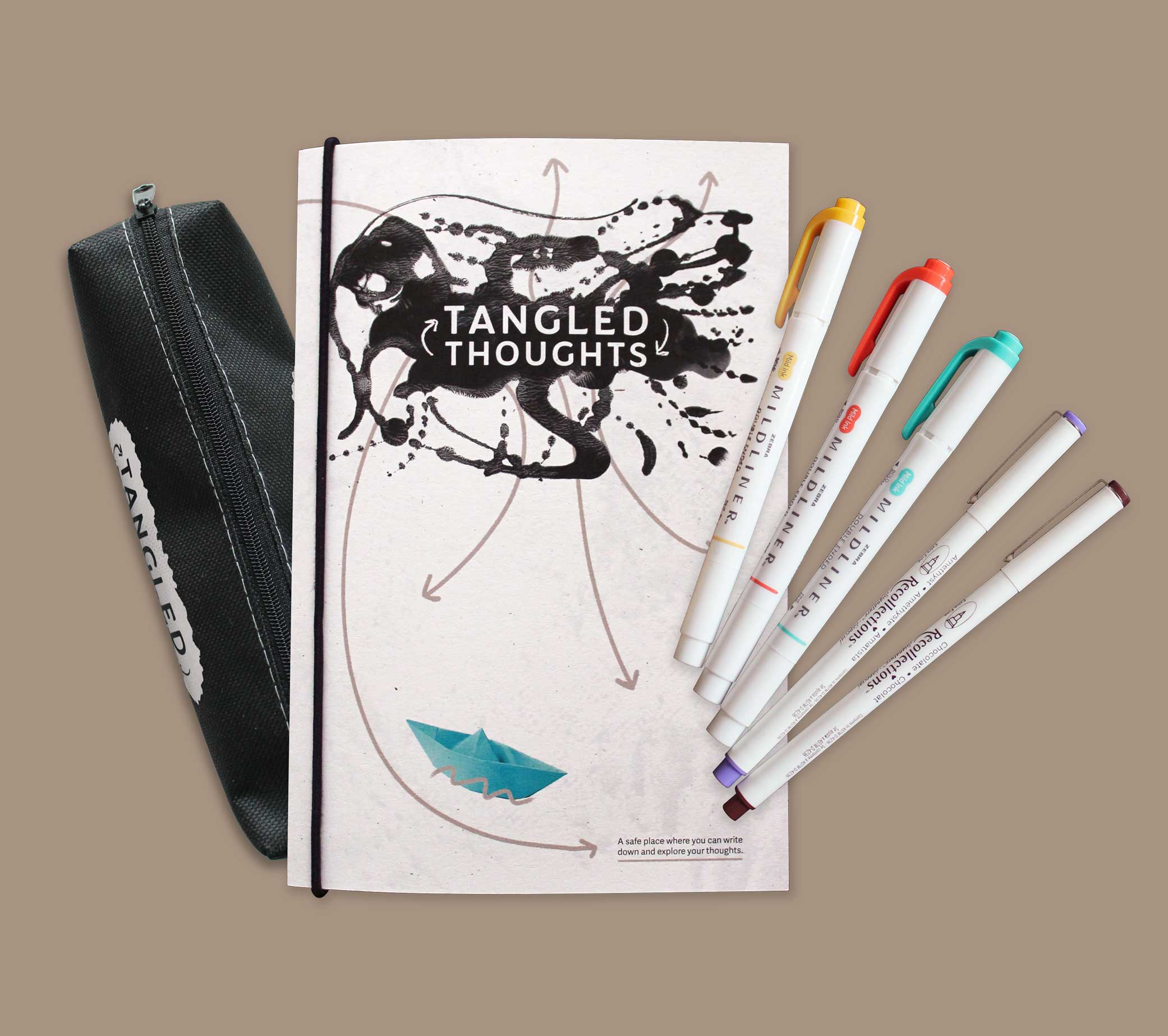
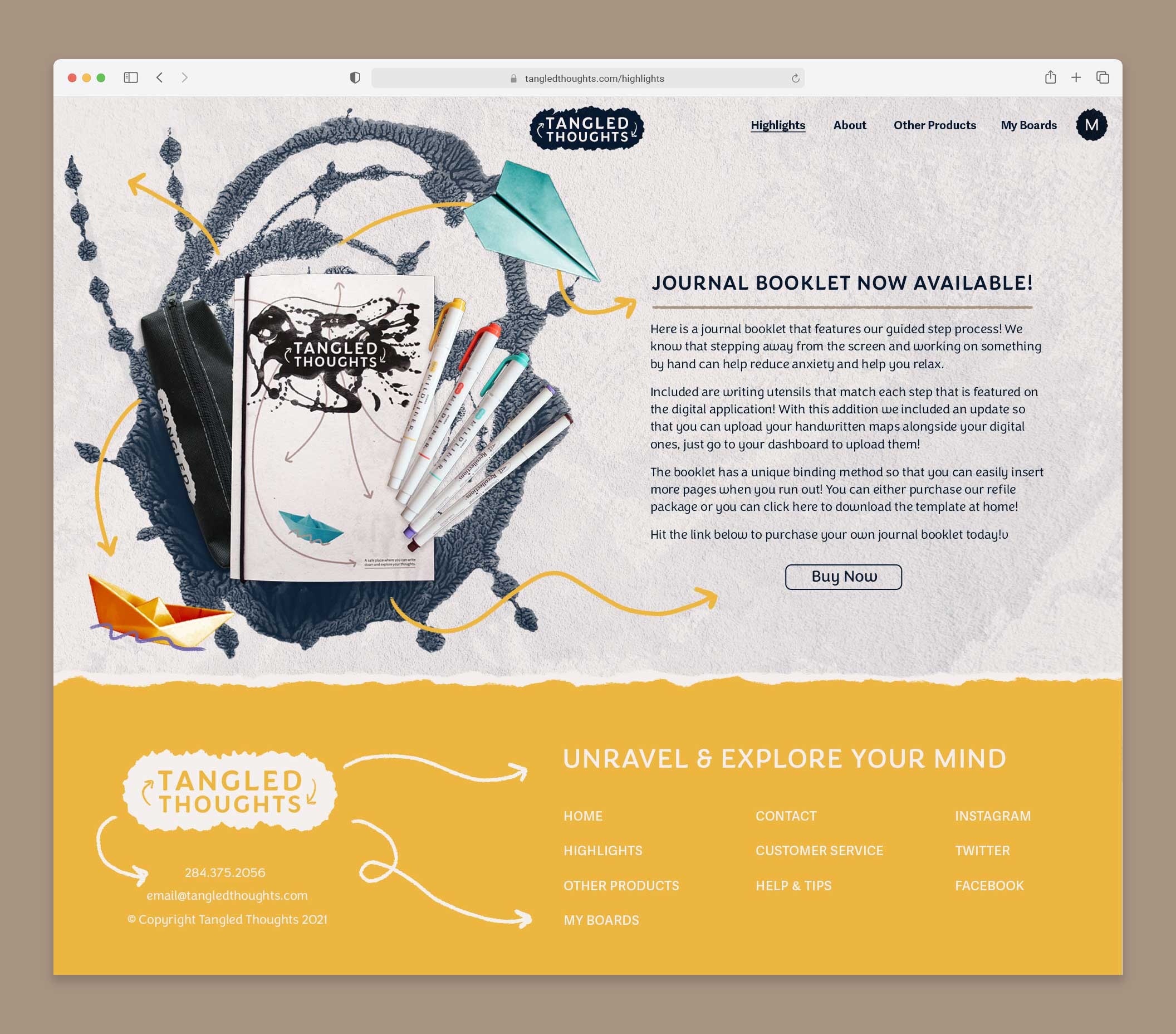
The focal point of most applications in this project is the collage portrait photos. To create them, I began by collecting portrait shots of various people, then converted the images to a dark blue monotone. After that, I removed the top portion of each subject's head. Using this stylized image, I added other visual elements to imitate a head full of disorganized thoughts. By visually representing the chaos of racing thoughts, you create a powerful connection with the target audience, acknowledging the seriousness and frustration of the issue without minimizing its impact. The images included with this portrait shot are crumpled papers, paper boats, paper airplanes, and written sticky notes. The element framing these pieces together is a large inkblot.
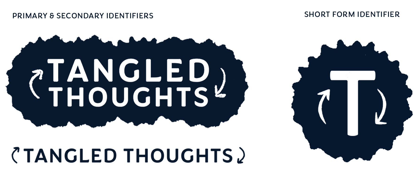
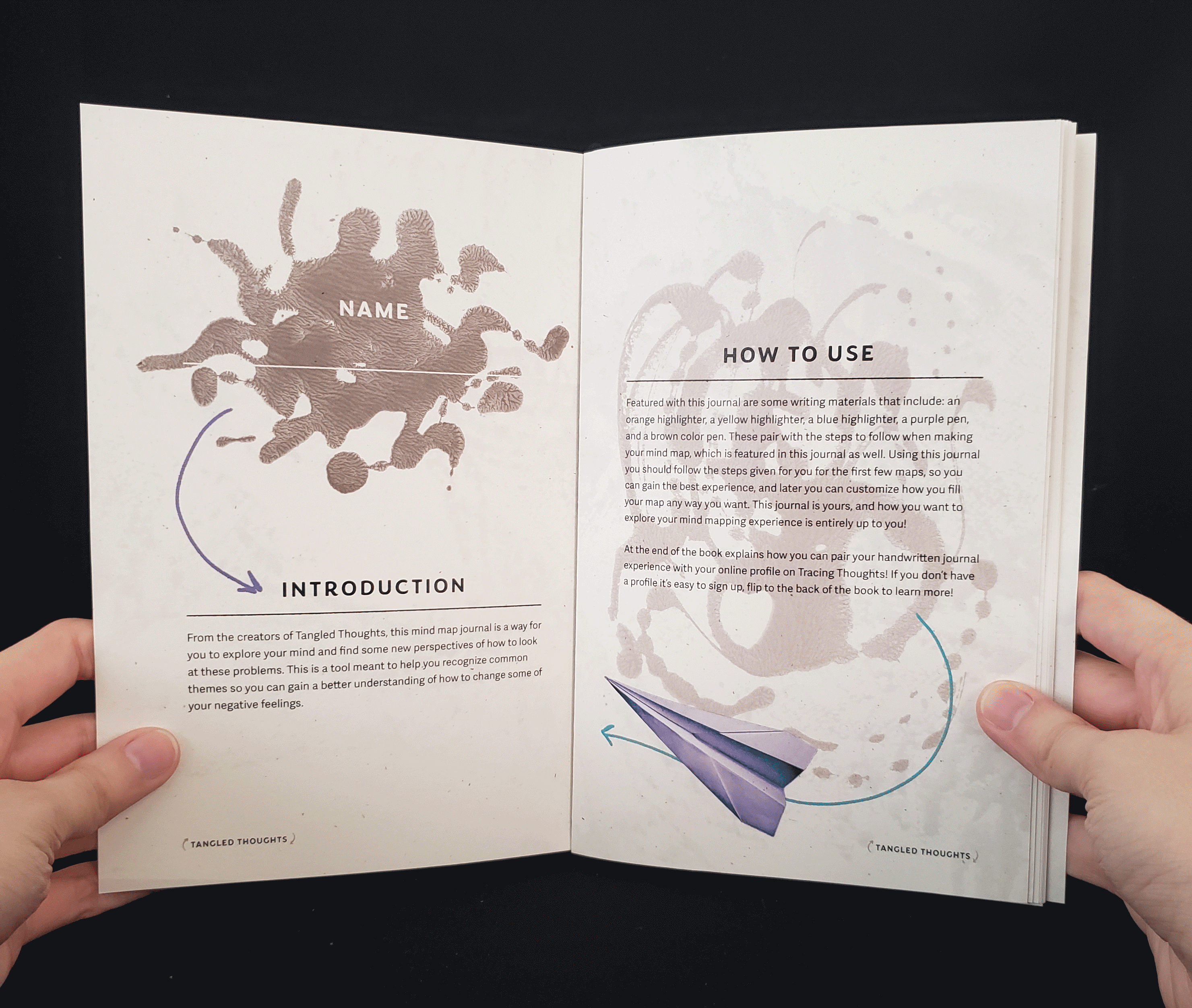
The inkblot test is synonymous with psychology and I saw it as a good framing device for the project's layouts. I used it as a focal point for the portrait collages and the topic section for the journal pages. This shape also became one of the identifiers for the program. This shape becomes part of the application's identifiers.
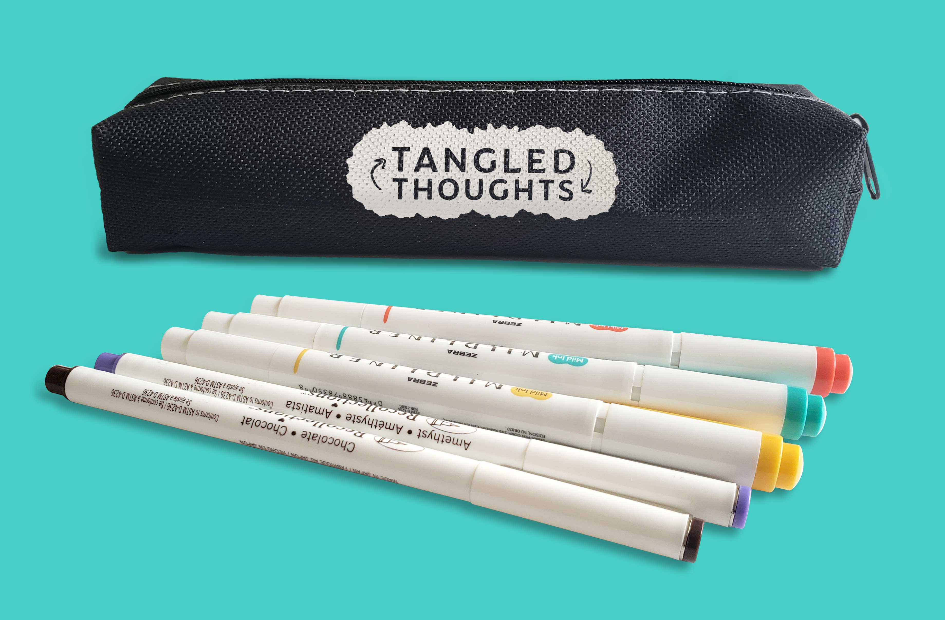
There are three identifiers: primary, secondary, and short form. The primary identifier features "Tangled Thoughts" stacked on each other with arrows left and right of the text. A simple solid color inkblot frames the text but is sometimes replaced with a complex inkblot. An example of this is the journal cover. The second identifier has "Tangled Thoughts" running on the same baseline, with the arrows again on the right and left side of the text. This is used minimally and when the application is small. An example is in the journal publication where this identifier is at the bottom of each page. The short identifier is used for small 1:1 ratio uses, social media profile images for example.
Cutting the profile image between the nose and eyes was intentional. I didn't want the profiles to feel too personal, this way if someone wanted to use an already rendered image it would be generic enough to view it as themselves. Another reason is that eyes show and express emotions very well, and that would distract the user from the collage of images coming out of the head.
When you make your account, you can pick from a range of avatars to use from the site or you have the option to upload a photo of yourself.
Above is the home page of the digital application. Additional web pages and screenshots from this section of the project can be found below.
I wanted my image treatment to reflect the internal conflict people have when they are over-stressed and anxious. By having the paper balls, notes, planes, and boats overflowing and rushing out of the person's head, you can feel the chaos representing the ideas or thoughts floating through a person's head.
Arrows help direct the eye through the composition across all layouts throughout this project.
Above, you can see an example of how someone would work through making a mind map. The site takes the user through a prompt system to get familiar with the interactive elements, all while asking how they are feeling and what they're thinking.
Found above is the printed book portion, with a more detailed exploration of this part of the project further down.
The markers are the same colors that the digital application uses. This creates a smooth transition from digital to paper experience.
I created these inkblots by sandwiching paint in between two pieces of paper. This was a great exercise in letting go of control and having the image form organically.
Binding the pages together is an elastic band, so people can easily remove, add, or replace any pages in their journal.
To get new pages, users can either buy the official pages from the website, or they can scan the QR code in the back of the book to print out the templates. The spreads in this book are 8.5 x 11 so they can easily print them anywhere with no hassle!
Entry points for the application are postcards and social media posts. Postcards can be distributed at doctor's offices, high schools, and college campuses during events. These places can have stressful environments and having a resource to help reduce those feelings would be beneficial. The back of the postcard includes an introduction to the site, a brief guide on how to use it, and instructions for accessing it. The front shows a portrait collage, in the same style as you would find on the website, with a header asking if the reader is stressed.
There are three social media posts: one with a portrait collage, one with an introduction and explanation of the website, and one resembling the journal cover. Social media is a strong touch point for the target audience since this media has been causing additional stress for people. Vivid colors and imagery helps this ad stand out among other posts on the audience's feeds.
The postcards above can easily be distributed in doctor offices, high schools, and college campuses. Where if someone is showing emotional distress or high levels of anxiety, they can give the person a card with all the information they'll need.
Here is a short presentation explaining the system and how the elements and assets all come together.
The biggest area of growth I had from this project was how to cohesively craft an interactive experience through different media experiences. Learning how to translate the same feeling digitally and on paper but playing to each media's strengths at the same time.
Using a collage image treatment for the visual style was another new experience. In the past, I've been intimidated going in this direction, but after my Consent Campaign project, I was ready to try it out on a larger scale. Using this style has opened my visual language while letting go of having assets perfectly uniform. It allowed me to see the beauty in disruption and nuance this style can bring.
This project brings together everything I learned during my studies at CCS. It also provided me with valuable reflection, helping me identify areas where I can continue to grow as a designer. These insights will guide and influence every project I take on moving forward.
Similar Projects:
LIFE REMODELED |
What Are You Feeling?