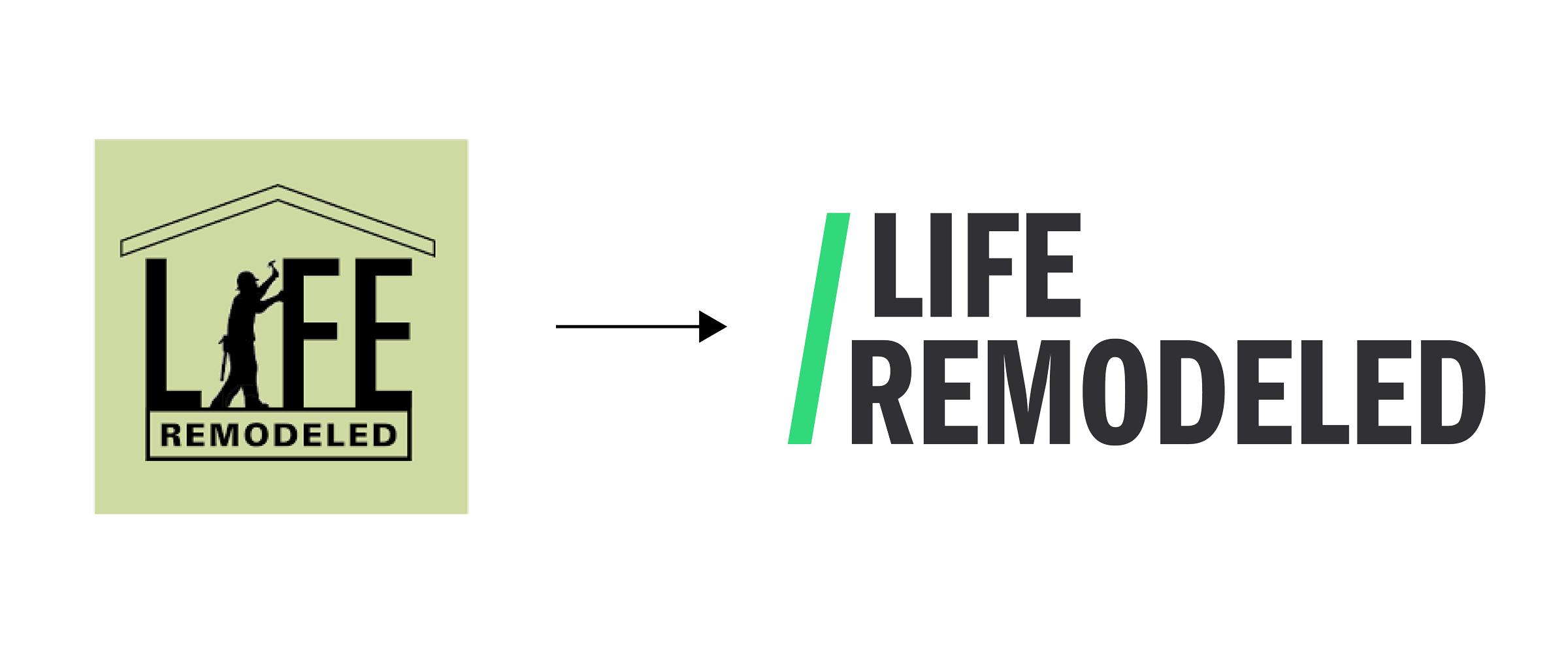
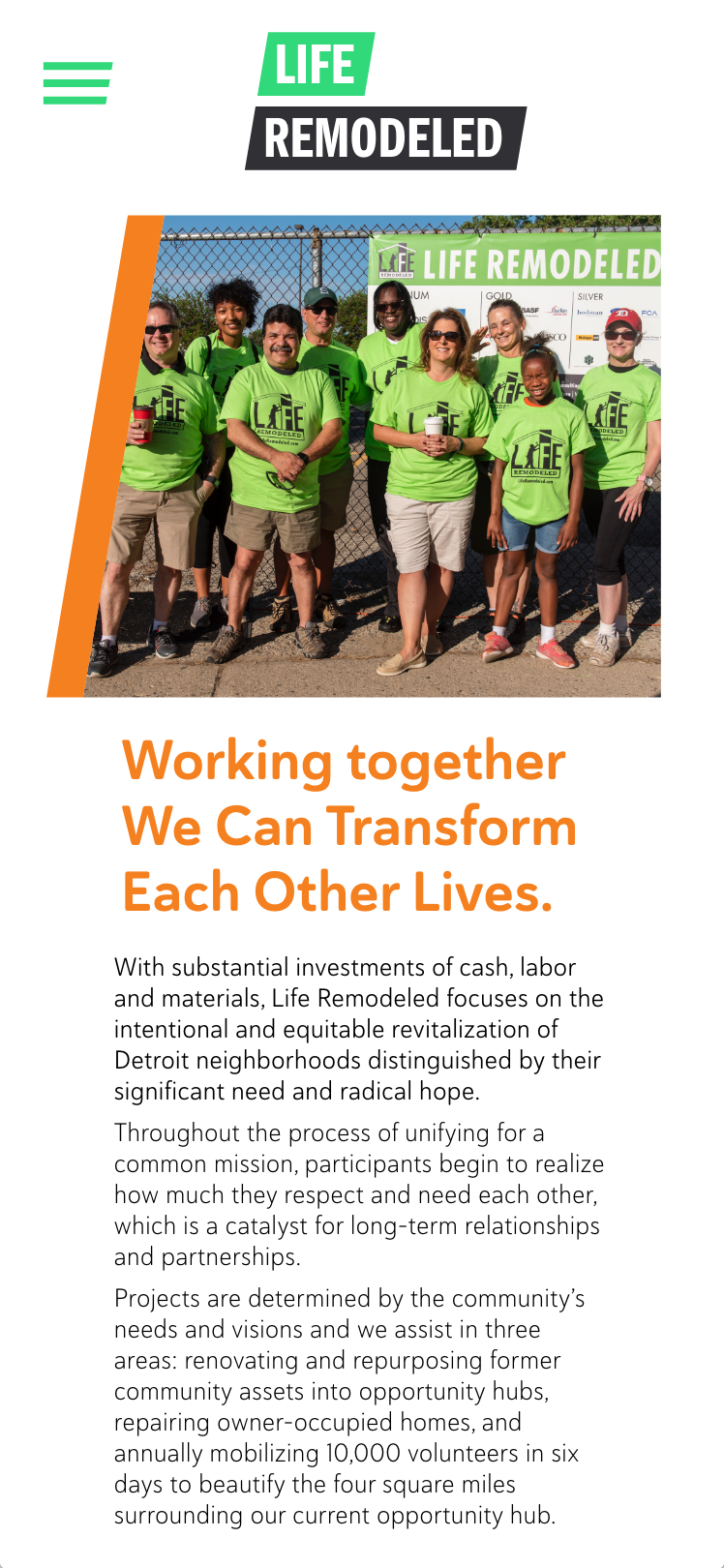
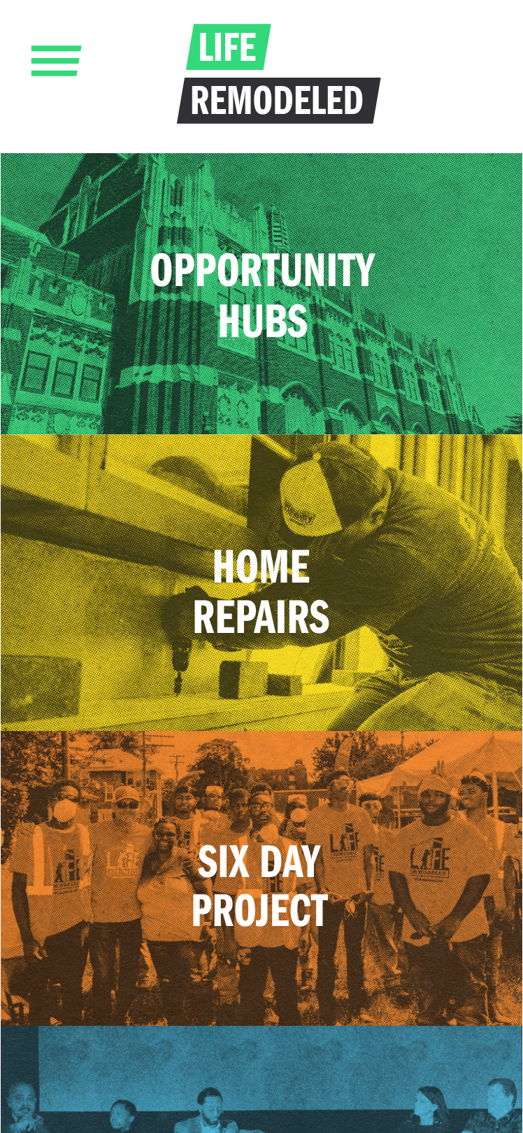
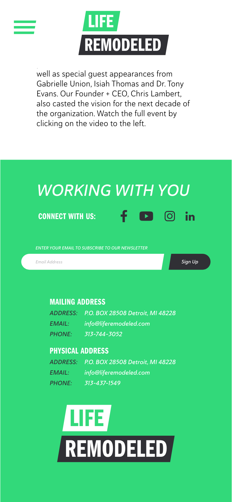
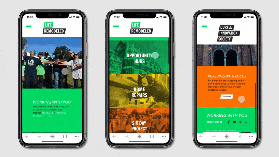
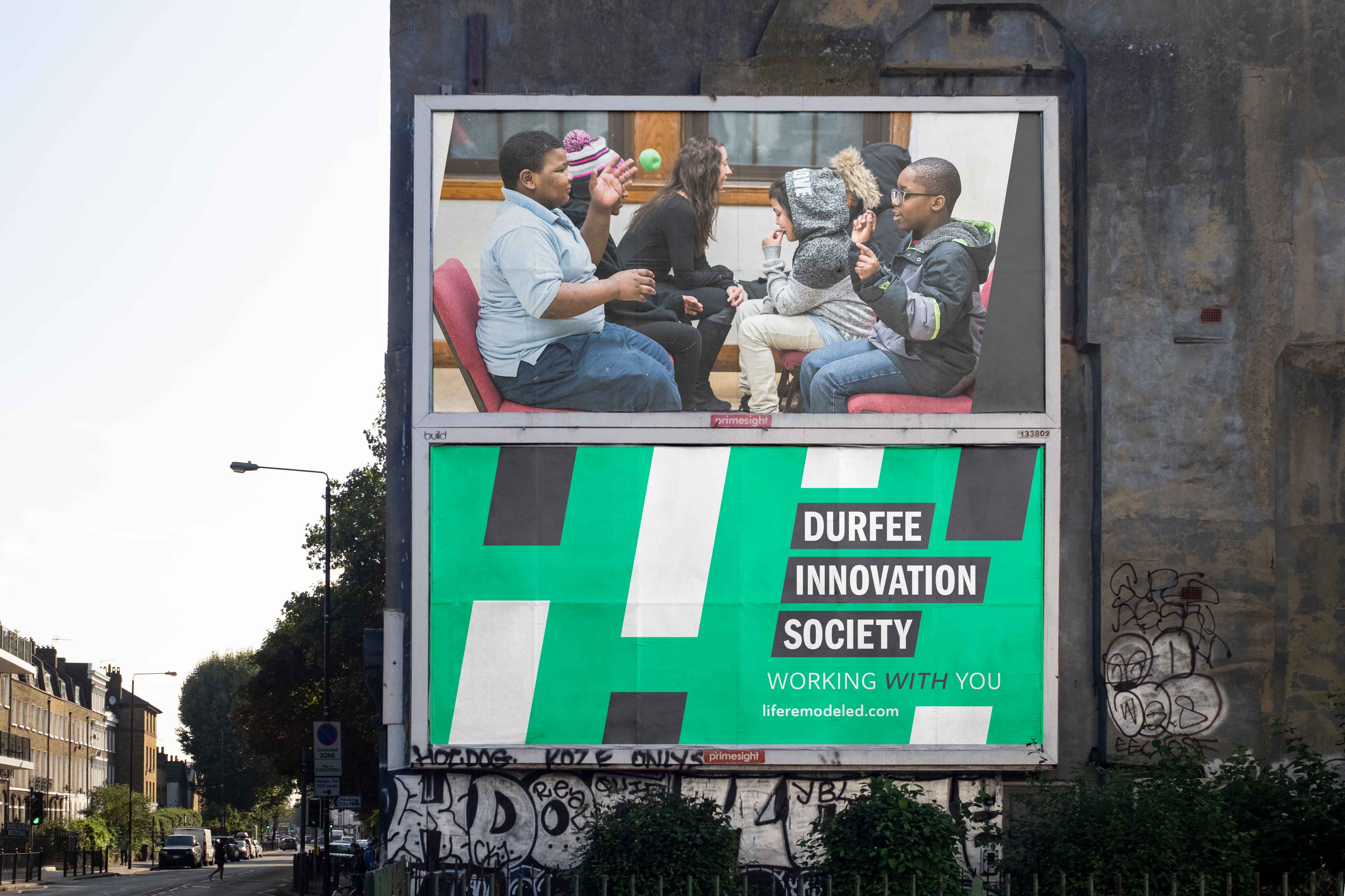
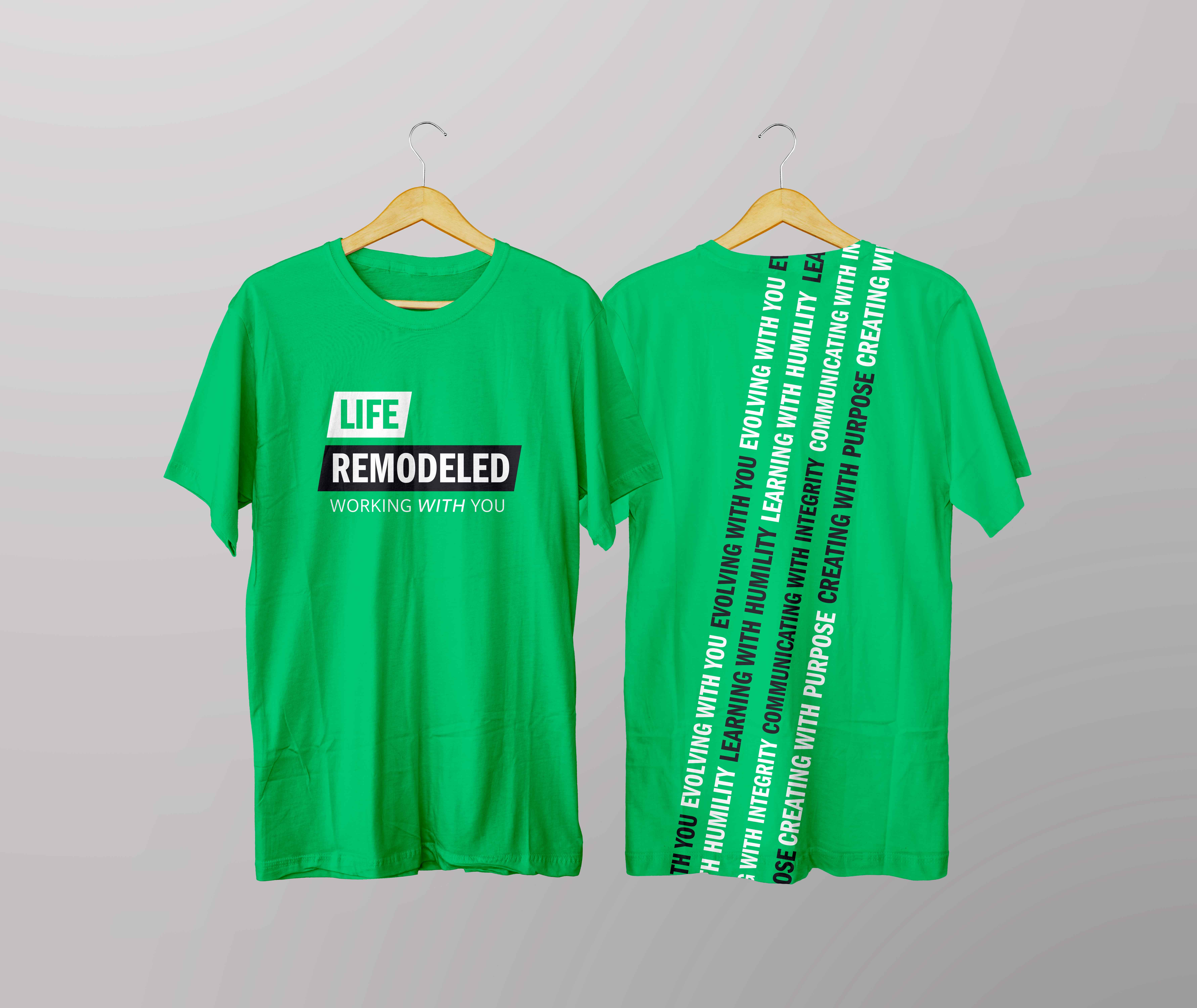
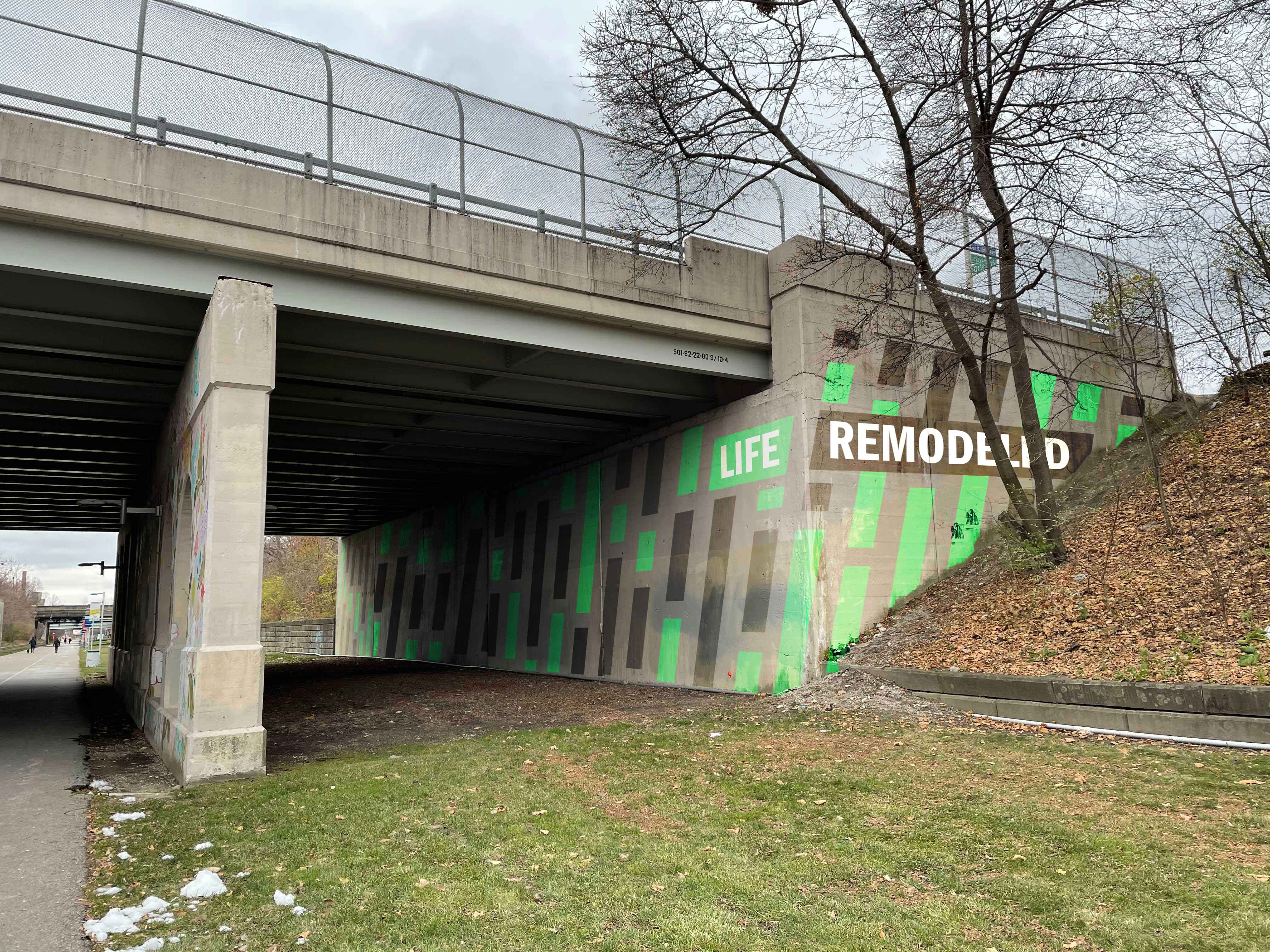
LIFE REMODELED

SPONSORED STUDIO
& BRAND IDENTITY

Problem

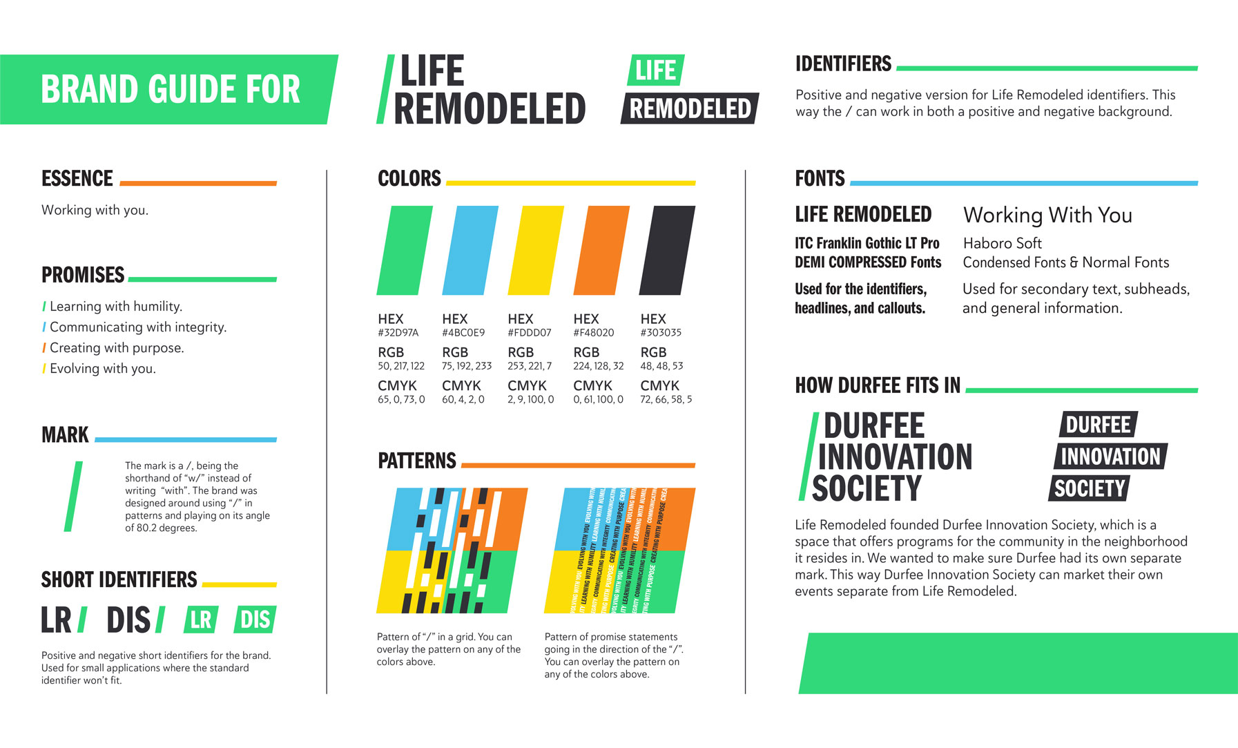
To rebrand the identity of Life Remodeled, a Detroit-based non-profit organization dedicated to empowering residents by providing access to education, employment opportunities, essential health and wellness services, and more. The rebranding initiative was sponsored by Ford Motor Company and served as a studio project at the College for Creative Studies, where different teams collaborated on the redesign.

Solution

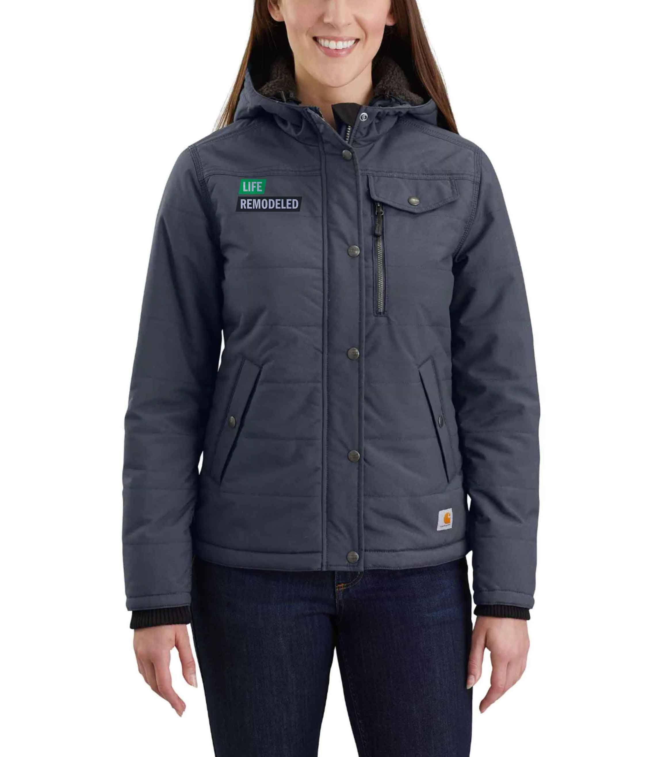
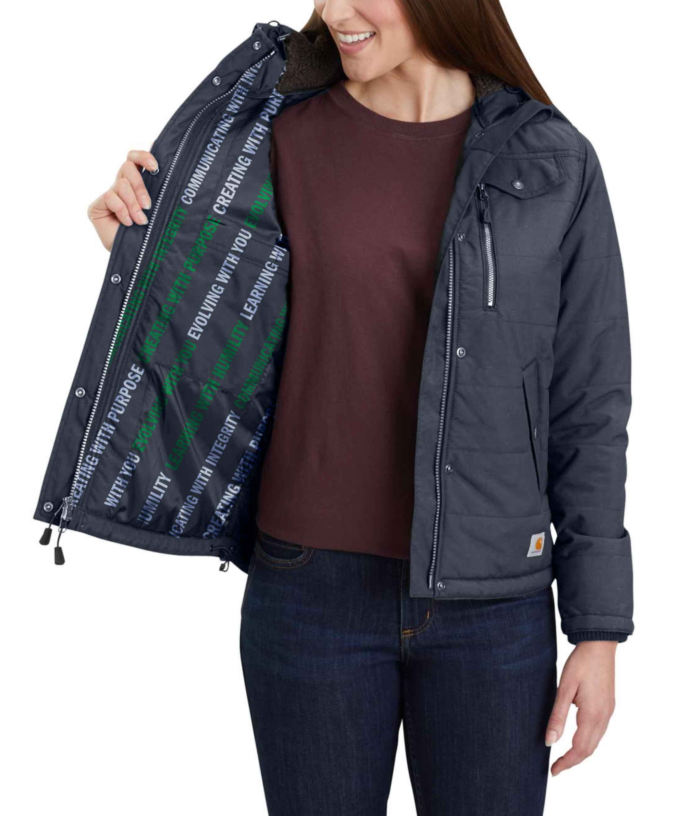
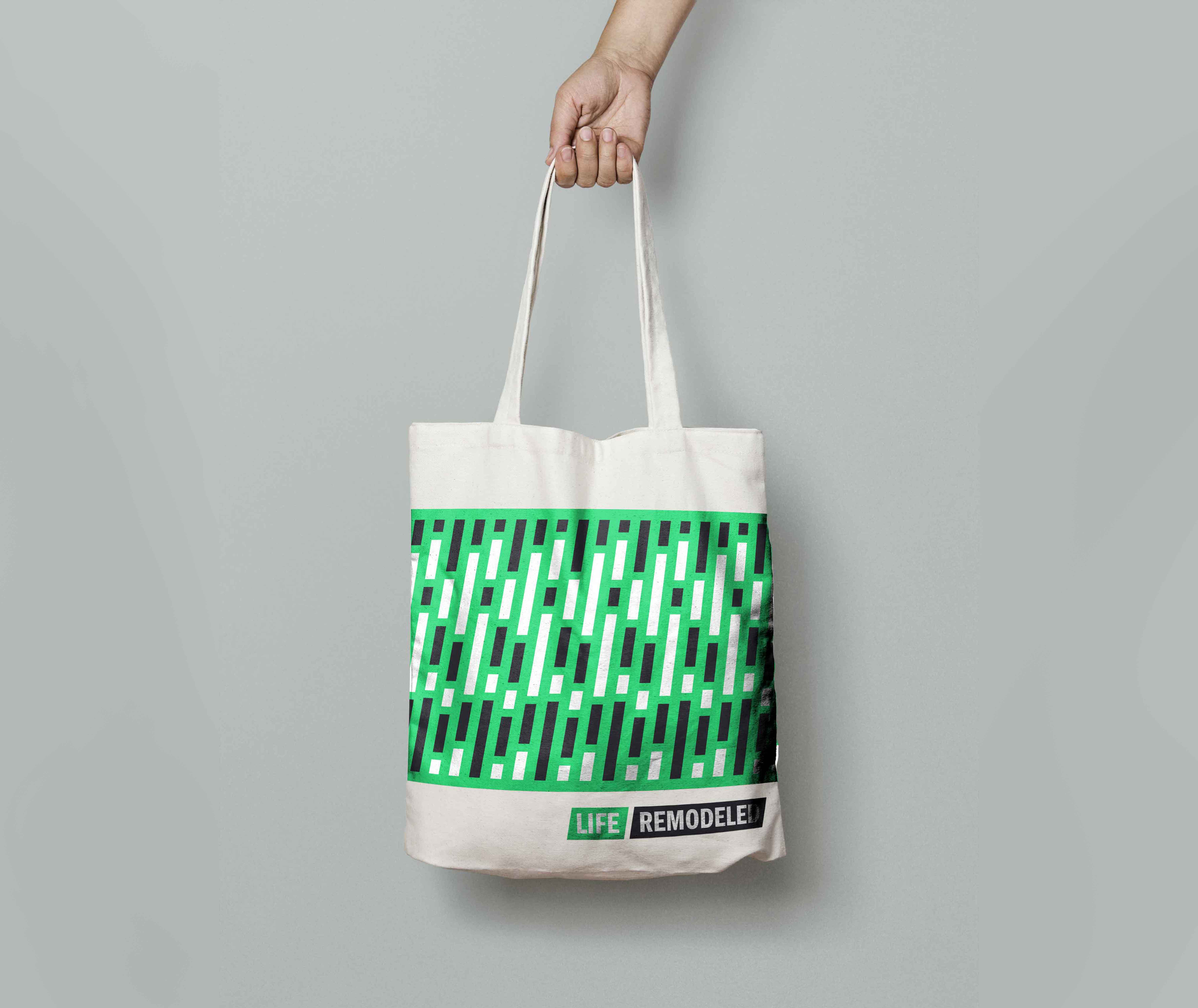
The central message of the rebranding emphasized that Life Remodeled is working with people through their challenges, not just for them. My specific focus was on refining the identity markers through each revision, designing the website, and creating promotional materials such as t-shirts and tote bags.

Expanding on Project Introduction

To visually convey the idea of Life Remodeled working with people, we incorporated a forward slash ("/") in front of the organization's name, inspired by the shorthand "w/" used for "with." Using this powerful message and striking design elements, our redesign was selected by the organization as its new identity.

This project was in collaboration with the executive leadership team of Life Remodeled and classmates Alex Porter, SopheAnn Buzgan, and Rachel Smalley.

scroll down icon

Gaining Insight about the Client

Life Remodeled (LR) is a non-profit company that gained its start by constructing houses for people in need in the Metro-Detroit area, this program is called the "Six Day Project." Over the years they would also work on restoring, updating, and cleaning schools in the Osborn neighborhood while boarding up vacant houses which led them to partner with the Denby High School. Working alongside the high school students and listening to the student's needs, they helped build a safe space for them. With the help of partnering communities and volunteers, they were able to make the space these students wanted and needed.

After their work in Denby, Life Remodeled focused on renovating and repurposing the former Durfee Elementary Middle School into the Durfee Innovation Society (DIS). This innovation society is the central hub for Life Remodeled. The hub also provides opportunities for community members such as after-school programs, jobs/workforce developments, and community resources. DIS is more than a building for Life Remodeled, it's a place for the neighborhood to come and work together to build a brighter future for everyone.

Life Remodeled came to College for Creative Studies looking to update its branding. With the DIS's construction wrapping up and Life Remodeled about to celebrate 10 years, they wanted a brand that symbolized their growth and outreach work.

Their old logo features "Life" as the walls of a house with a triangle representing the roof on top. The "I" is replaced with a person working on the "house". "Remodeled" represents the foundation.

Their logo made sense when focusing on their Six Day Projects program, but this organization has grown and expanded its services. It was time to evolve their brand identity to the same level as their organization.

Objectives of the rebrand

1. To help bring a sense of unity to their brand. Issues with consistency, lack of brand clarity, and ambiguity in communicating their organization's goals visually resulted in their limited brand identity.

2. The solution needed an informed strategy for both Life Remodeled & Durfee Innovation Society. Representing their relationship and determining the appropriate hierarchy between these two institutions for the occasions where they need to be separated. Designing a comprehensive brand system that is visually cohesive, scalable, flexible, and dynamic to work across all media platforms.

3. Developing a solution that resonates with both Life Remodeled and the community.

Persona Development

Defining the target audience is crucial for this rebrand due to its diversity. Life Remodeled engages with a wide range of groups, including inner-city youth and local residents—both long-standing and newer to the community—as well as volunteers and donors.

We focused our research on four key audiences when designing. A passive observer who doesn't know about LR, an active participant of LR/DIS, a generational resident who could help or tell their family about the services, and lastly a potential donor to help LR's mission. Below are in-depth bios for each target audience:

scroll down icon
scroll down icon

Strength of Language & Messaging

When visiting LR we could see their passion when working with the neighborhood's people, businesses, and schools. Their model is not built on coming into a space and making changes they feel are right. Instead, they listen to the people who have lived and worked there for years, hearing their perspectives and needs, then doing the work that needs to be done with those perspectives and needs in mind.

Learning about their organization, we heard them emphasize, "Our organization stays away from the top-down approach when working with residents because the residents already have insights into what they need. Instead, we work with them."

This inspired the new brand essence, "Working with you."

Building out the language into four different promises:
• Learning with humility
• Communicating with integrity
• Creating with purpose
• Evolving with you

This message invokes collaboration and understanding for LR and the communities they work with. Showing that they are actively listening and not talking above or down to them.

scroll down icon
asterisk symbol for key.

In my group, I was responsible for making revisions to the word marks and making sure the files were up to date with the latest identifiers.

Typography & Color

We wanted to maintain familiarity and honor the inherent value LR has gained over the years with typography and color.

ITC Franklin Gothic was chosen because it feels similar to the old typeface but has the opportunity to be flexible with LR's needs. Multiple weights can be used across all applications to stay consistent while providing variety. The secondary typeface, Haboro Soft, offers a range of weights for versatile applications, complementing the strong foundation provided by ITC Franklin Gothic.

Honoring LR's legacy, the primary brand color remains green, which is now brighter and more saturated. Green ties back to the quality of evolving, which LR is doing. Blue, yellow, and orange tie back to the four promises of the organization:
• Green for Evolving with you
• Blue for creating with purpose
• Yellow for communicating with integrity
• Orange for learning with humility
• Black, while not part of the promises, is for becoming stronger together

Identifiers / Logos

There are two core identifiers featured. The primary identifier has "Life" and "Remodeled" in parallelograms. Parallelograms communicate a sense of equality that Life Remodeled embraces in their organization. Life's shape is green to show that LR's branding has evolved while Remodeled's is black representing its strong foundation. The secondary identifier is an abbreviated icon for Life Remodeled. "LR" is in a green parallelogram, referencing the long identifier's "Life" parallelogram. These are the "positive" identifiers, we also came up with "negative" versions to provide application flexibility.

Recognizing an opportunity, we incorporated a forward slash into the negative identifiers. The slash symbolizes the shorthand for "with" (w/). We positioned the slash before 'Life Remodeled' and after 'LR' for the secondary identifier.

All the angles of the parallelograms and forward slashes are set at 80.2°, a measurement derived from the Franklin Gothic forward slash. We created a grid ensuring consistent application of this angle throughout the branding process. By building assets within this grid, we minimize the risk of errors down the line.

We applied this outcome to the Durfee Innovation Society, creating two variations: one featuring "DIS" alone, and another incorporating "LR" to indicate that DIS is part of Life Remodeled.

Patterns

To add texture to the brand identity, we developed two distinct pattern arrangements, both utilizing the 80.2° grid for element placement. The first pattern consists of tall, narrow parallelograms stacked vertically, alternating between white and black, with one of the four brand colors in the background. The second pattern features the brand's four promise statements, aligned along the 80.2° angle, repeating and alternating between black and white for enhanced readability.

These patterns are featured on promotional and stationary items for the organization.

Image Treatment

We developed two distinct photo treatments. The first treatment cuts the photo along the 80.2° angle and is used on the website and social media posts. The second treatment features images in a monochromatic color palette with a screen-printed texture, designed to enhance text readability when layered over the image. This treatment is applied across various assets within the brand system.

Website

When designing the website, we aimed to capture Life Remodeled's passion for its mission and playful spirit. To do this, we focused on images that conveyed determination and teamwork. The layout features a visual split using a forward slash, with a photo on one side and text on the other, highlighting key topics.

Each section was assigned a distinct color from the brand palette to create a cohesive, dynamic look. After finalizing the mockups, the website was built in Adobe XD, a design tool that enables the creation of interactive prototypes, wireframes, and graphics for web and mobile applications. Below is the website on mobile and desktop:

scroll down icon
scroll down icon
scroll down icon
scroll down icon
asterisk symbol for key.

Showcasing how their website can be redesigned to fit their new image was very important. I mocked up the design in Illustrator and then built out the interaction elements in Adobe XD, so the client could get a feel for how the site would feel live!

Assets

Promotional materials were created to highlight the new rebrand and generate excitement about the possibilities within our system. These materials include a billboard, jacket, tote bag, and t-shirt. By incorporating the brand's identifiers, patterns, and colors, we ensured these assets were cohesive while also giving each piece its own unique charm.

My favorite assets I created during this project were the jacket and the t-shirt design. Finding interesting ways to include the word patterns was a fun challenge. The clients also really enjoyed these mock-ups as well.

scroll down icon
scroll down icon
scroll down icon
scroll down icon
scroll down icon
asterisk symbol for key.

I also designed the mock ups for the tote bag and t-shirt. The t-shirt was fun to make for this project and the clients loved the design!

scroll down icon
scroll down icon

Final Thoughts & Takeaways

Working with a group on this in-depth project was a great learning experience. Working together to not only come up with ideas but also in a way that will showcase everyone's feedback and input. None of us wanted one person to make all the decisions and ideations. Making sure everyone had an equal opinion and challenging each other to keep refining ideas or asking if the ideas made sense was key when working with this group.

It was a privilege to collaborate with this organization. They were open to our ideas while providing the critical feedback we needed to hear. They had a strong sense of their core values and were clear when something didn't align with those principles. At the beginning of the project, we didn't fully understand the organization, but thanks to their honest input, we were able to adjust our approach and create a system that truly reflects their identity.

Failure was an important lesson I learned during this project. At the end of the language phase, we presented our system messaging to the client, to find they disagreed with our initial approach. They felt that the language was too distant and unpractical for Life Remodeled, saying it seemed "a little wealthy and out of touch" and "focused too much on us helping the poor, which didn't feel authentic or right." This feedback forced us to start over from scratch. Accepting those critiques and quickly pivoting our approach completely changed how we tackled the project. With this new direction, we created a brand for Life Remodeled that ultimately impressed the client and sparked their excitement.

Our clear and impactful messaging was a key reason why the client chose our group's rebranding over others in the class. To this day, Life Remodeled continues to use the system we created, though they've made some adjustments and expanded it to meet their needs.

scroll down icon

Similar Projects: 
Tangled Thoughts |
Consent Campaign