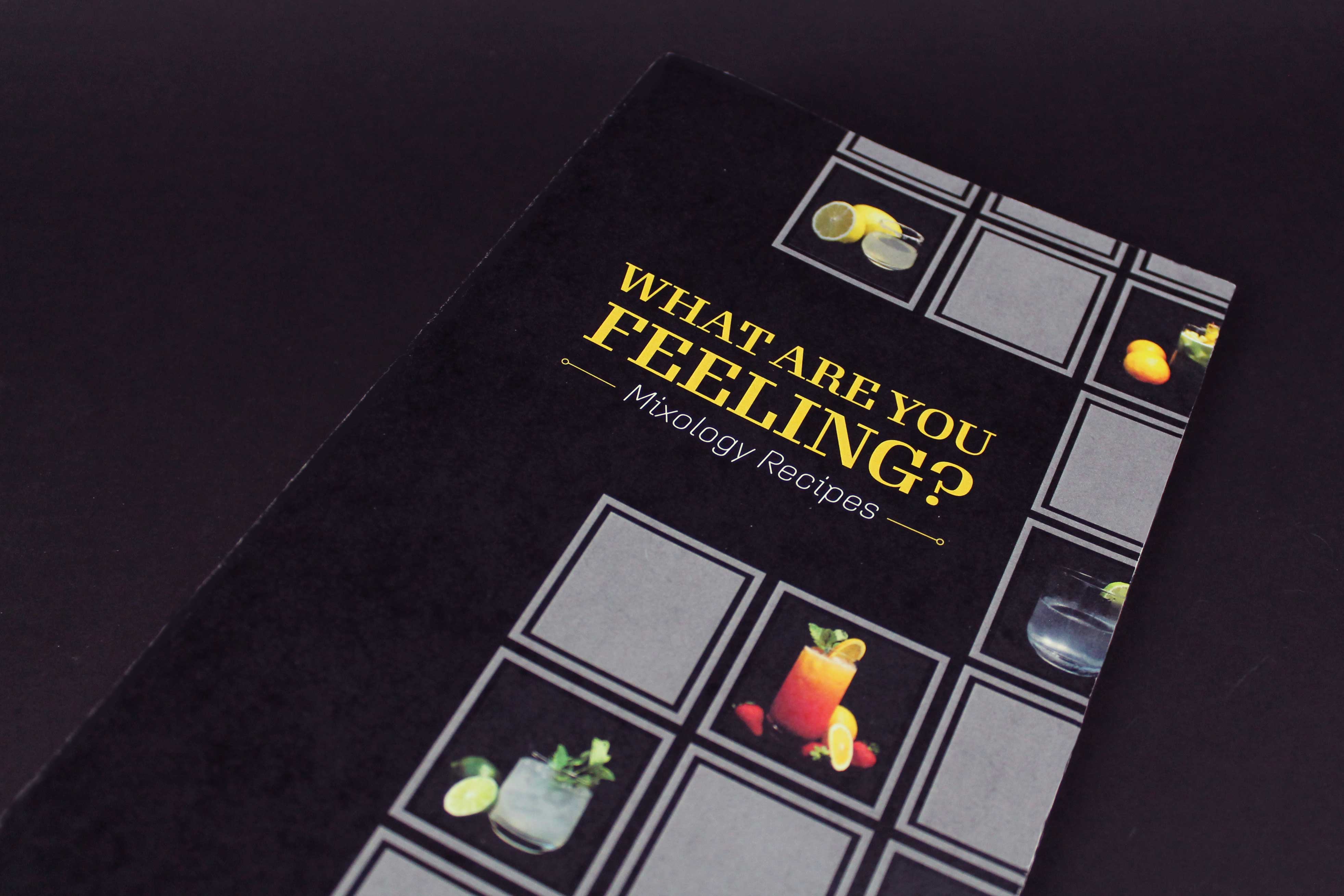
What Are
You Feeling?
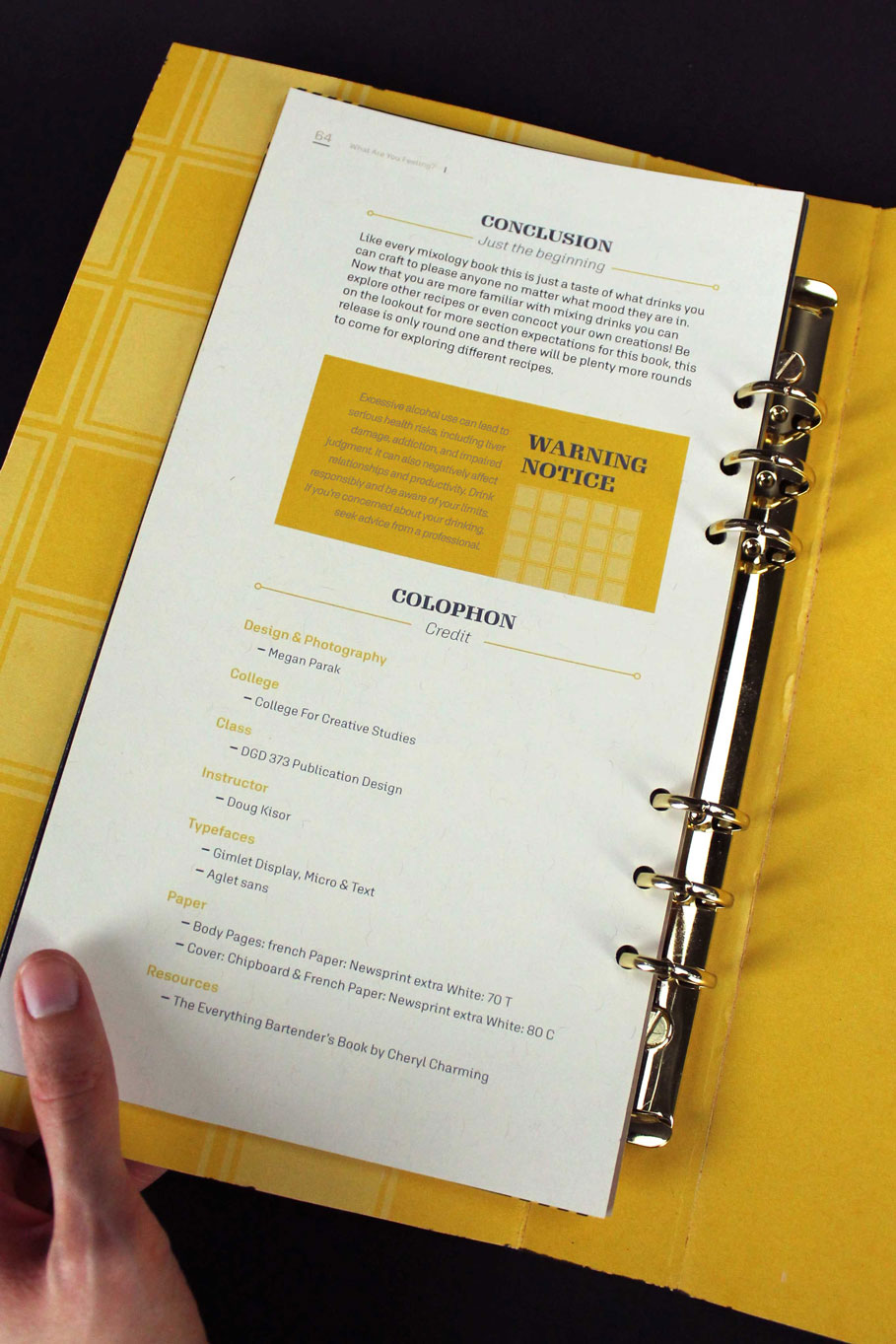
PUBLICATION
Problem
I've always been interested in the art of mixology. Thinking of balancing flavors while having the drink look as stunning as it tastes is no easy feat. This inspired me to design a publication around the complex art of mixology.
Solution
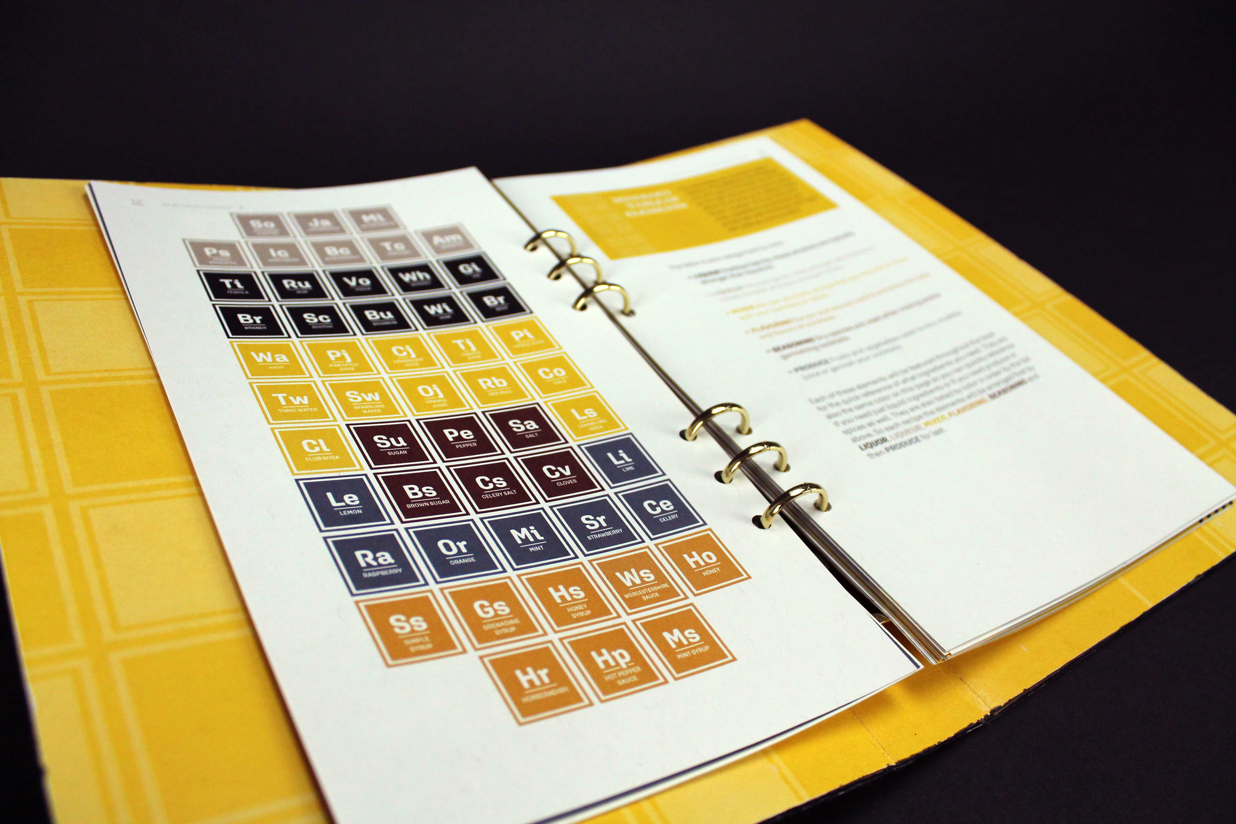
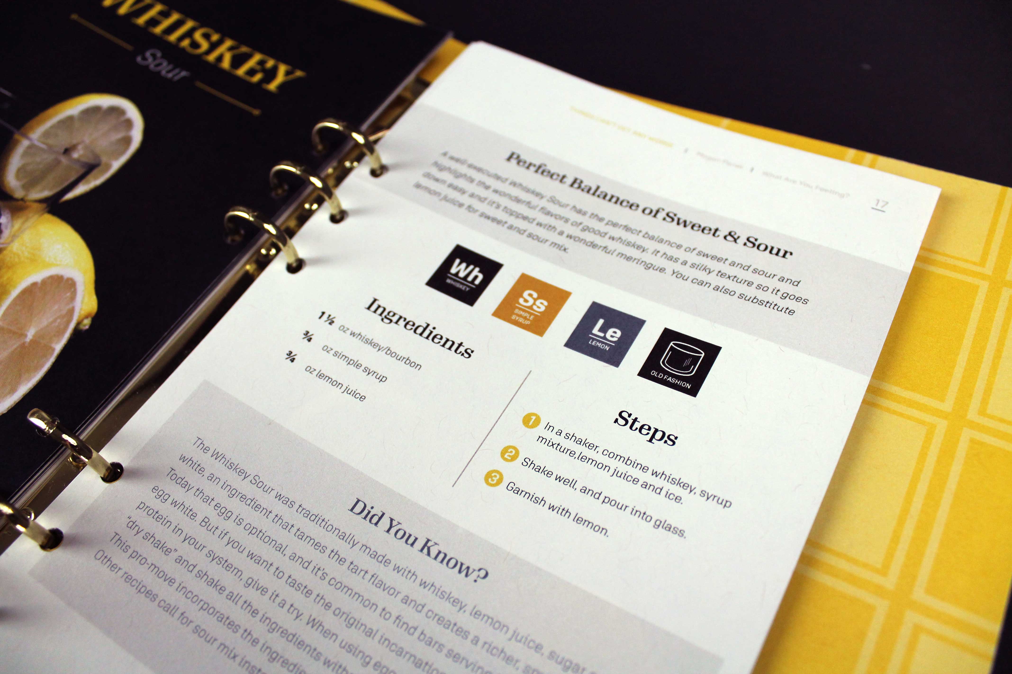
To stand out from other mixology and bartending books, this publication is organized by your drinking mood instead of alcohol type. The sections range from a relaxing cocktail after work to a celebration drink. In addition to the printed recipe, there is a digital component that provides a video tutorial for the recipe.