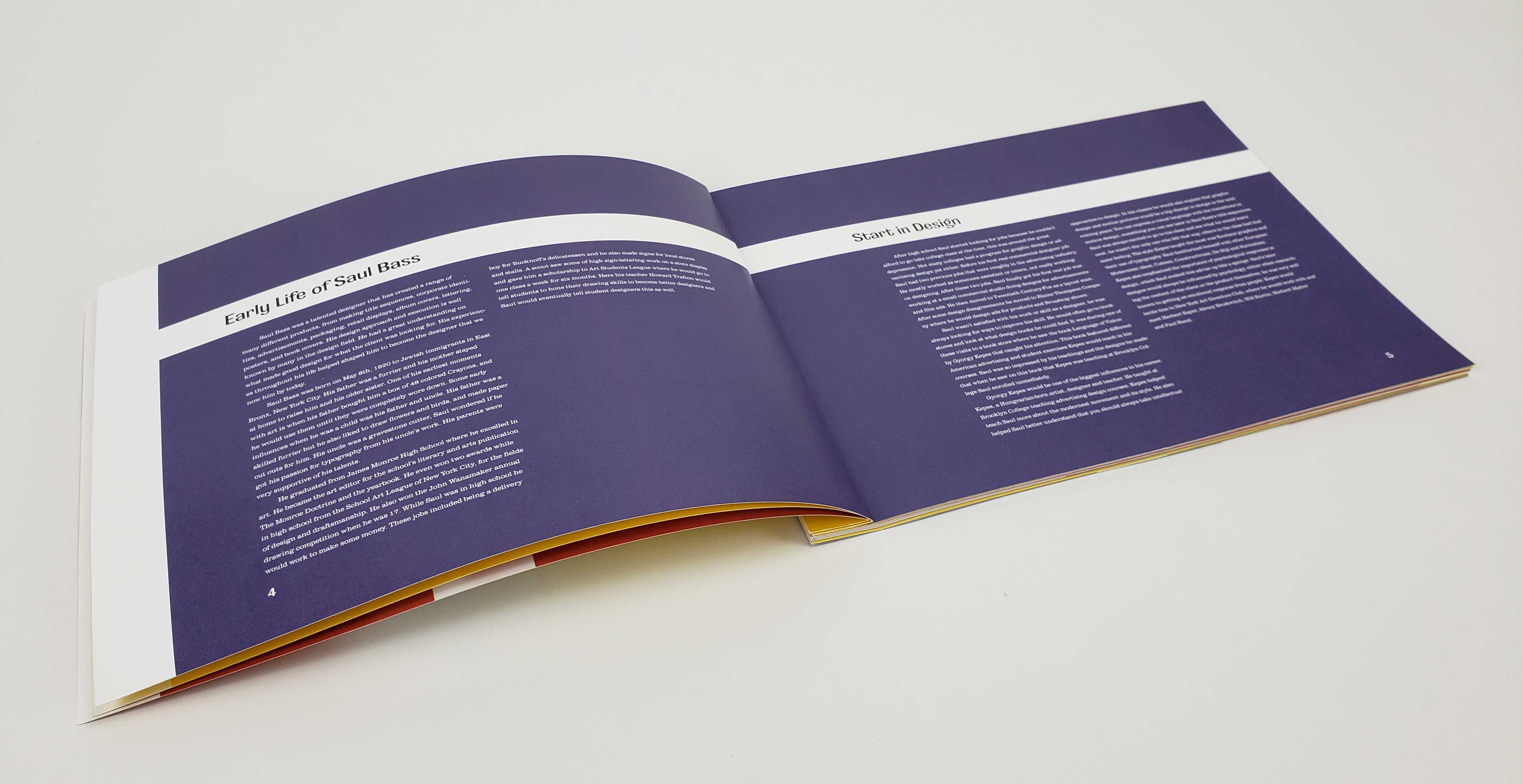
Researching a historical figure in graphic design and documenting our findings in a book publication. The publication should reflect the style of said graphic designer.
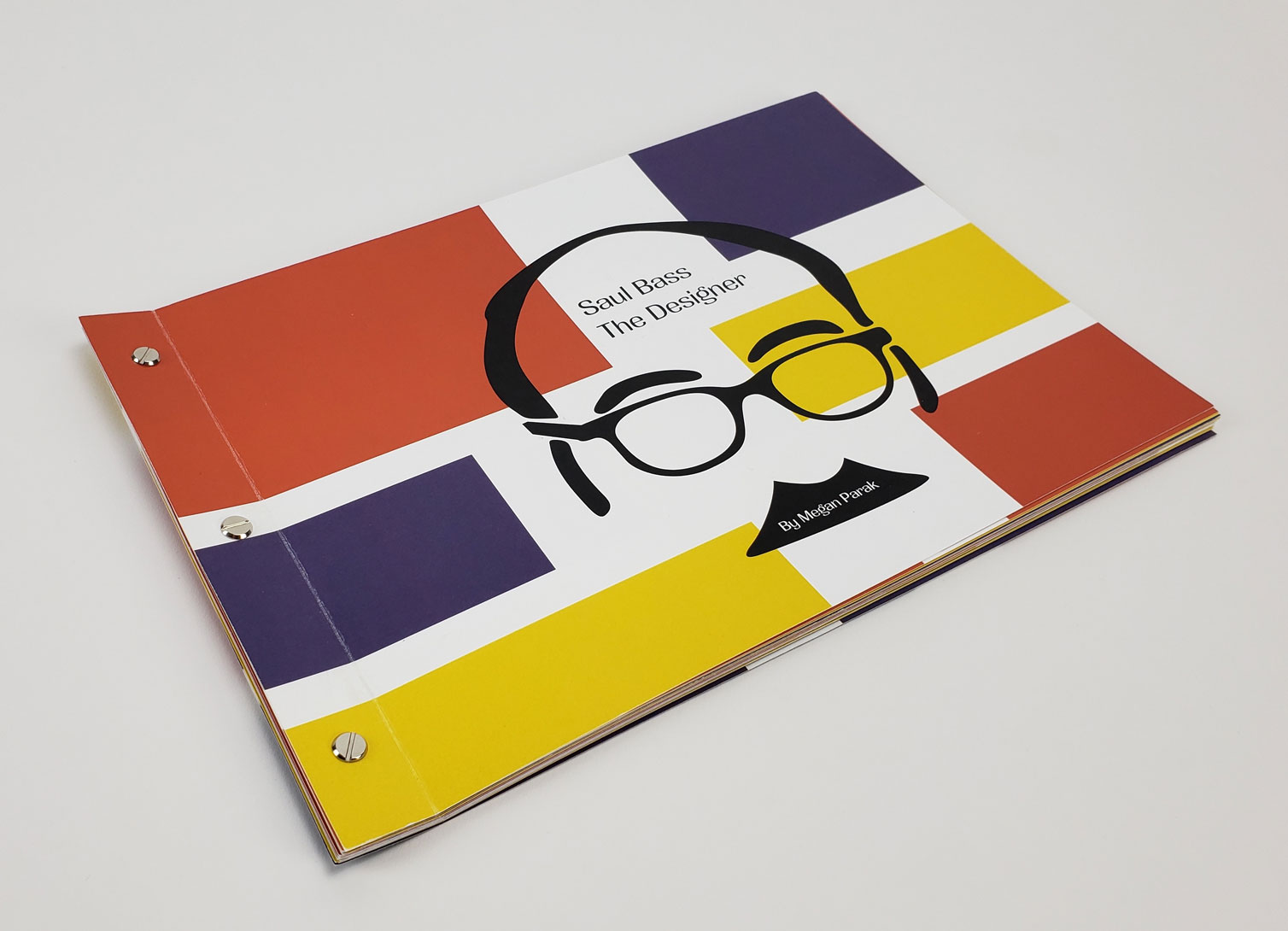
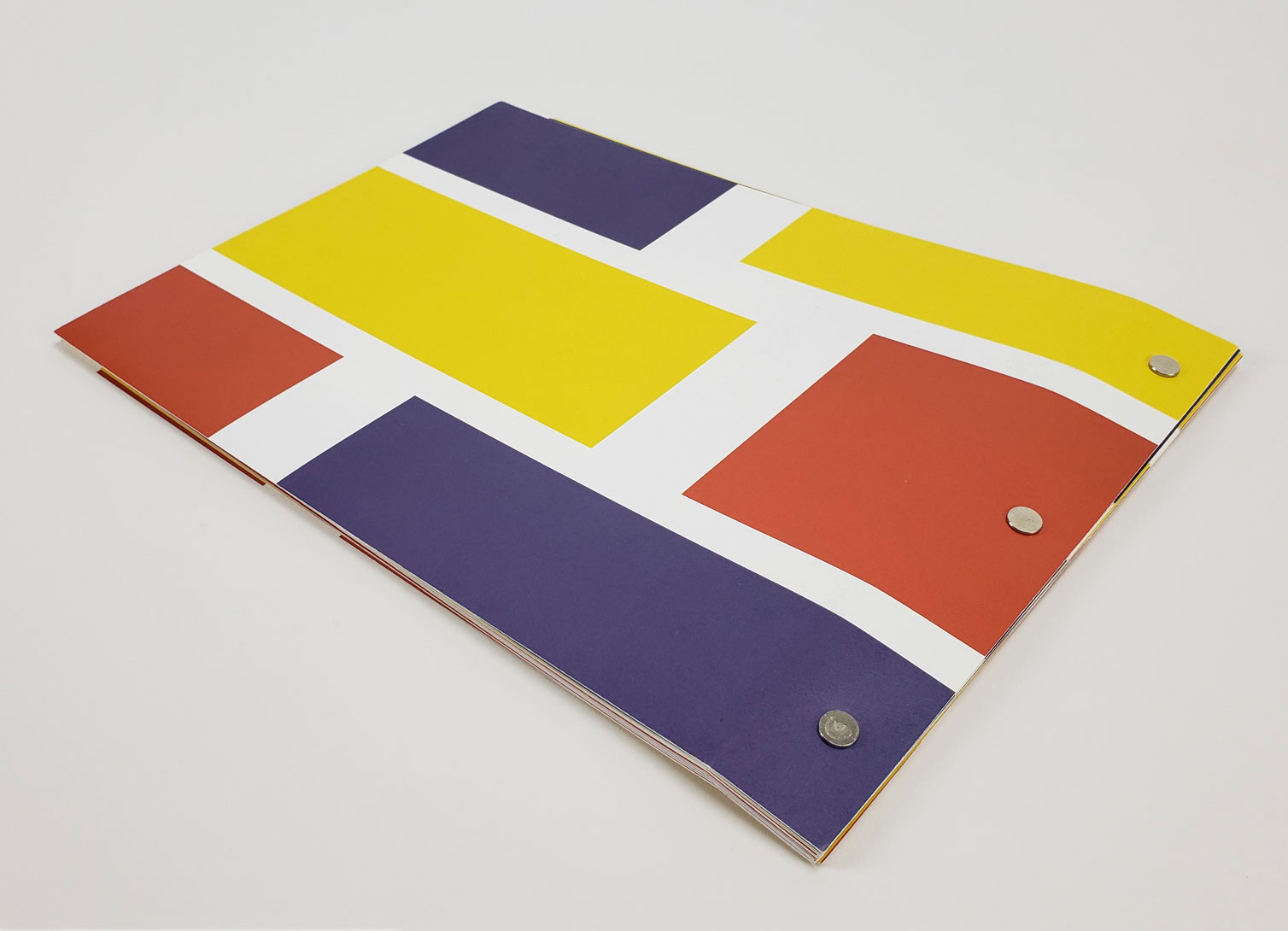
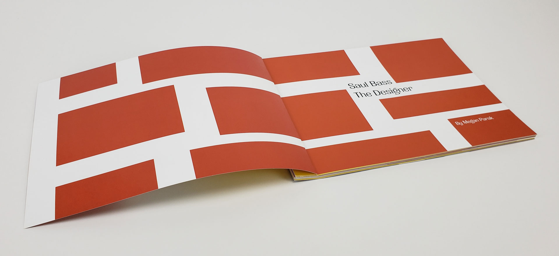
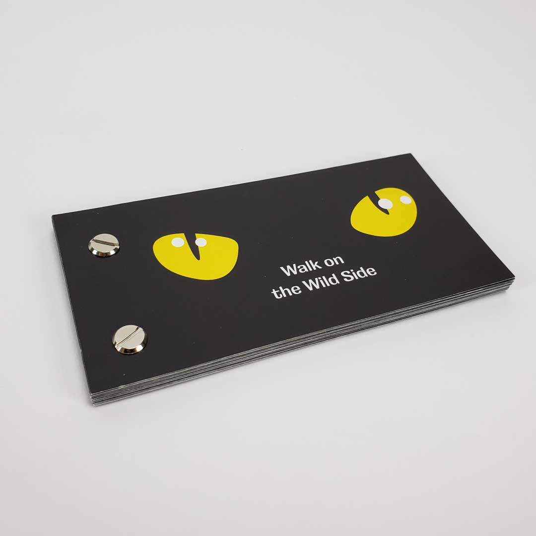
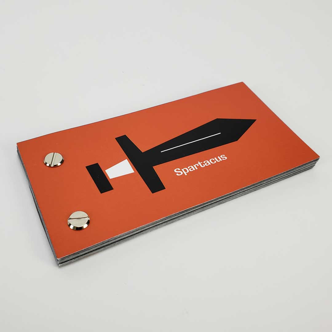
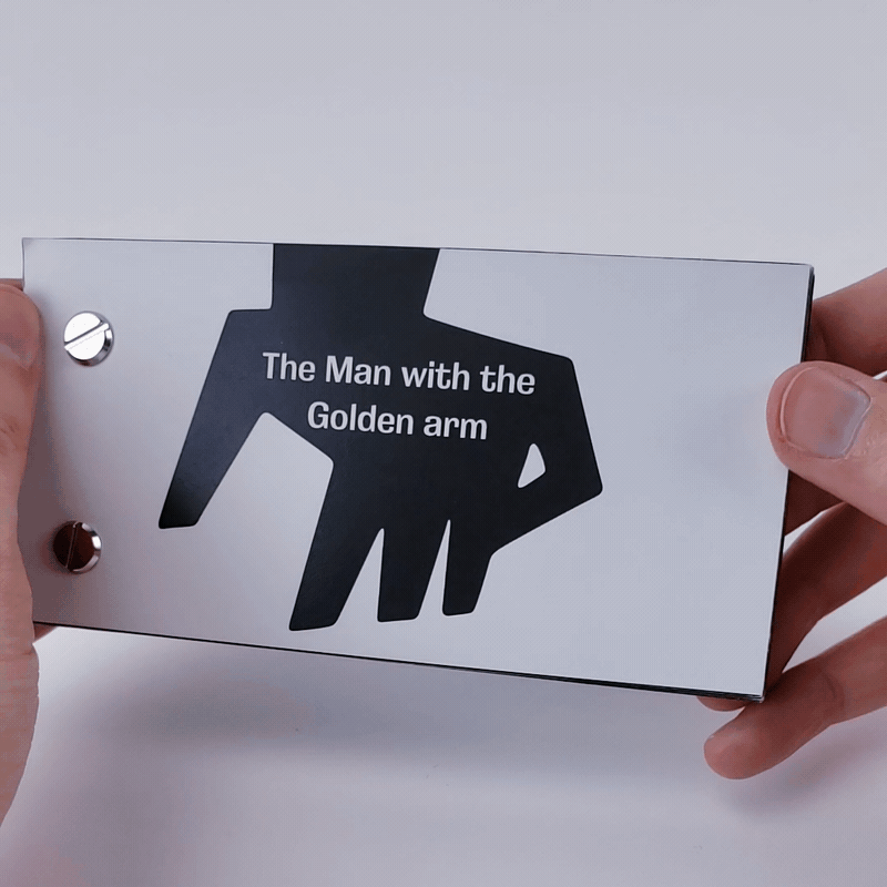
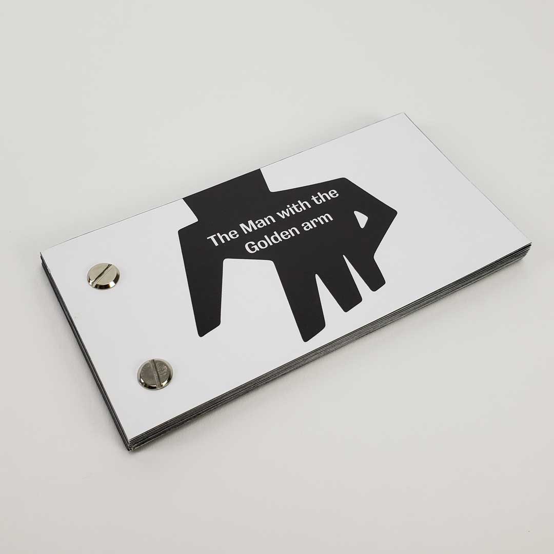
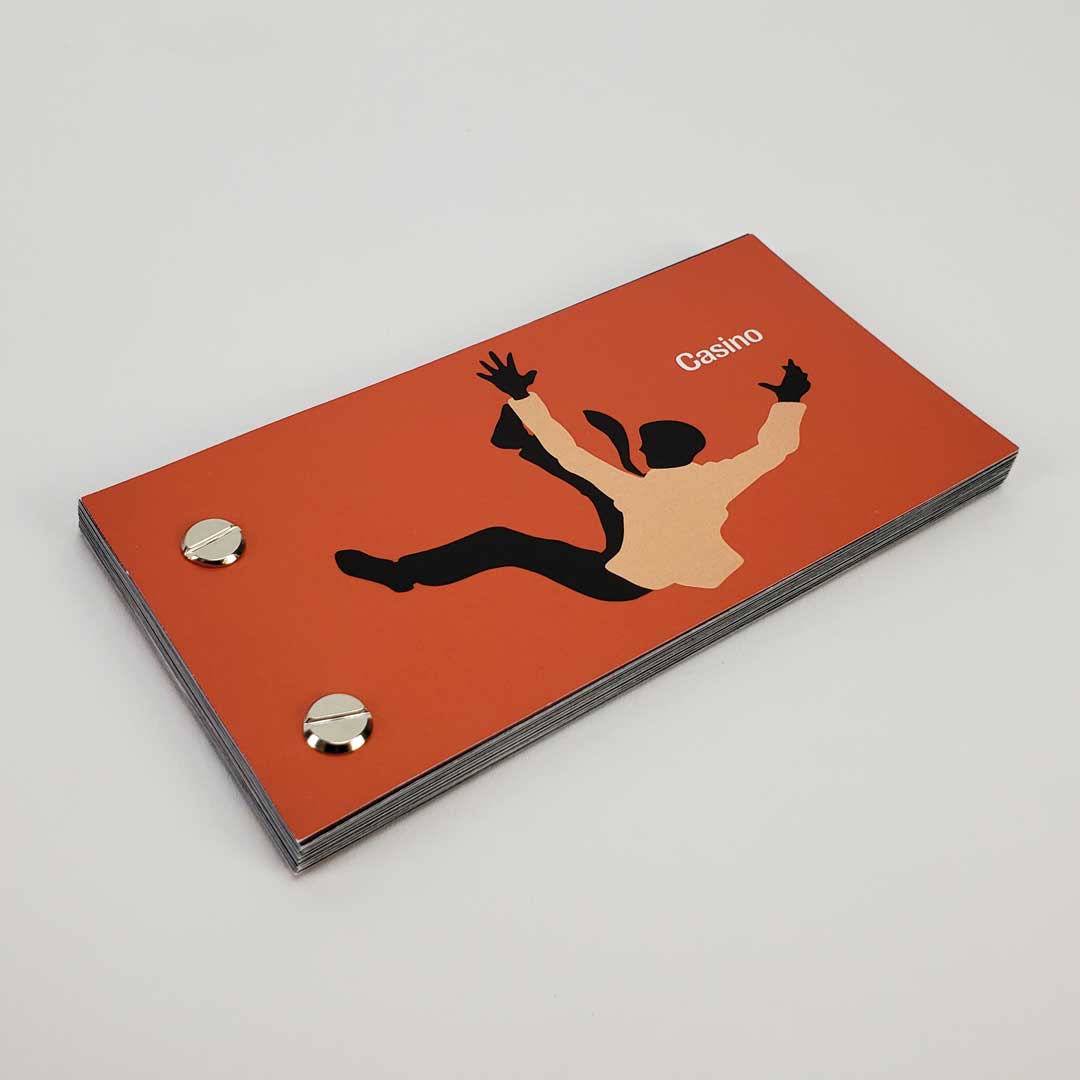
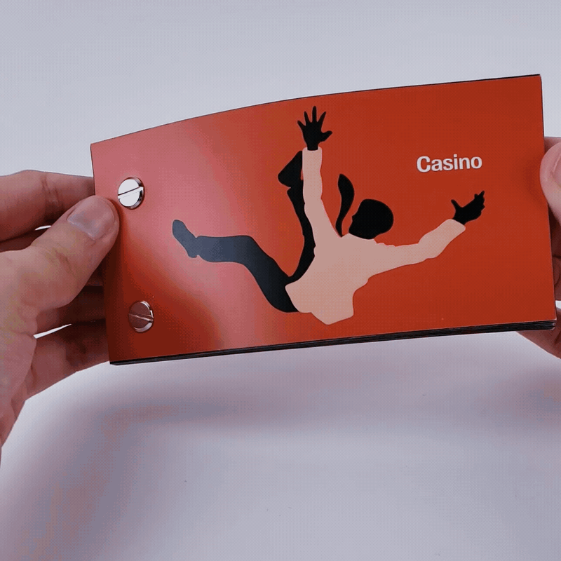
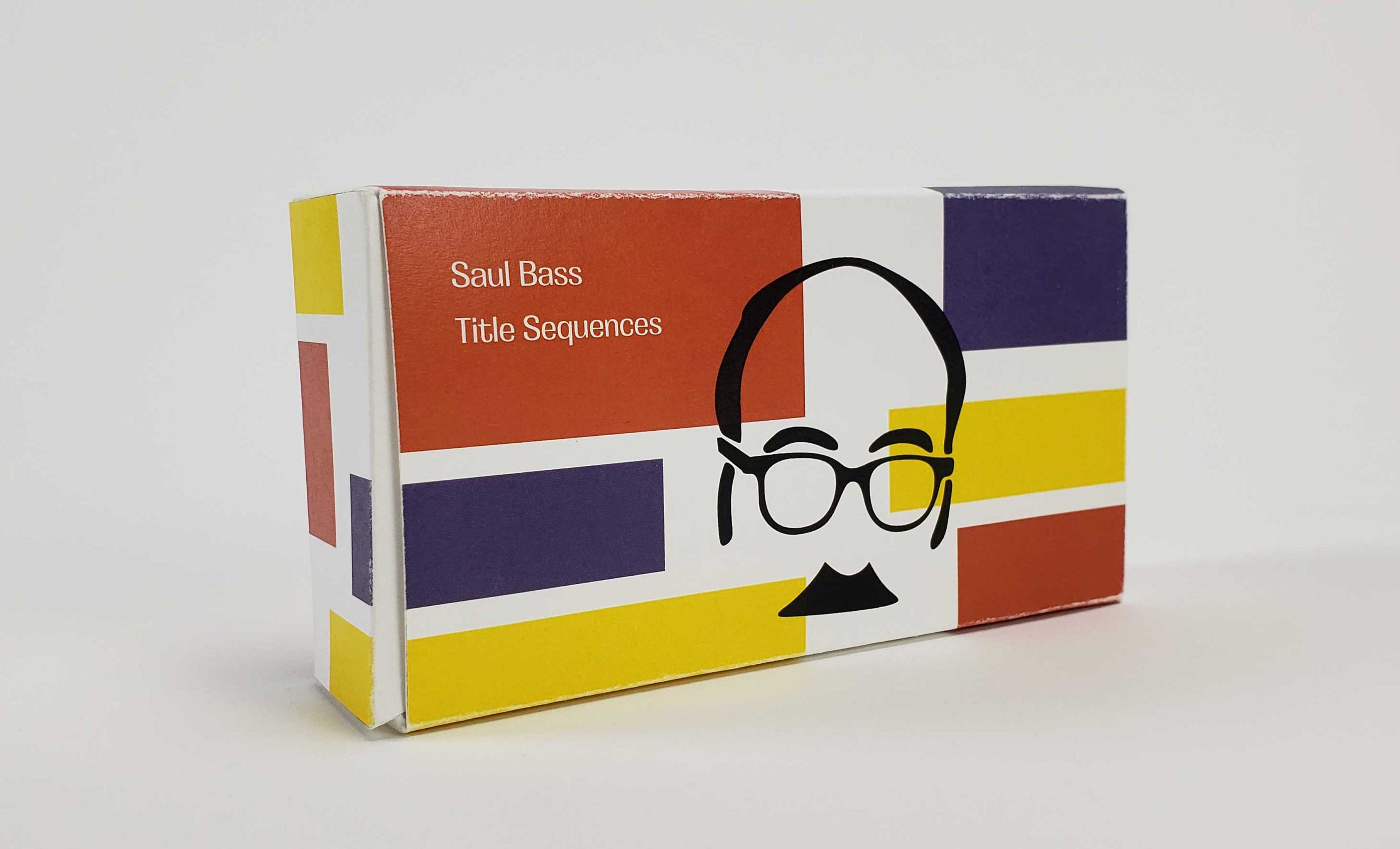
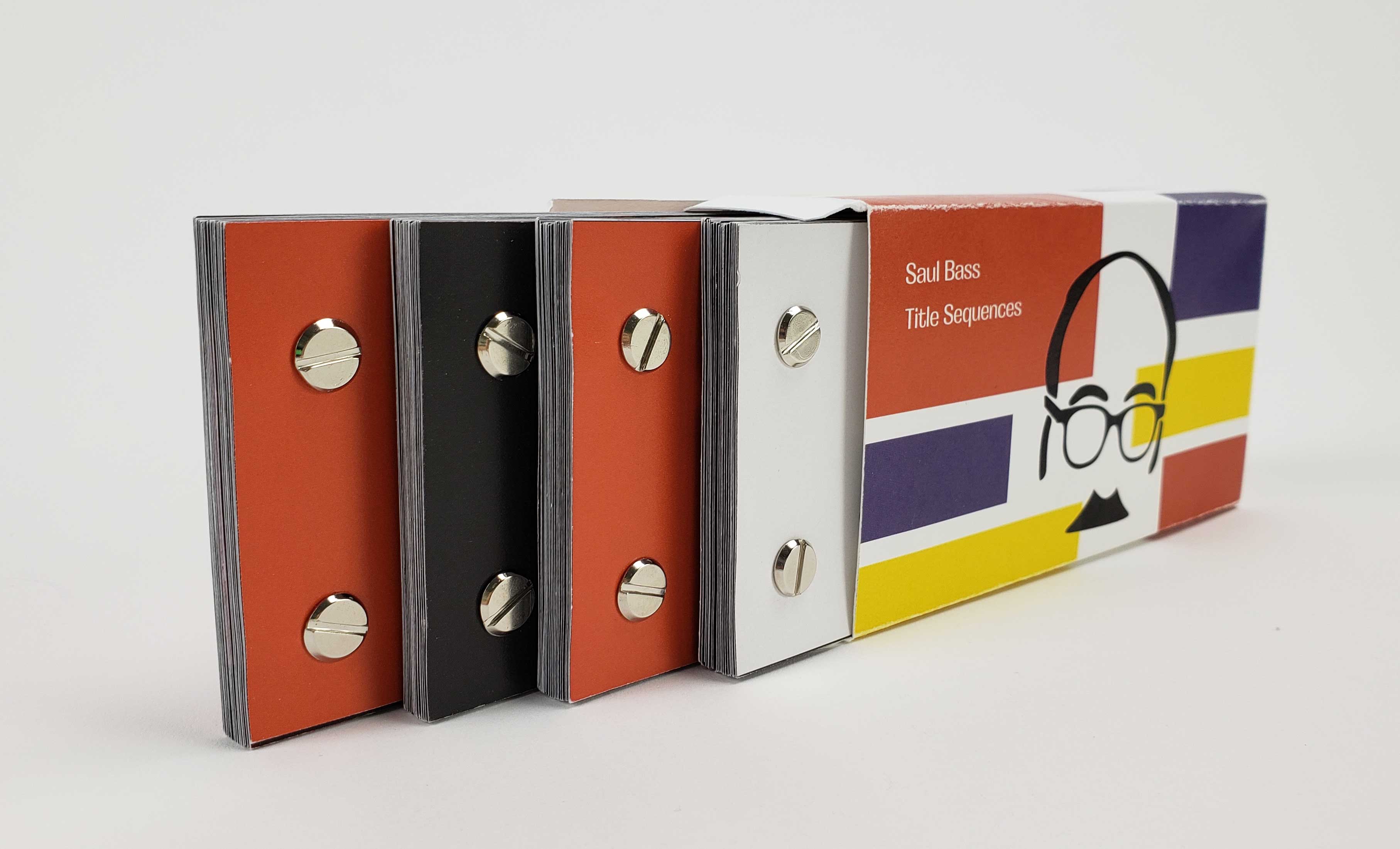
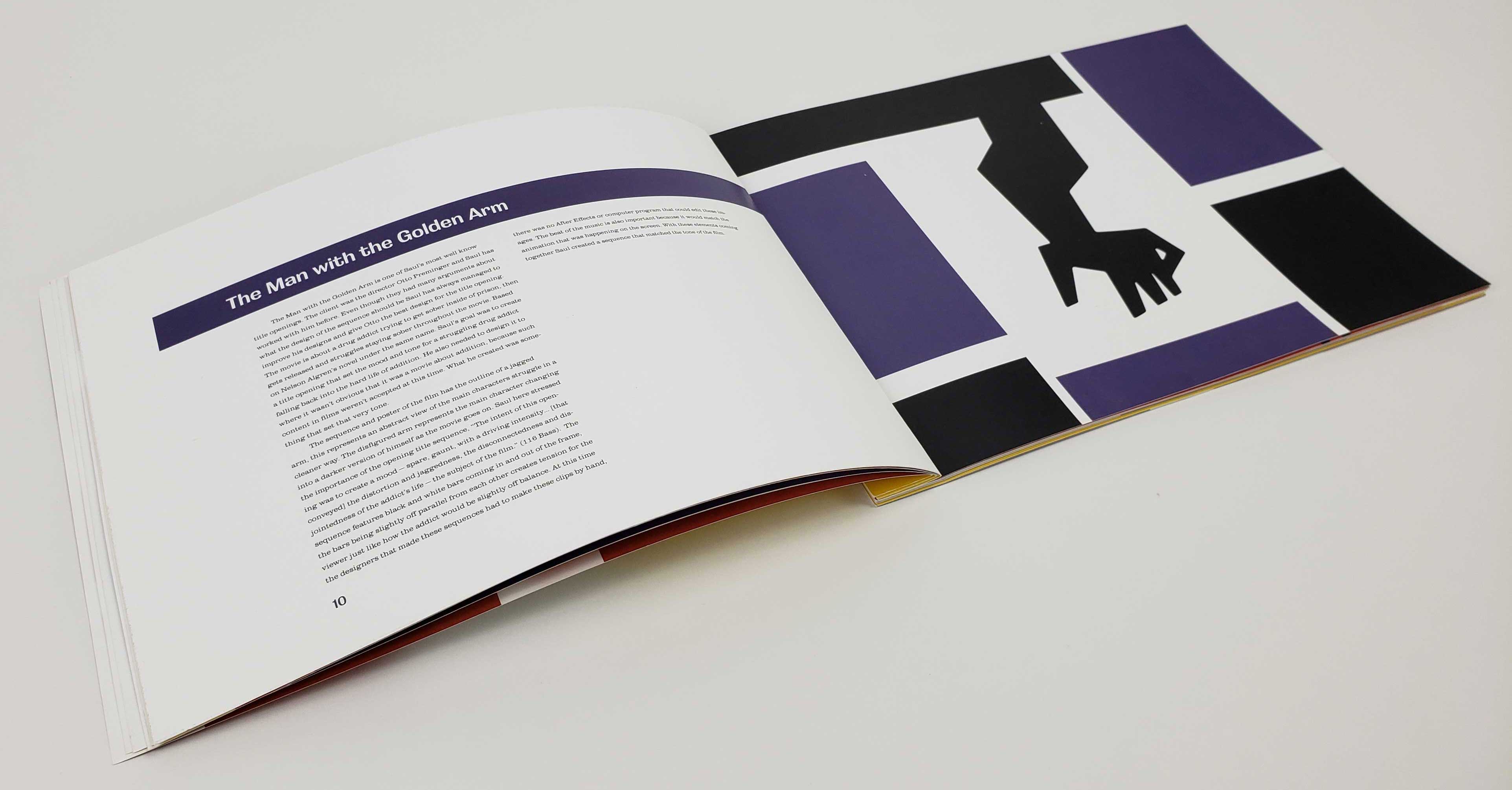
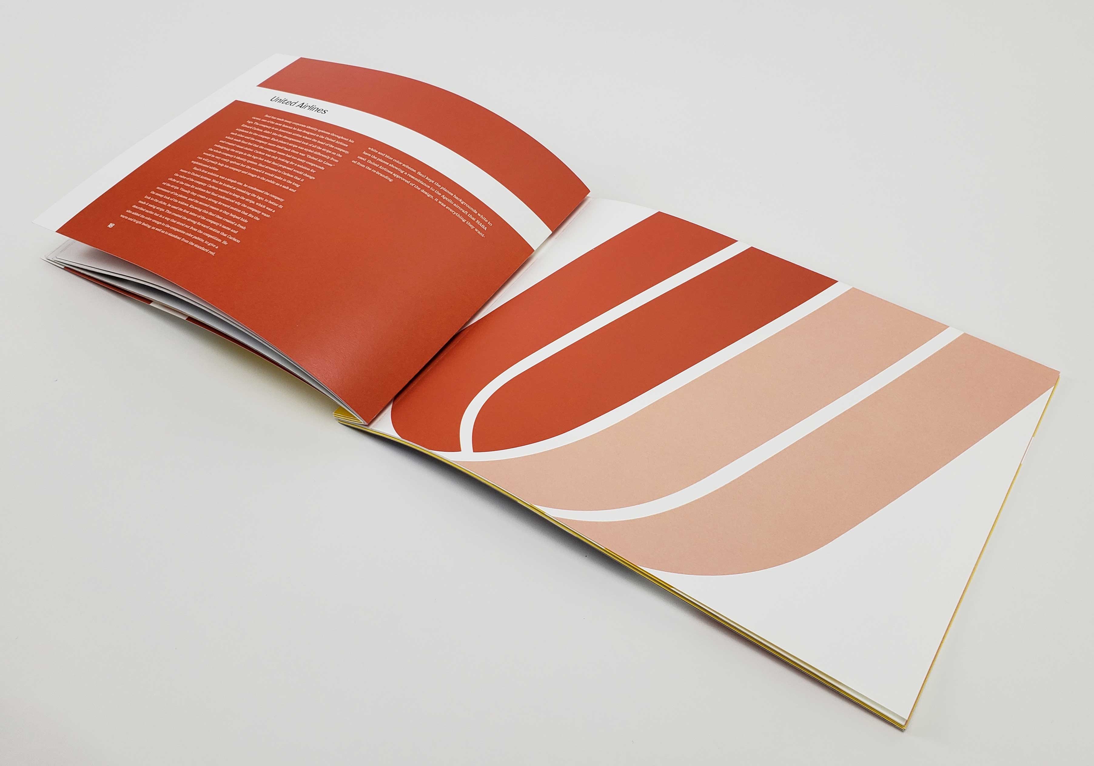
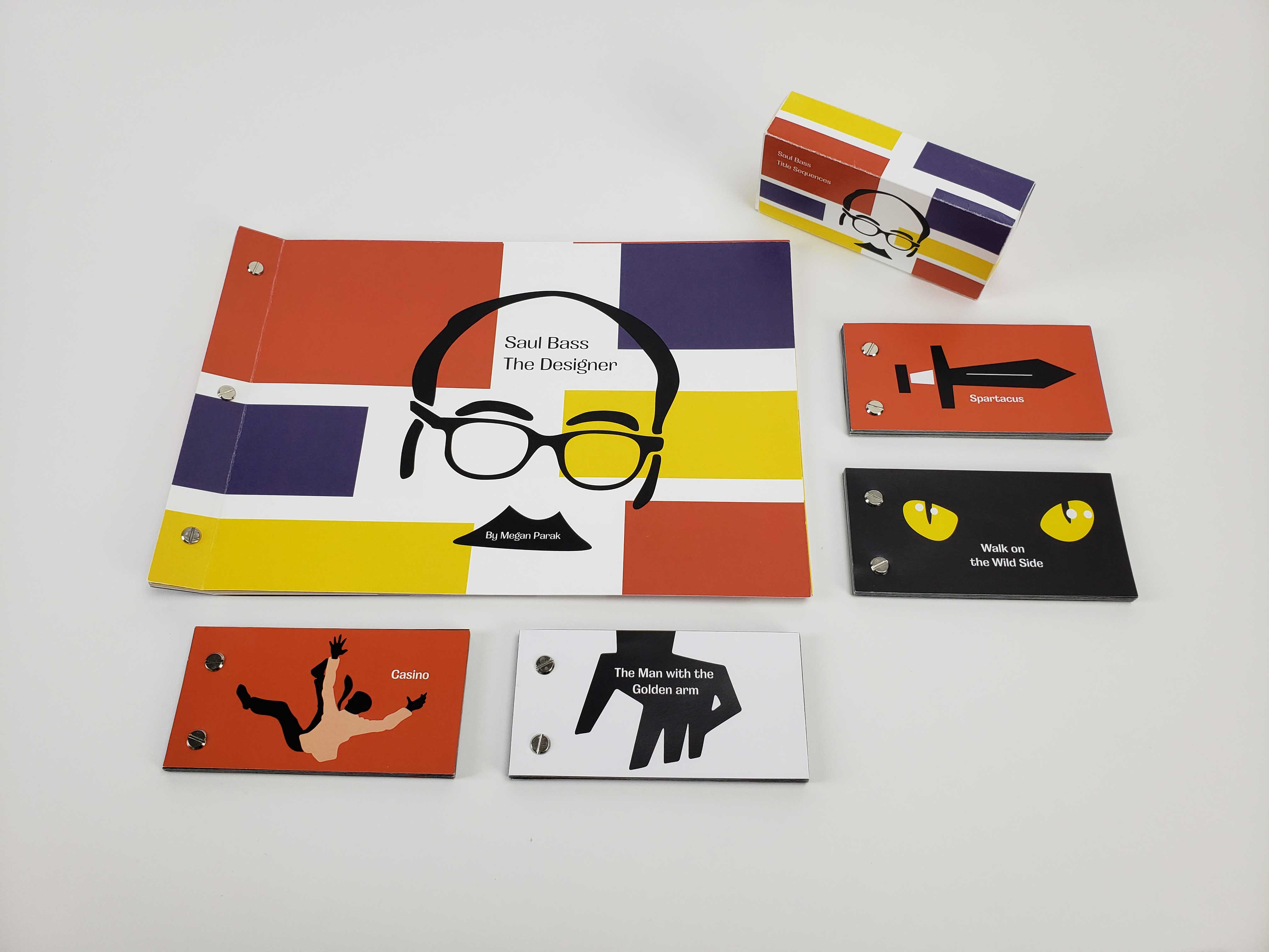
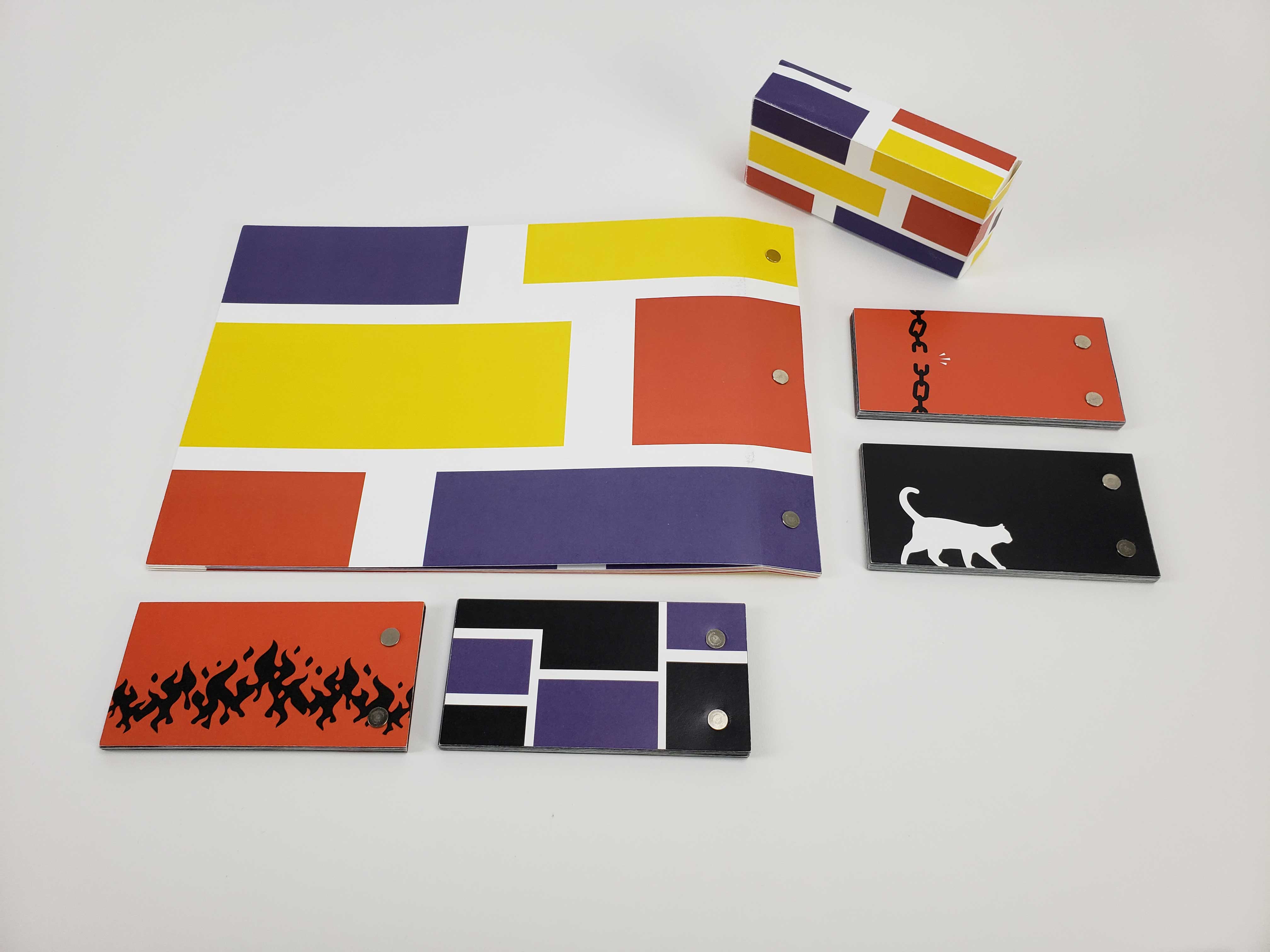
Saul Bass was known for his clean, minimal design style, particularly in motion picture title sequences, film posters, and corporate logos. His distinctive use of basic shapes made his work in logos and title sequences stand out, leaving a lasting influence on graphic design. This is highlighted through a large, bold publication detailing his work, accompanied by a brief biography. Included are four flipbooks, each featuring a different movie title sequence he created.
Saul Bass focused on simple, geometric shapes and symbolism for his designs. Using these basic shapes to convey a powerful message and often making these shapes and text by hand makes his work casual but still impactful. Reflecting this sentiment within the publication, I created large spreads with an image taking up one page and the other discussing the contents of the image.
Bass's standout work was his logos and title sequences. This publication discusses some of the more memorable pieces of those two mediums. To pay tribute to the title sequences, there are flipbooks for every title sequence mentioned in the publication. The flipbooks only show a few seconds but still show how striking they can be.
When deciding on color application, the best direction was to choose a variation of the primary colors. Throughout Bass's work, he used many bold primary and secondary color choices, letting shapes and text stand out against the background or having the background be the stand-out color with black or white text.
When it came to typefaces, Bass's work features sans-serif fonts, some of which he hand-cut. Having the sans-serif slightly rounded and contrasting in the letterforms keeps the human touch of Bass's cut-out letters.
Post-binding enables readers to engage with the content without needing to keep the book open. This feature does not apply to flipbooks due to their interactive nature. The landscape orientation of the books mirrors the rectangular aspect ratio typical of video and film, reinforcing their visual connection. Additionally, the main publication's large format is designed to be impactful, allowing readers to appreciate Bass's designs up close.
When illustrating the flipbook covers, I took inspiration from the movie posters that Bass helped design and his approach to simple geometric shapes. For the text pages, extra space was placed along the binding edge to ensure the imagery would not be obscured or cut off by the gutter. Included with the flipbooks is a box to hold them all together, sharing the design of the cover of the main publication.
Finding the right balance between too much or too little detail for tracing while balancing contrast with colors was an important skill to grow. Maintaining a consistent visual style across all imagery throughout the deliverables was another valuable learning experience, particularly given the variety of topics, from an airline logo to the cover of the Casino flipbook cover.
Publication and layout design was another valuable skill learned. I started to look at this project differently when adding the interactive element of the flipbooks. This taught me how to be more whimsical and playful towards my design outcomes and process.
Similar Projects:
From_SCREEN To_PSYCHE |
What Are You Feeling?