From_SCREEN To_PSYCHE

PUBLICATION

Problem

Research a social issue to explore and discuss, then create a designed asset from the research that reaches the target audience. The design should relate to the people experiencing this issue. The topic I chose was how social media overconsumption affects teenagers' thought processes with teenagers being the target audience.

Solution

The asset I chose was a publication because I wanted to stay away from a digital solution. After compiling the research and seeing how much screen time teens are consuming, the deliverable shouldn't add more time but be a break from it. However, the layout design of the publication mimics the layouts you would see on social media.

How Harmful Can It Be?

When researching social media overconsumption among teens, many concerning side effects came up. The most researched side effects are anxiety, body image, and sleep loss. These three areas are the focus of the publication, with a general overview of how teens interact with social media. Within each section are examples of how social media can cause the side effects being discussed.

Instagram was a large influence on this project. Up until TikTok, Instagram was the most popular social application for teenagers. They could easily post and share photos, videos, and stories to keep friends updated. Sending direct messages and memes was also very common. A requirement for all posts to have images also opened possibilities for layout design.

Typography & Colors

When approaching color, I wanted to have vivid colors to catch the attention of my target audience. Instagram's brand colors were the direct influence of the color palette. Changing the colors enough to add contrast between them.

When selecting a font family, a font with different classifications was key. Wanting to replicate the appearance of social platforms while creating an interesting typography header layout was no easy task for a limited font family. I selected the IBM Plex family for its large diversity.

scroll down icon
scroll down icon

Design Approach

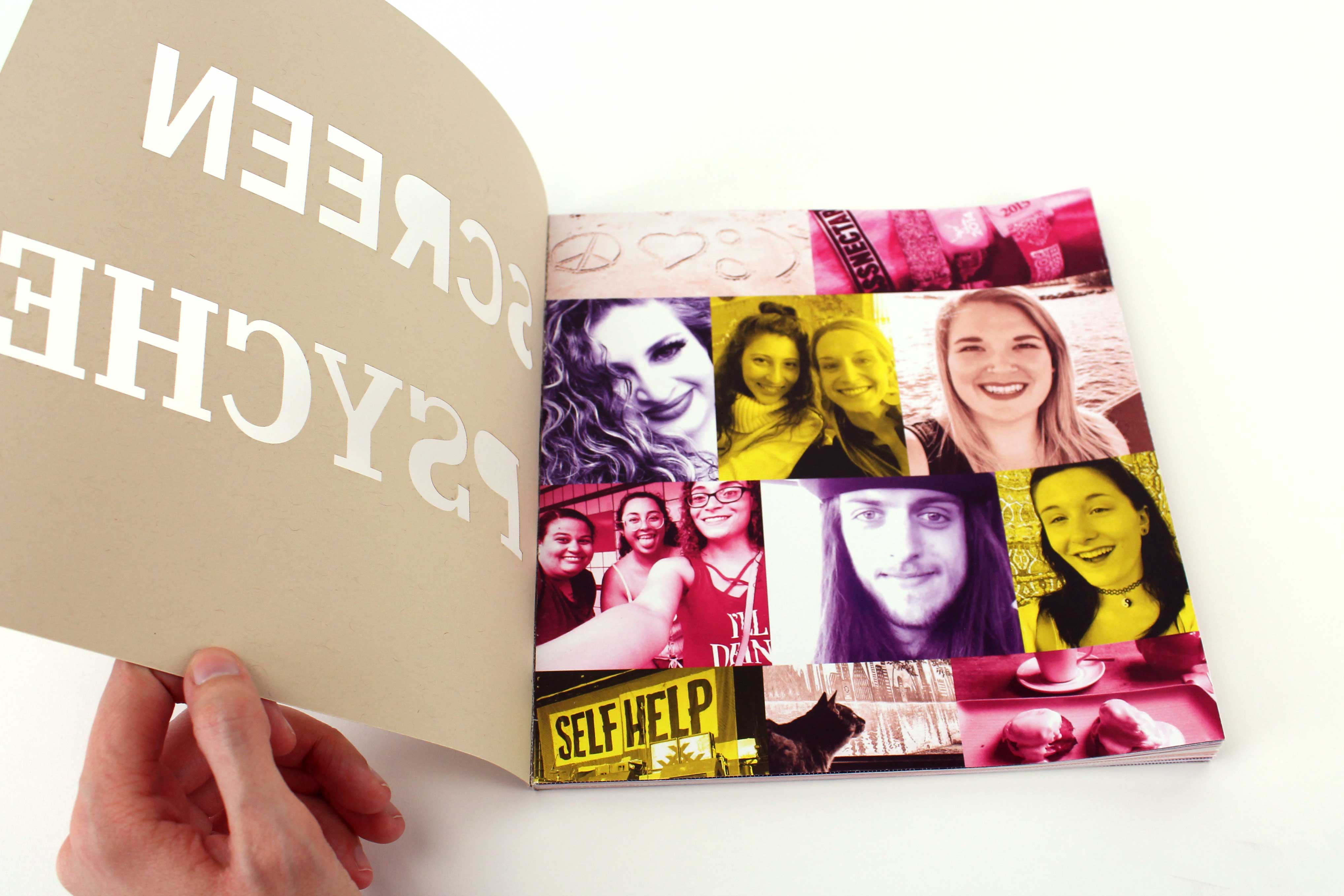
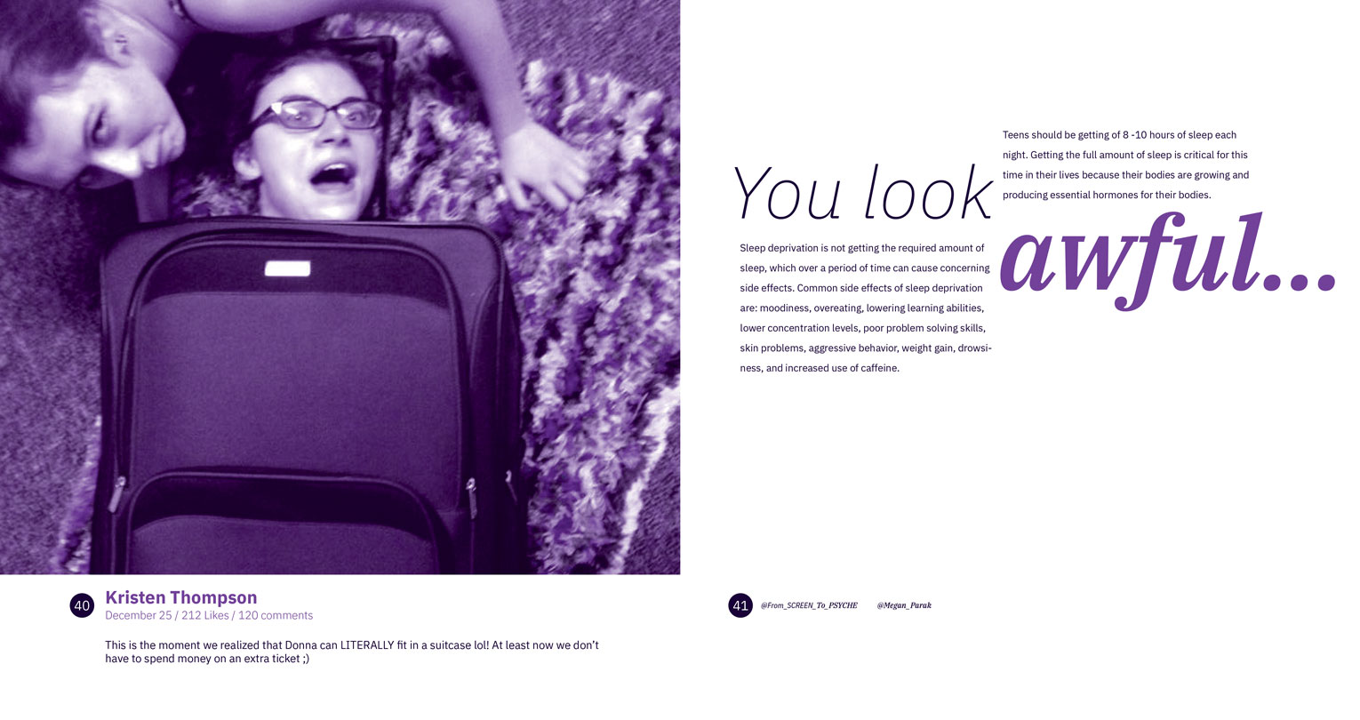
I wanted to present my research with real social media posts that people have shared. Gaining permission from people I knew, I used their Instagram posts for this book. This included photos, captions, likes, upload dates, and the number of comments. The only change was their names, so they remain anonymous. Next was to design the book.

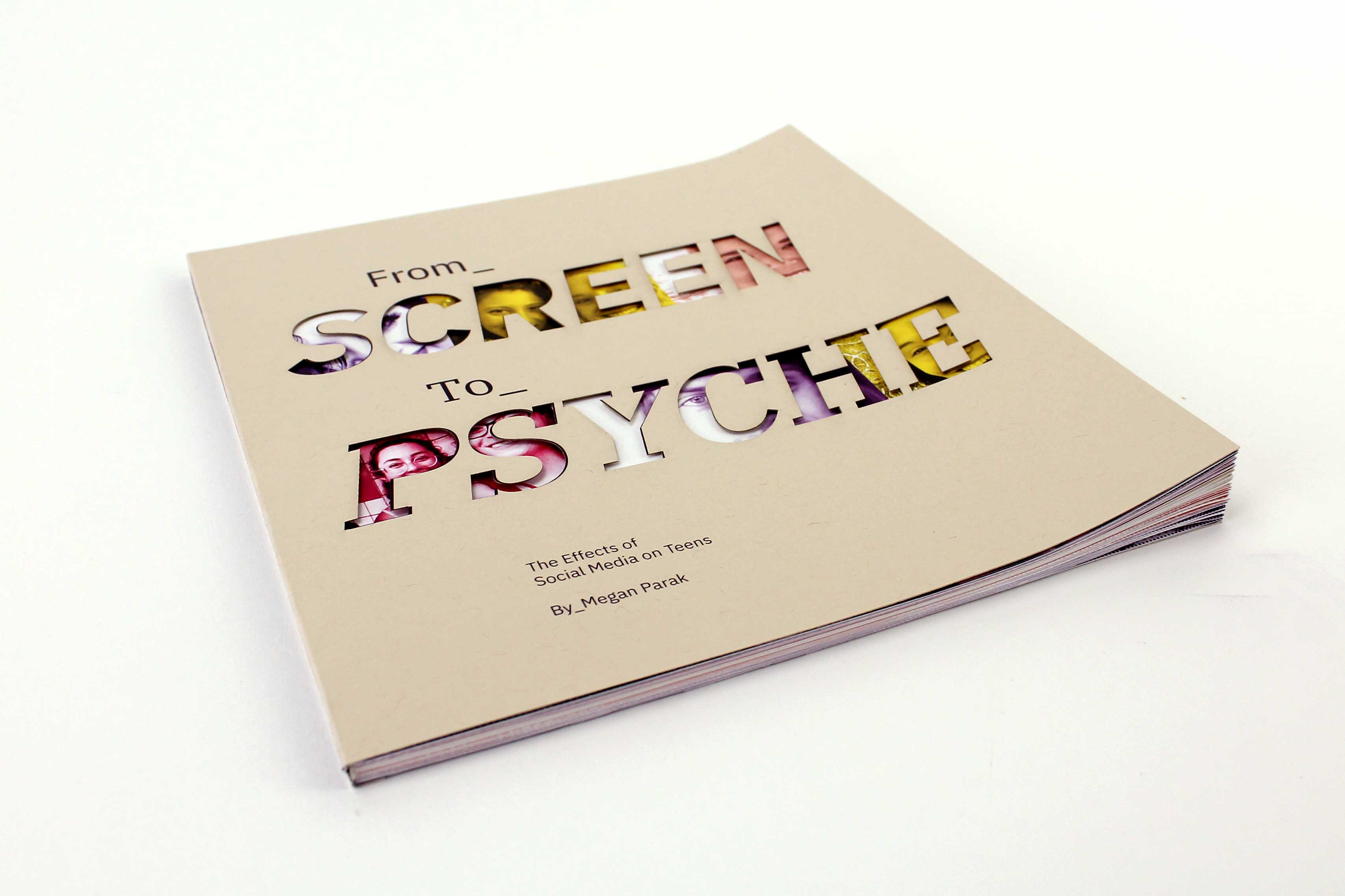
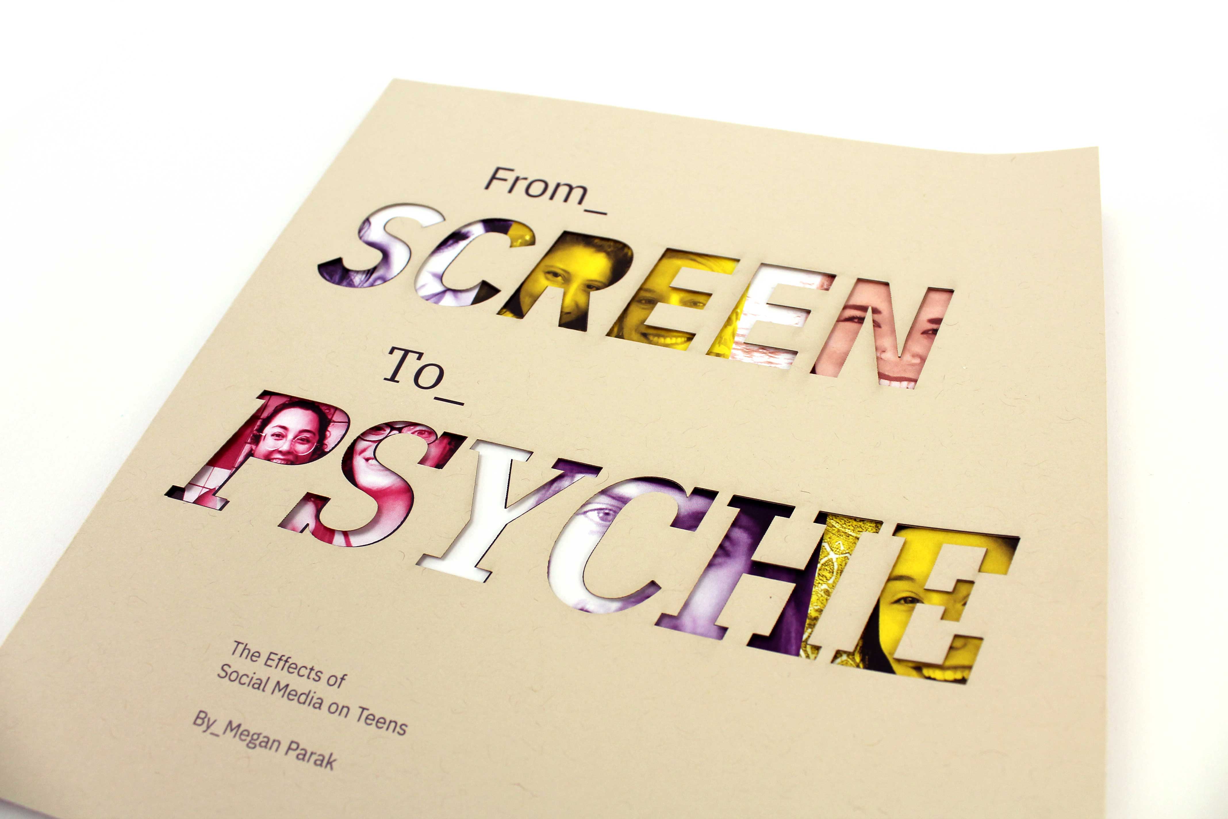
The publication has a square orientation to mimic the 1:1 ratio that most posts on Instagram use. The cover features the words "Screen" and "Psyche" die-cut to reveal vivid, monochromatic photographs of people, with careful placement so that the eyes and facial expressions are visible through the text. This design evokes the idea of only seeing a narrow, positive slice of someone's life, mirroring the curated nature of social media. To maintain focus on the striking cutout, the surrounding color is a subtle, neutral tan.

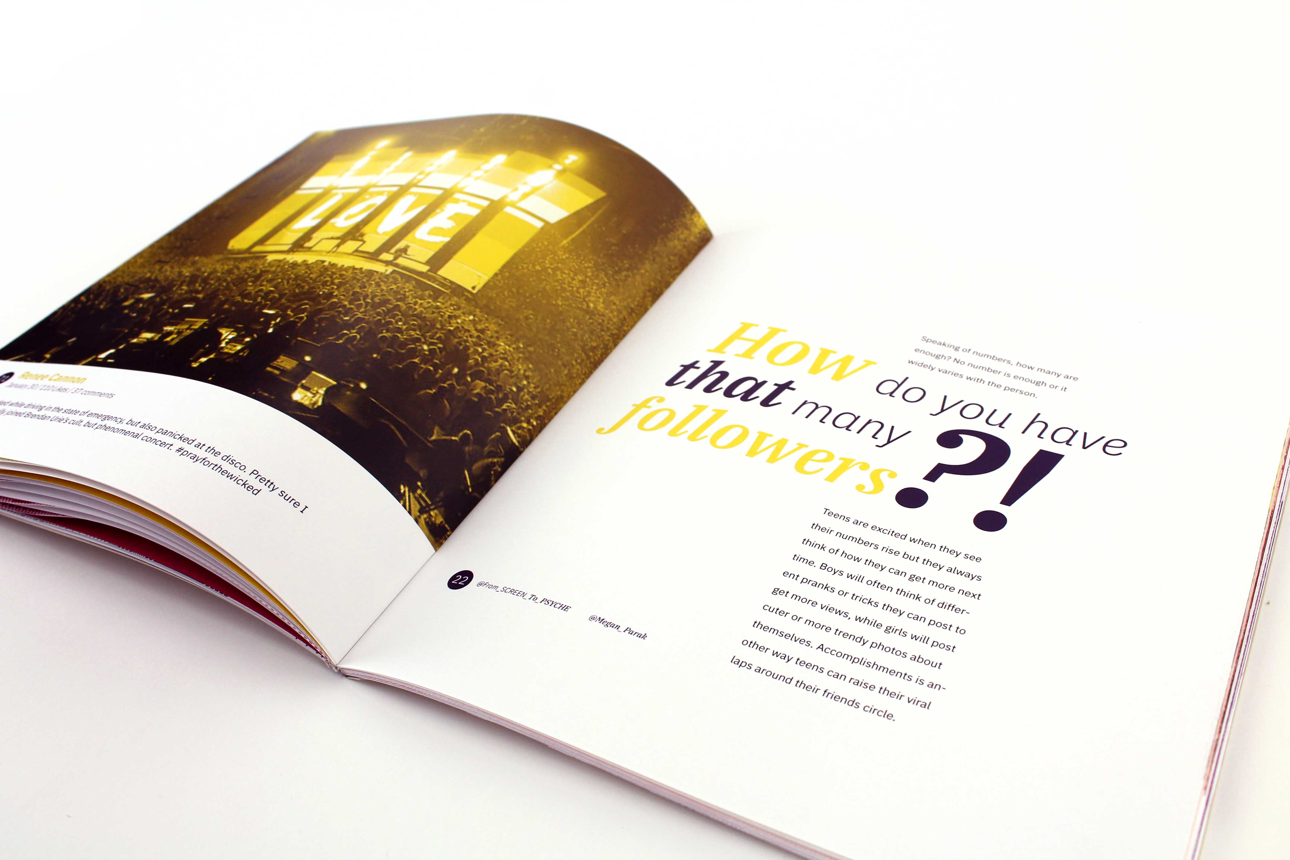
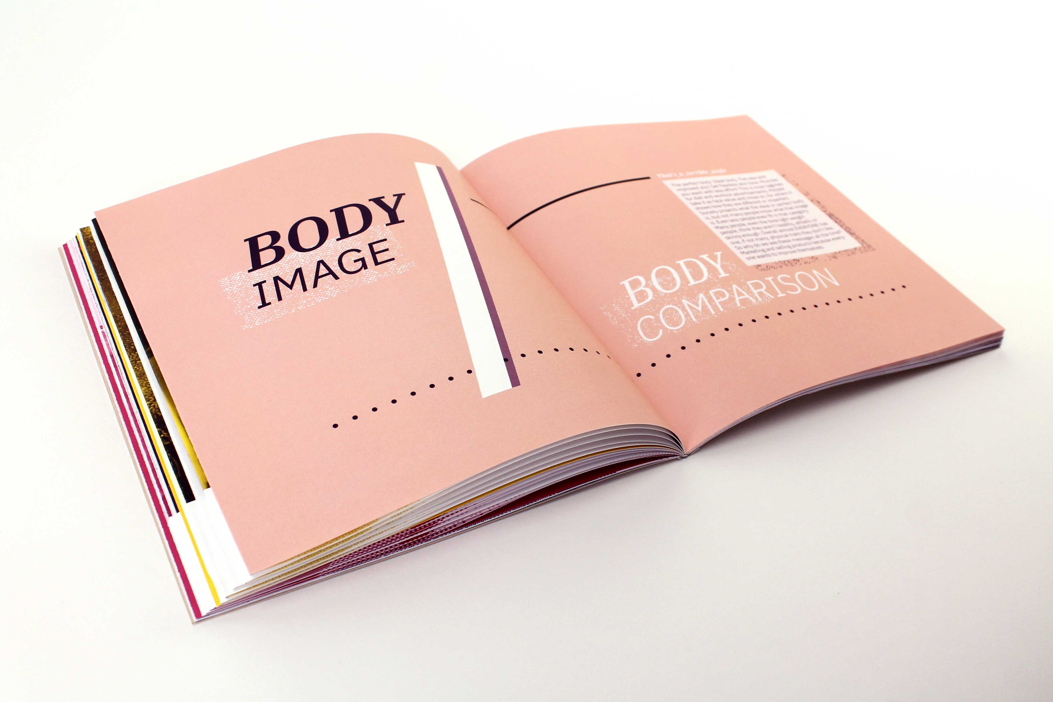
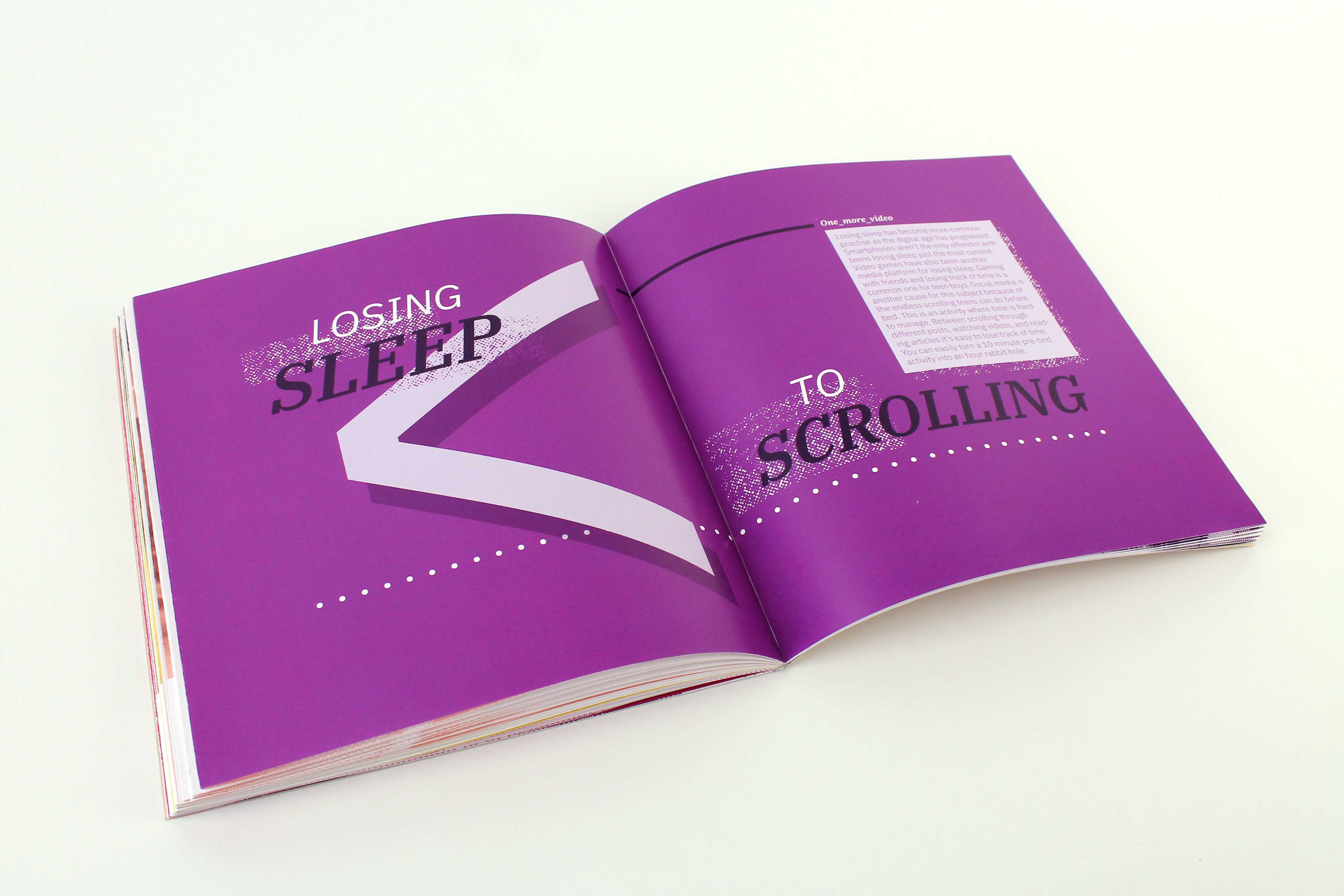
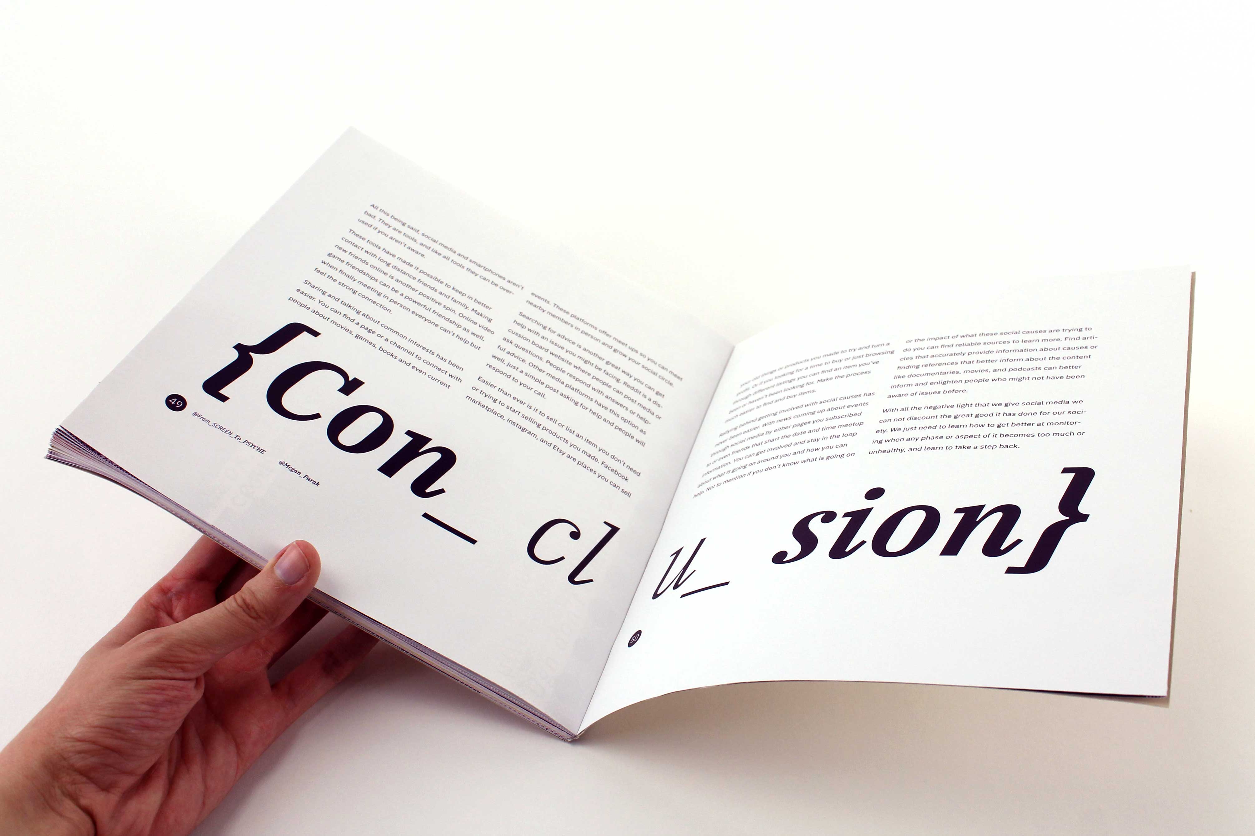
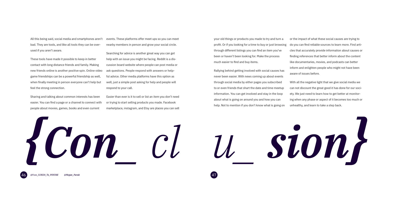
The treatment of spreads is used in a few different ways. The title sections take up both pages and are designed to invoke the message of the section textually and visually. The section "Losing Sleep to Scrolling" has a large "greater than" symbol placed behind the header to show that teens' sleep is less important than scrolling on your phone late in bed.

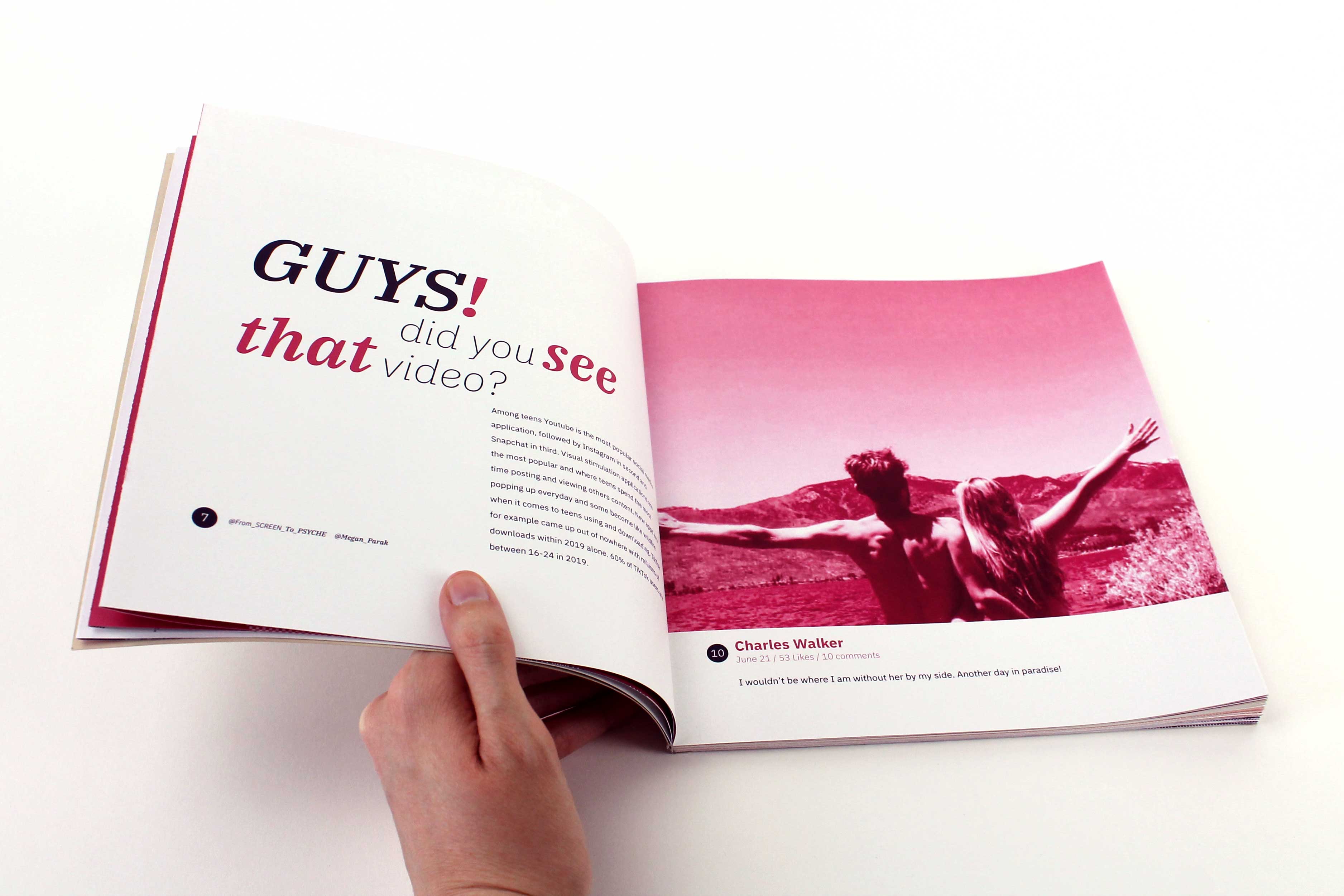
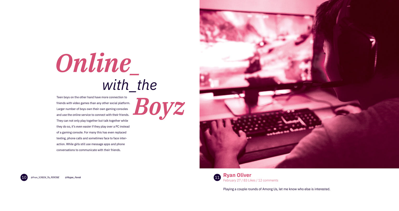
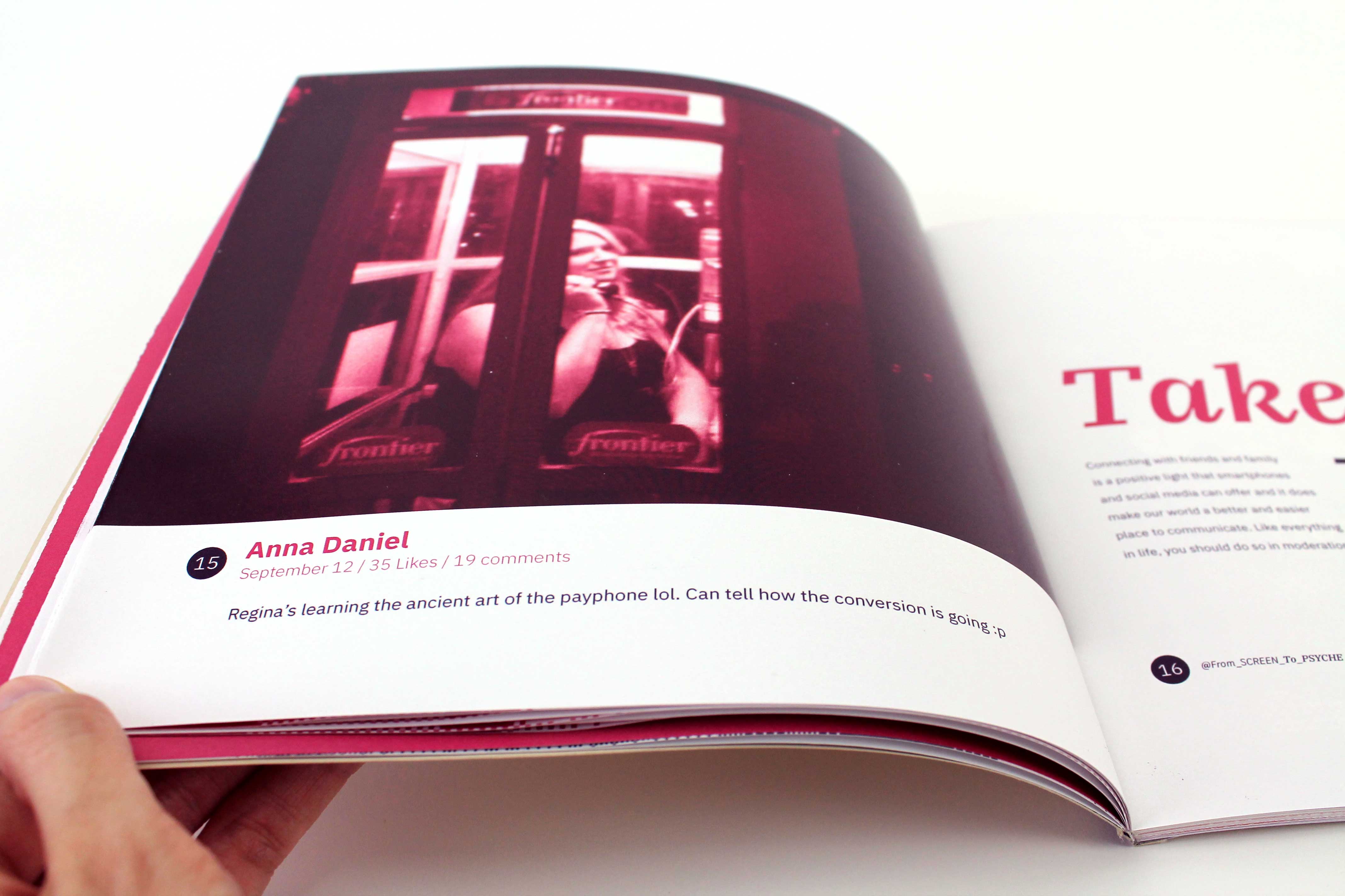
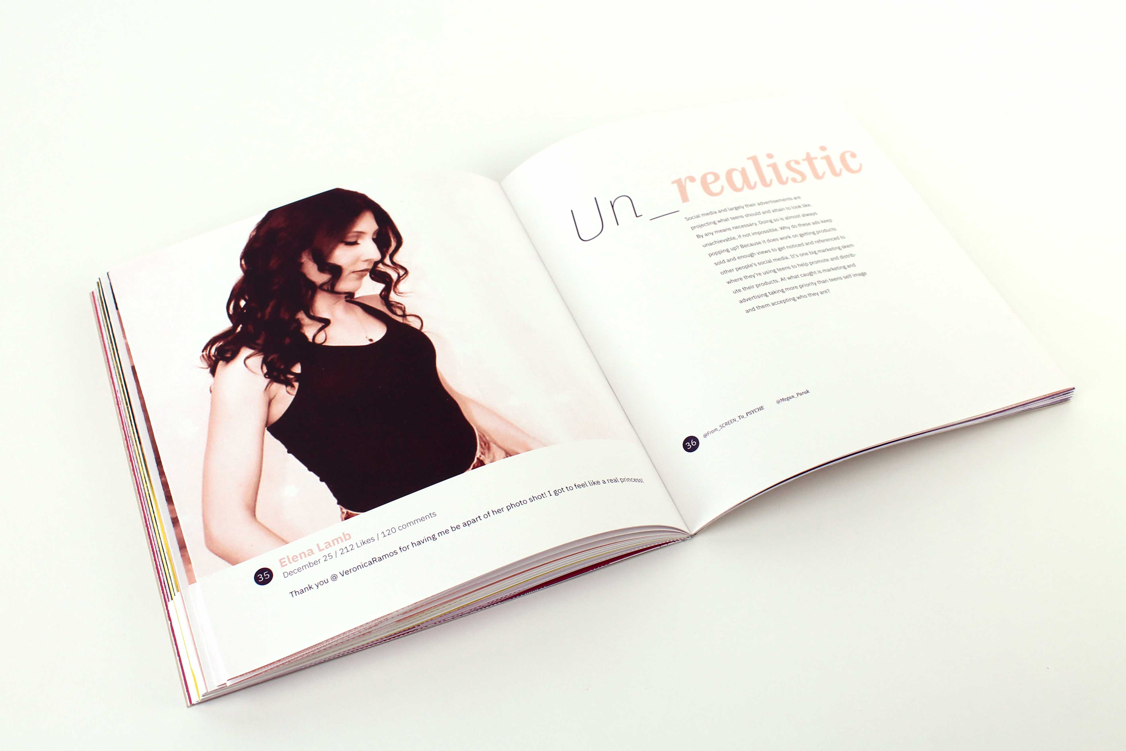
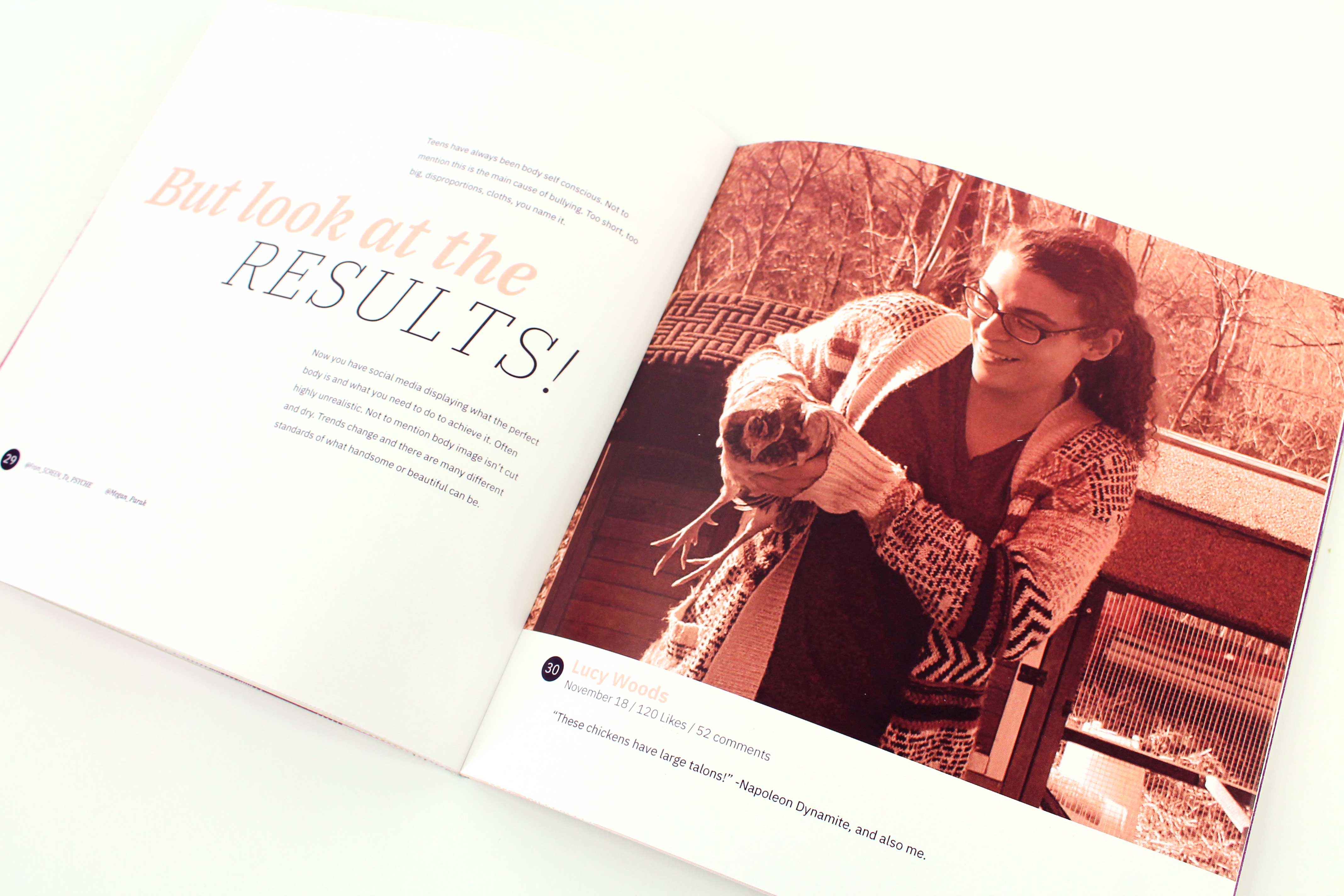
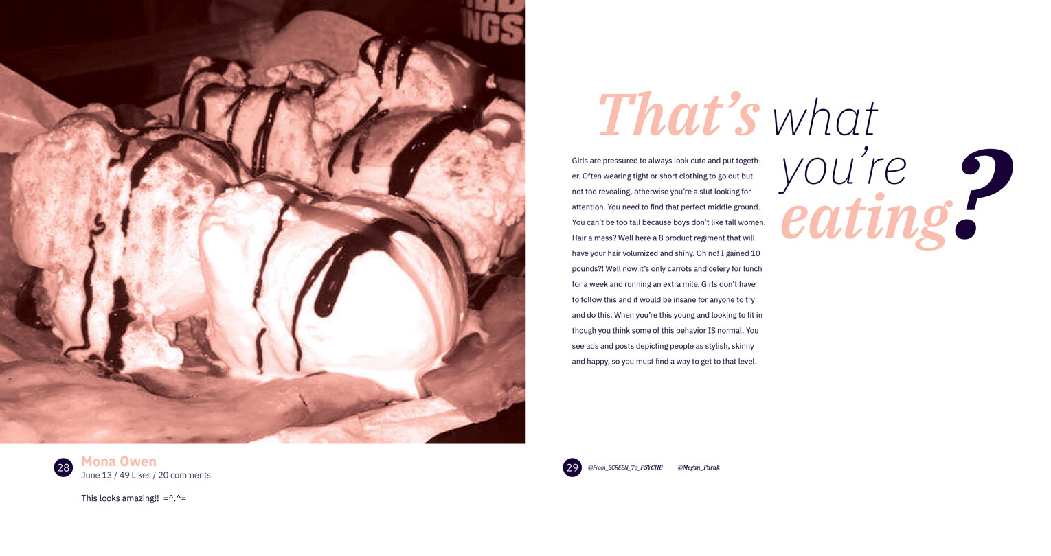
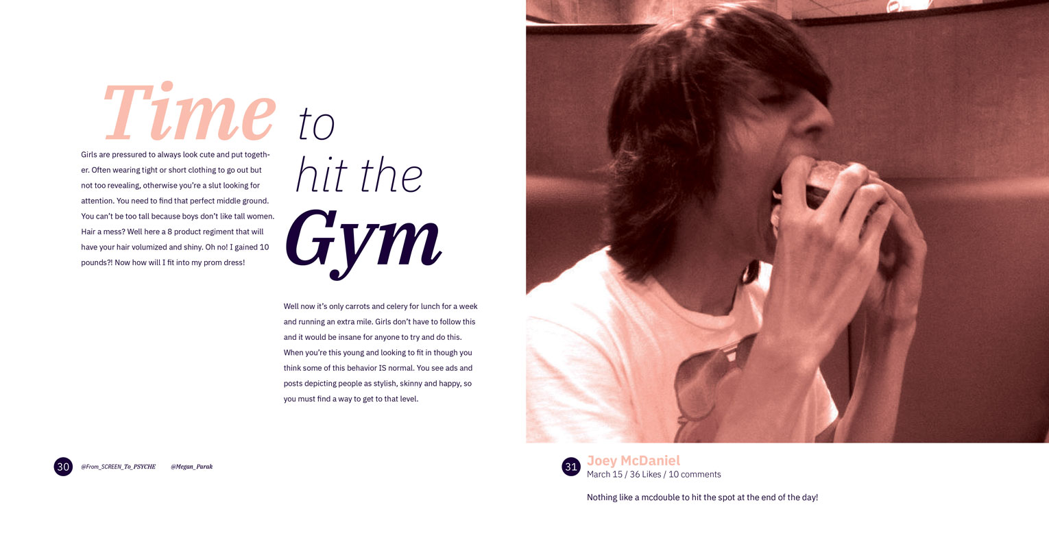
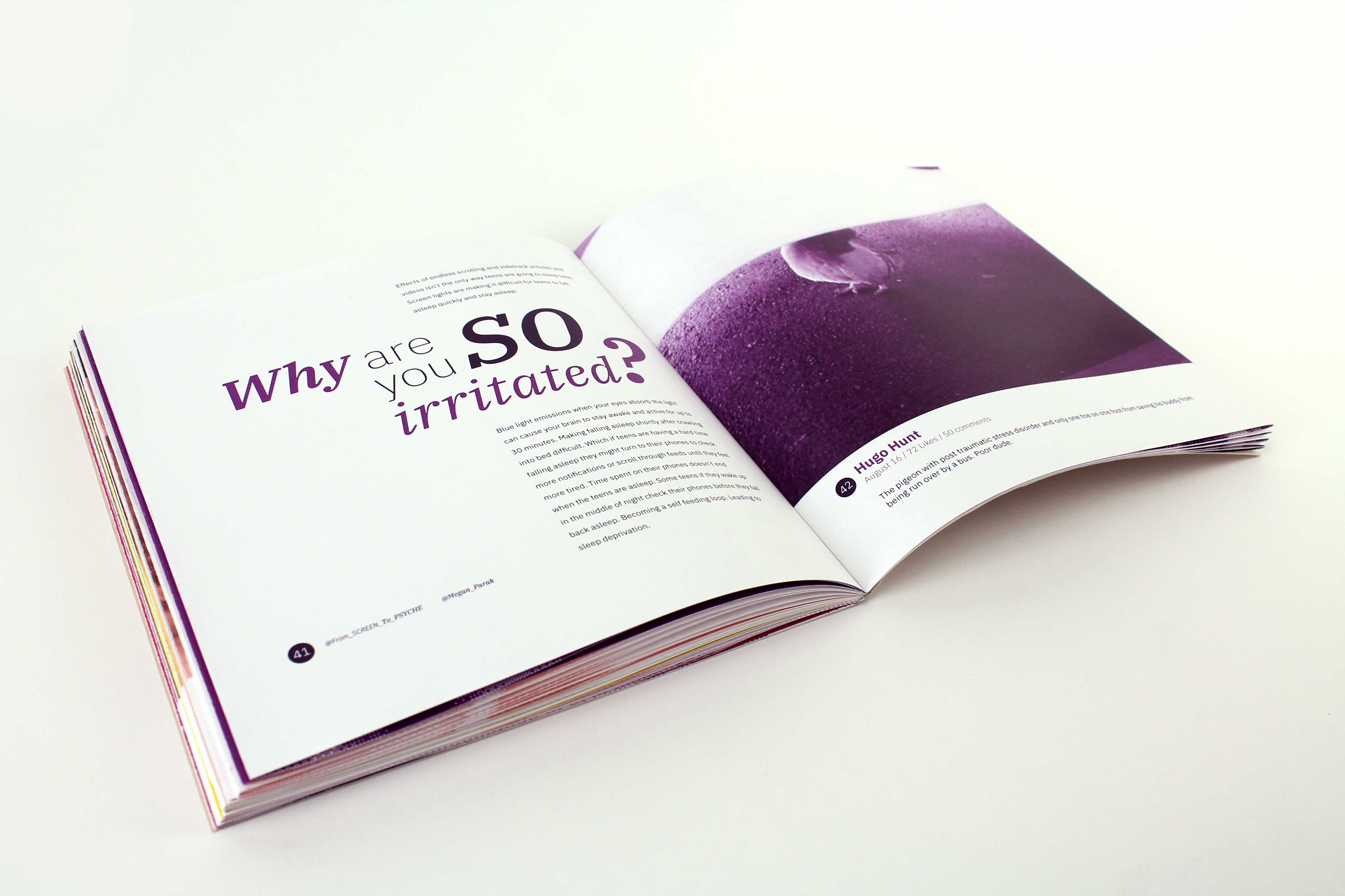
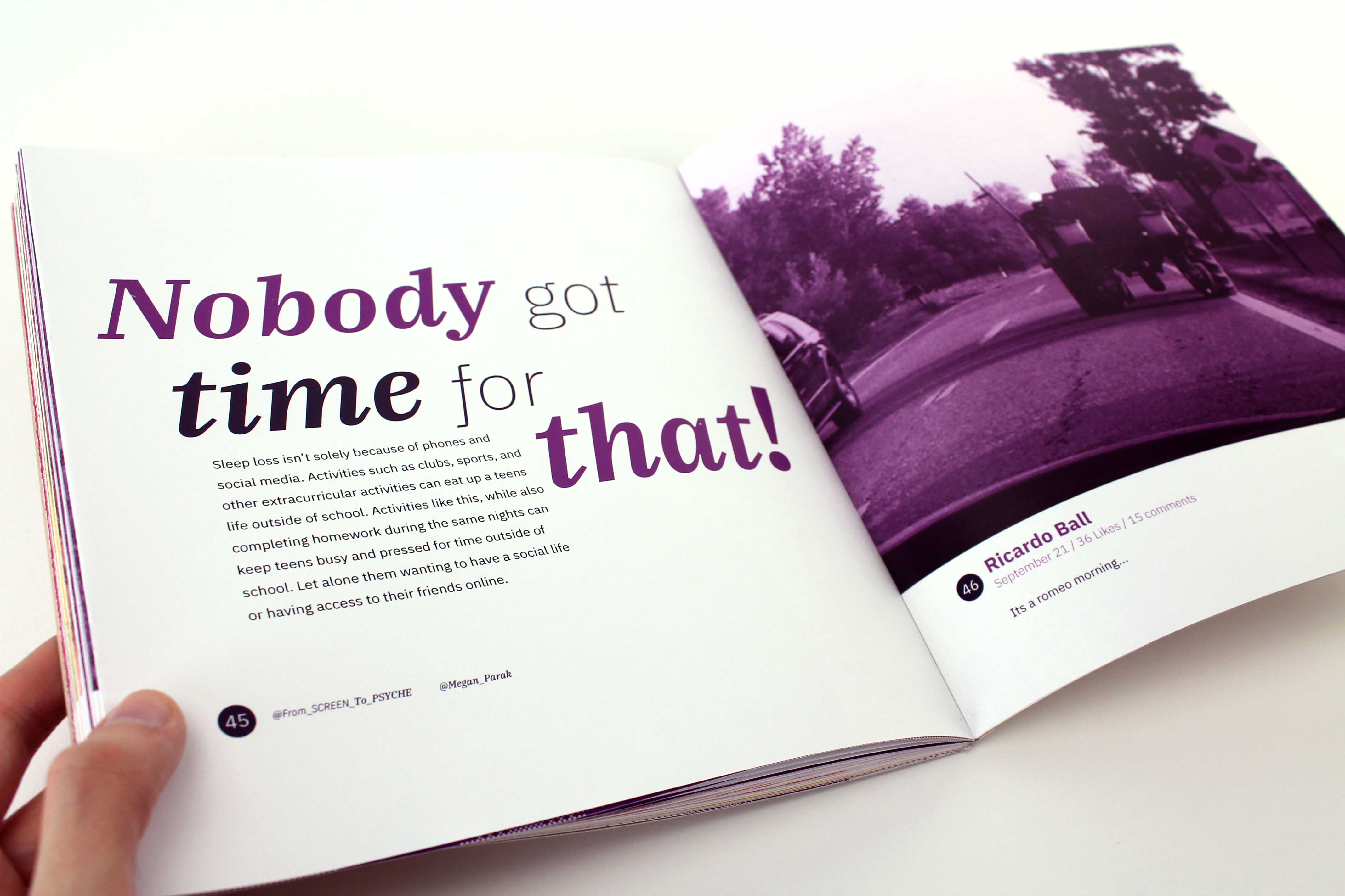
Body text spreads are laid out to have one large image on one side while the other side has a stylized header with the body text. The page with the photo takes up 70 percent of the page but leaves room at the bottom for the page number and photo information. The treatment for the page number and photo information is to resemble a profile image, username, post information, and post caption. All the information in the posts I obtained permission for is accurate. Each "post" aligns with the content being discussed on the corresponding spread.

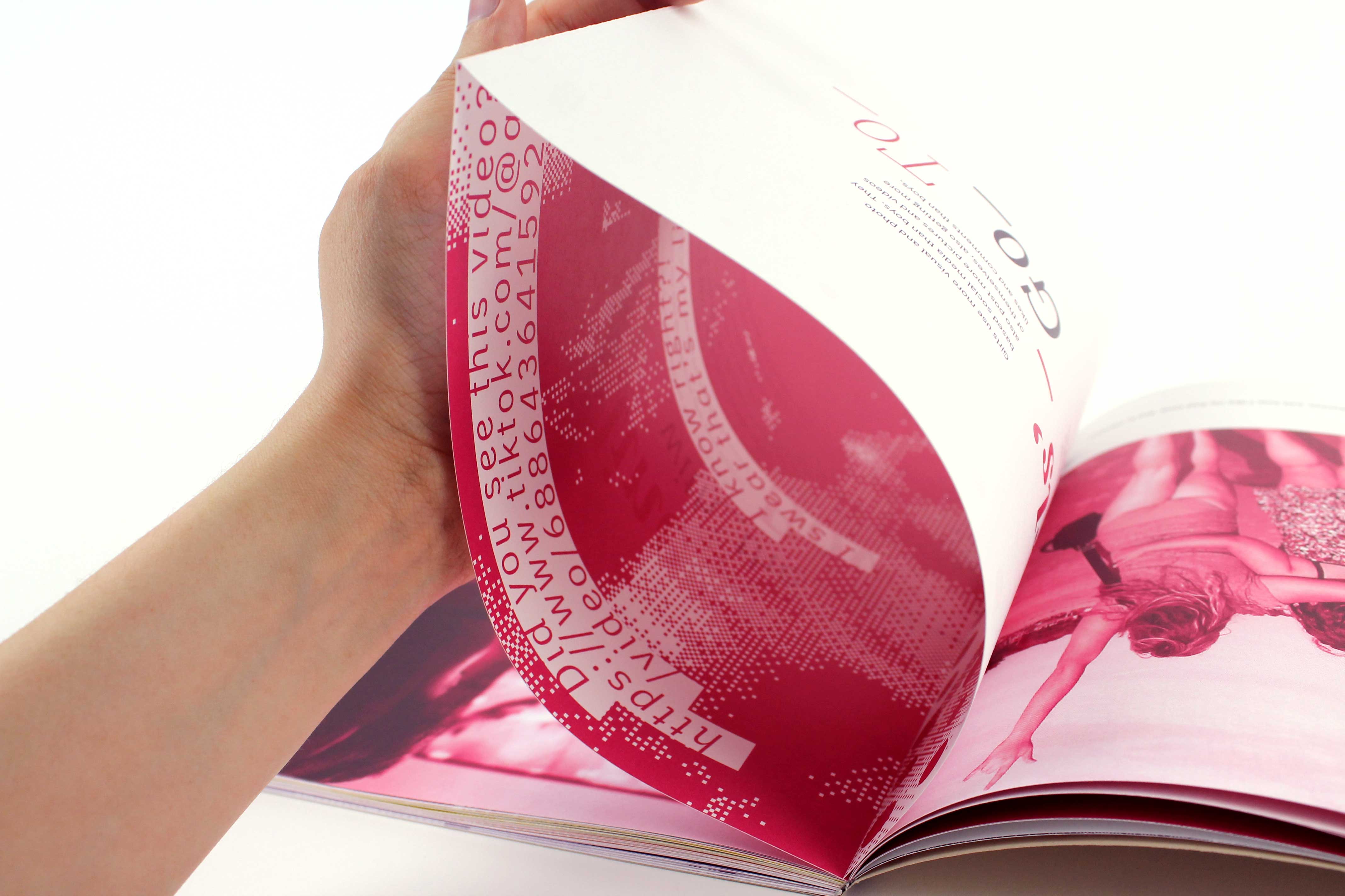
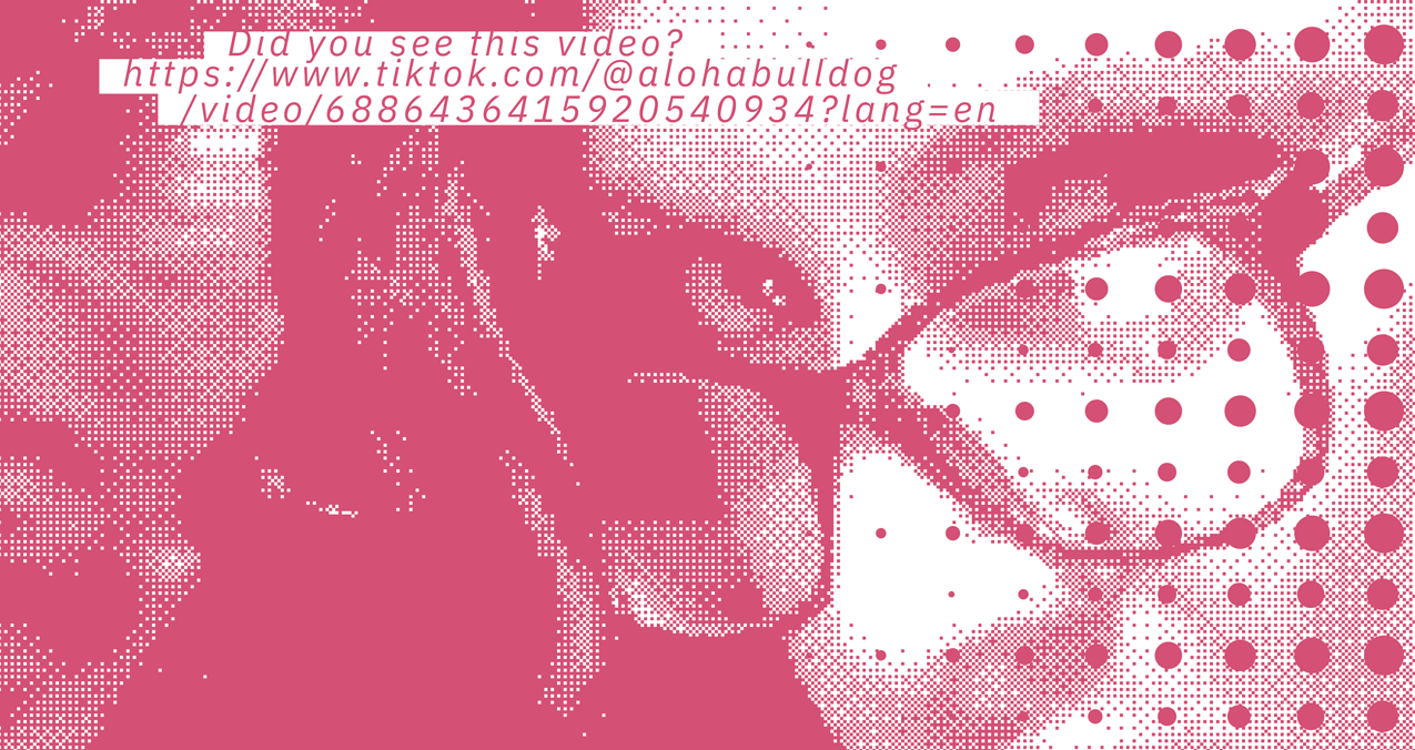
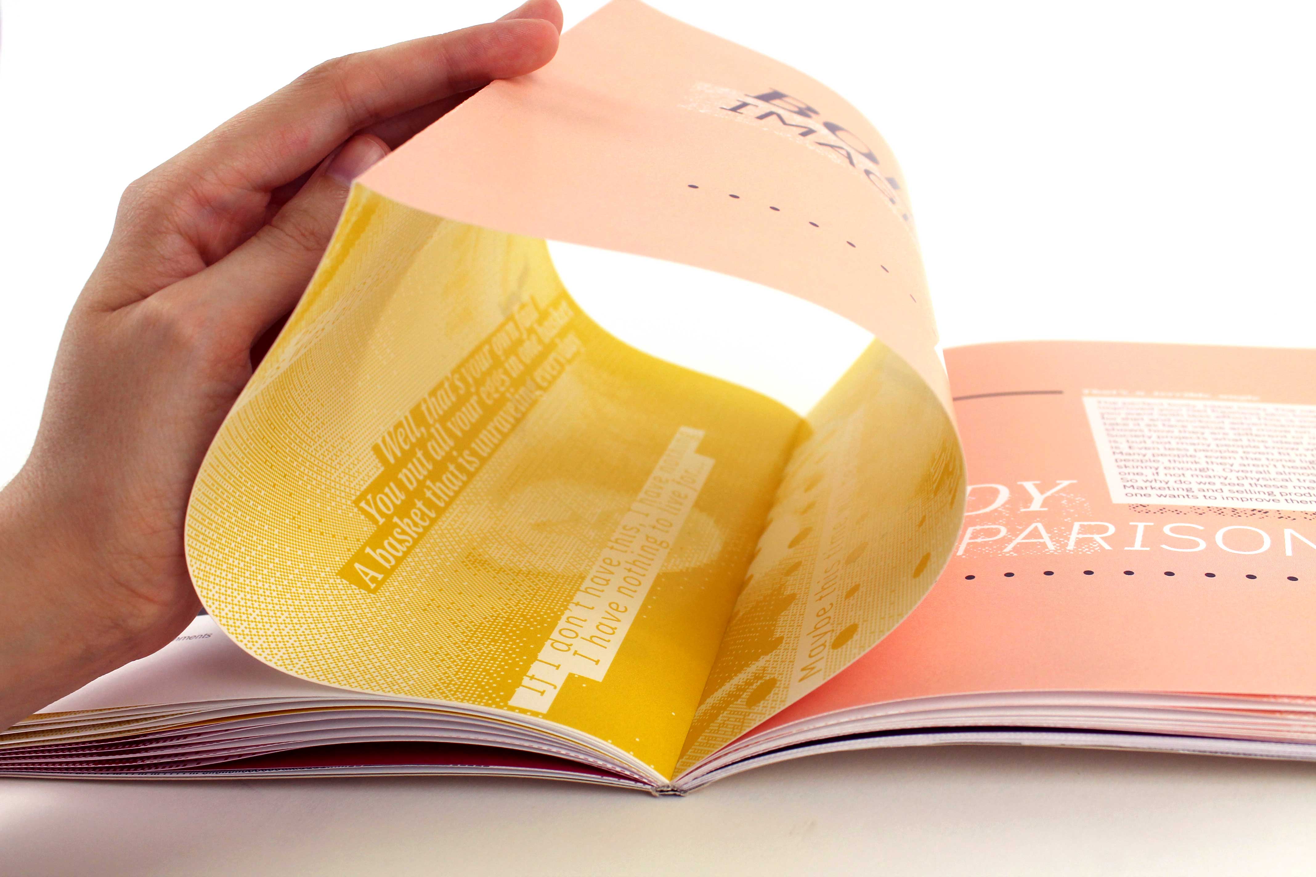
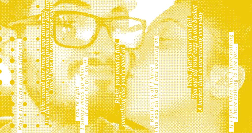
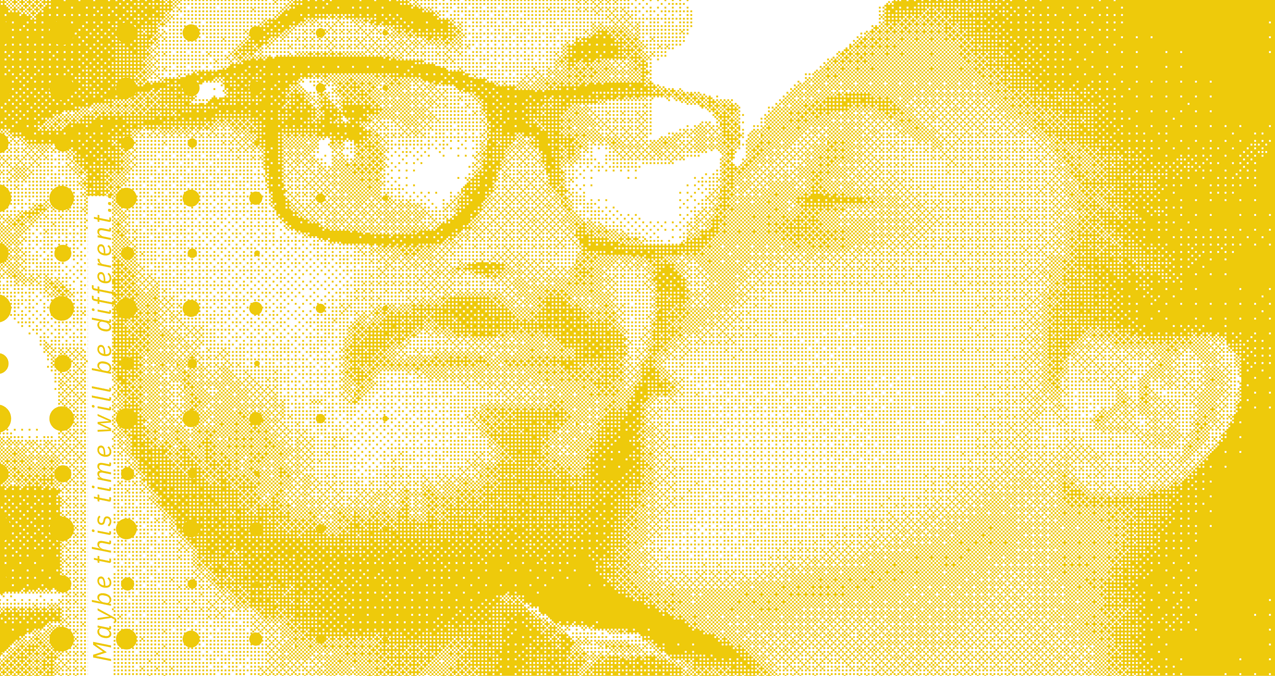
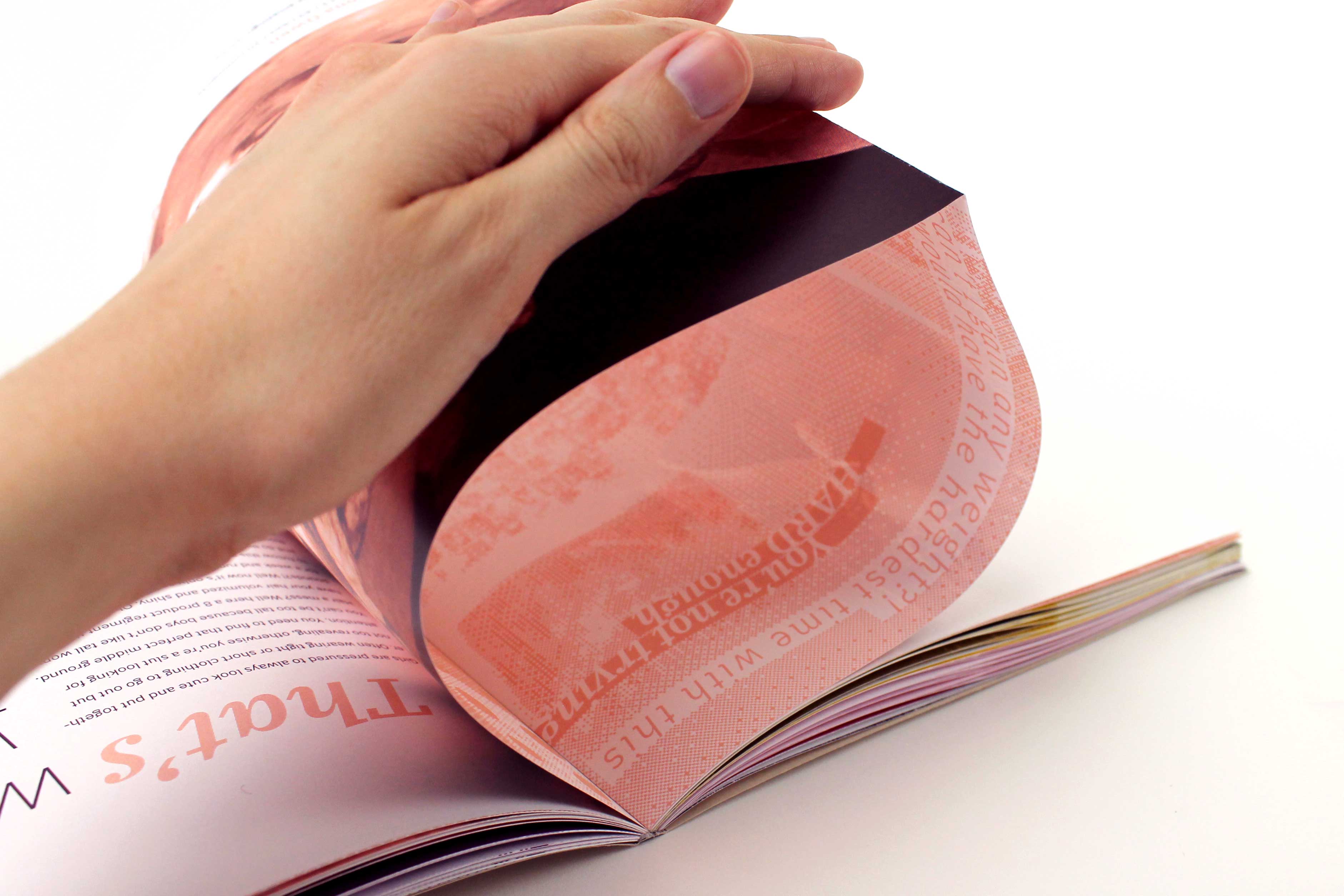
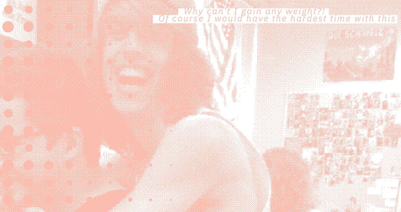
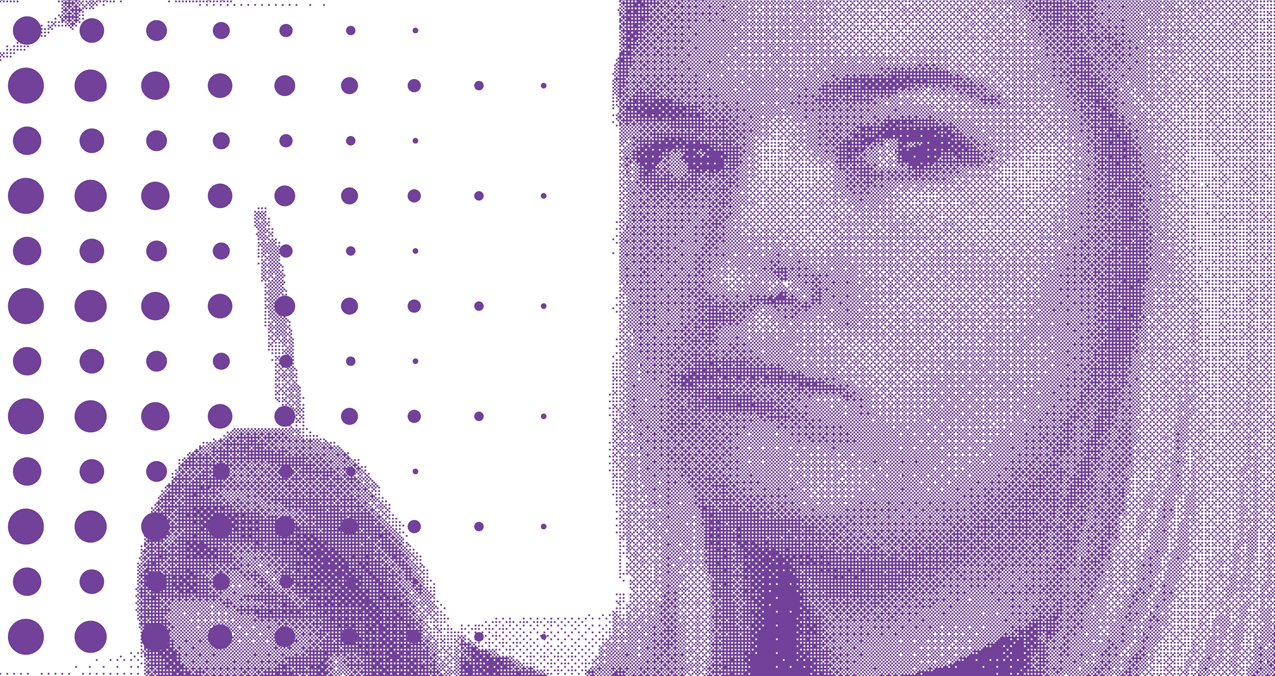
Every page in this publication is a French fold. Each sheet is folded in half with the cut edges glued to the spine, leaving the folded edge on the opposite side. This creates a pocket where you can see a layout on the "inside" of the page. The layout inside these pockets is chaotic halftone patterns of the photo on the spread, with negative messages corresponding to the posts. This can reflect the negative, anxious, or overwhelming side of social media when you scroll on it for too long. Contrasting this cluttered design with the readable spread's organized layout symbolizes that everyone is showing their best side on the surface, but they also have troubled parts hiding underneath.

scroll down icon
asterisk symbol for key.

My favorite part about this publication is the cover. The idea of a die cut design on a printed product can create interesting depth through the use of layers. The idea going into the cover being that you are looking through the medium into the person's behavior and psyche.

scroll down icon
scroll down icon
scroll down icon
scroll down icon
asterisk symbol for key.

This book features a french fold binding method. This method was chosen so that I could display what the thinking process is when teens are viewing social media. How I did this was by inserting a halftone image with messages overlapping the image inside the fold.

scroll down icon
scroll down icon
scroll down icon
scroll down icon
scroll down icon
asterisk symbol for key.

Captions for the book were set up to resemble comments posted on social media. Next to the photo caption is the page number in place of the profile image.

scroll down icon
scroll down icon
scroll down icon
scroll down icon
scroll down icon
scroll down icon
scroll down icon
scroll down icon
scroll down icon
scroll down icon
scroll down icon
scroll down icon
scroll down icon
scroll down icon
scroll down icon
asterisk symbol for key.

Each section of the book is about a different area of life that may be affecting the teen. Here you see this section of how teens are losing sleep because they are on social media too long, while the previous section was about how body image plays a big role with social media.

scroll down icon
scroll down icon
scroll down icon
scroll down icon
scroll down icon
scroll down icon
scroll down icon
scroll down icon
scroll down icon

Final Thoughts & Takeaways

Typography-driven layout designs. In many of my past projects, I was hesitant to experiment with the scale and placement of header text. For this project, I intentionally explored different letter placements and scales to create visually striking headers. Initially, it felt daunting, and I struggled with finding the "right" placement. Eventually, I loosened up and focused on what was visually engaging, allowing the words to guide my decisions. The outcome was both rewarding and enlightening, showing me that I didn't need to feel intimidated by using contrasting letterforms.

French fold binding was a difficult binding process. Perfect binding the pages and having them stay glued to the spine was a struggle, but it stayed together eventually. The outcome turned out better than imagined. Opening the pockets added texture and depth to not only the design of the book but the message as well. I couldn't have been happier with the way it turned out!