My Book Printer
MARKETING MANAGER & SOCIAL MEDIA DESIGNER
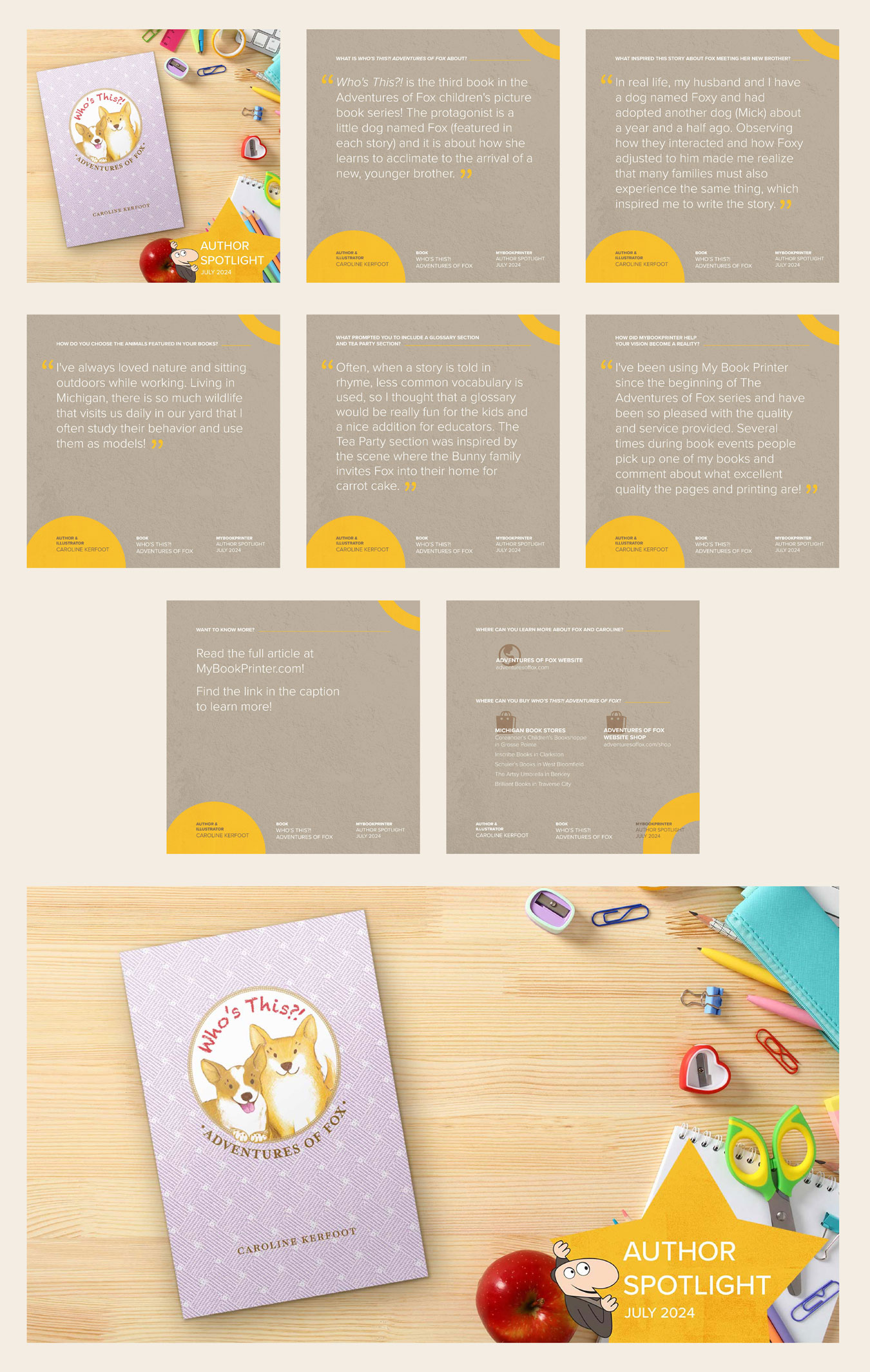
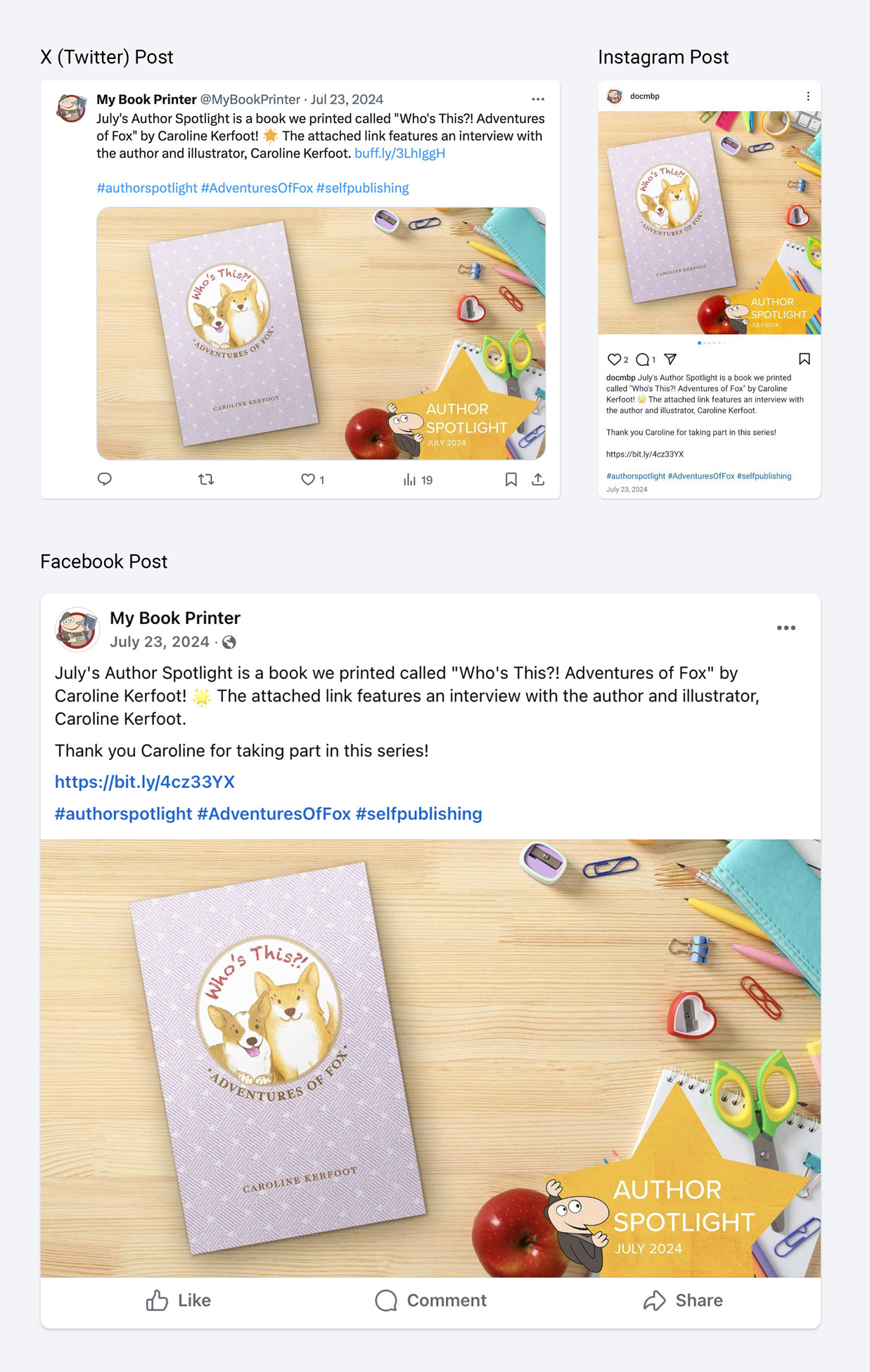
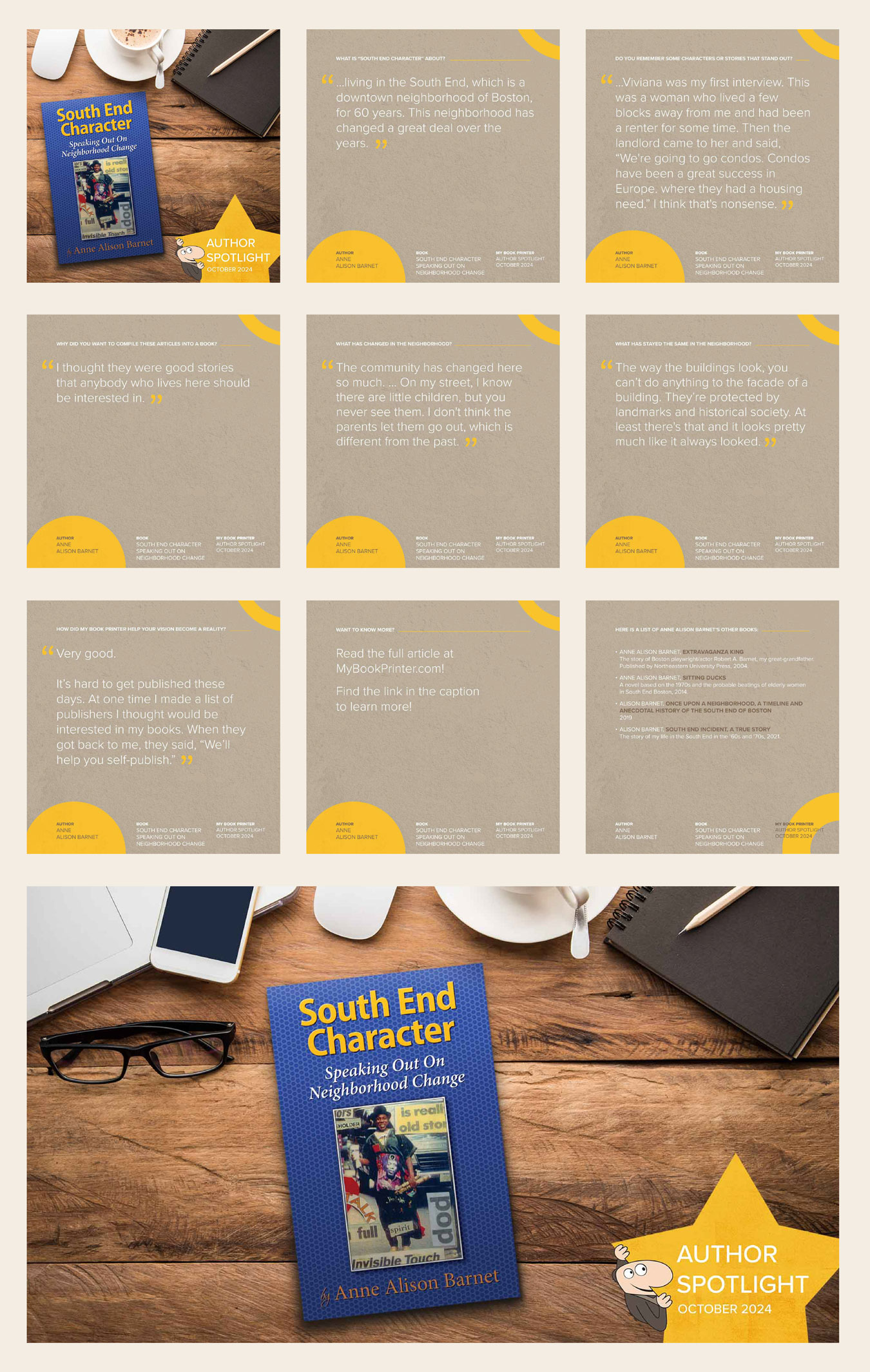
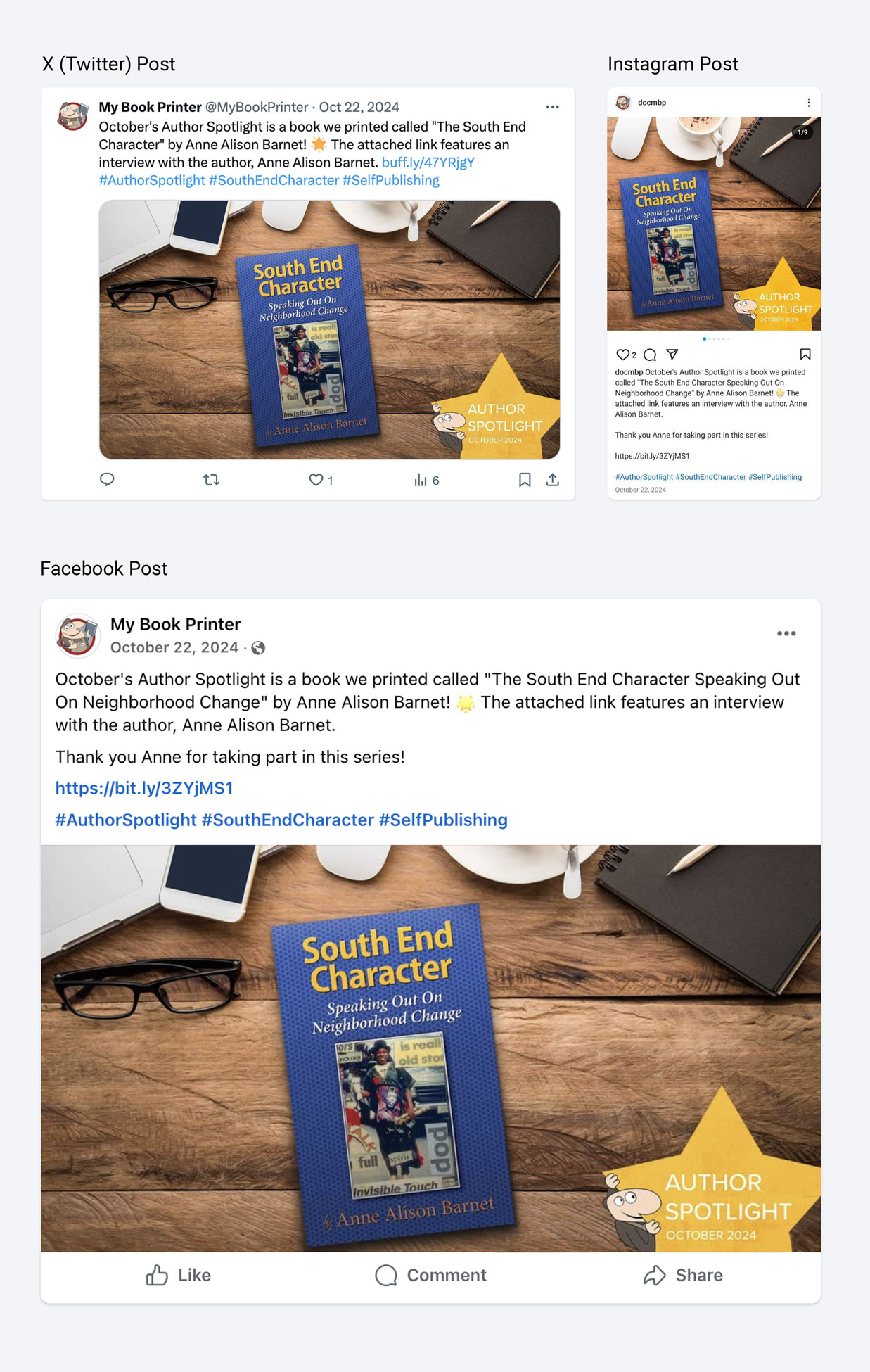
Responsibilities
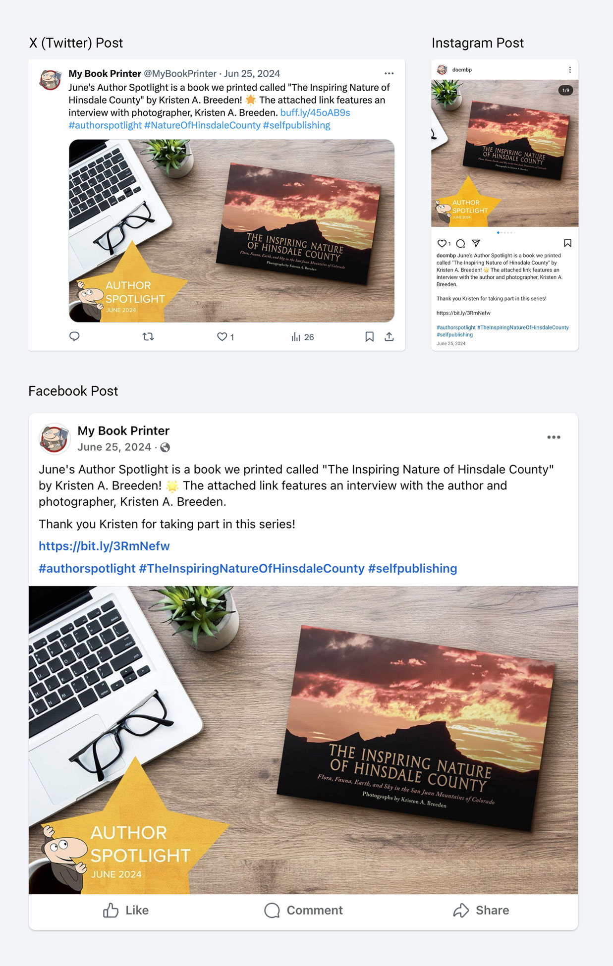
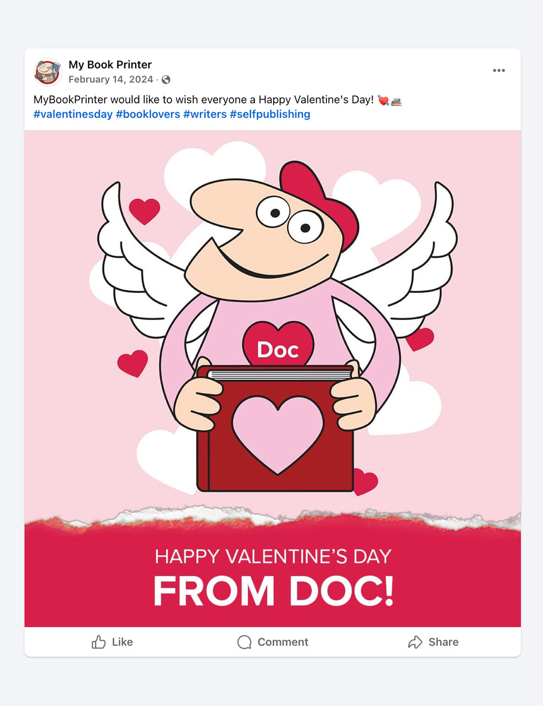
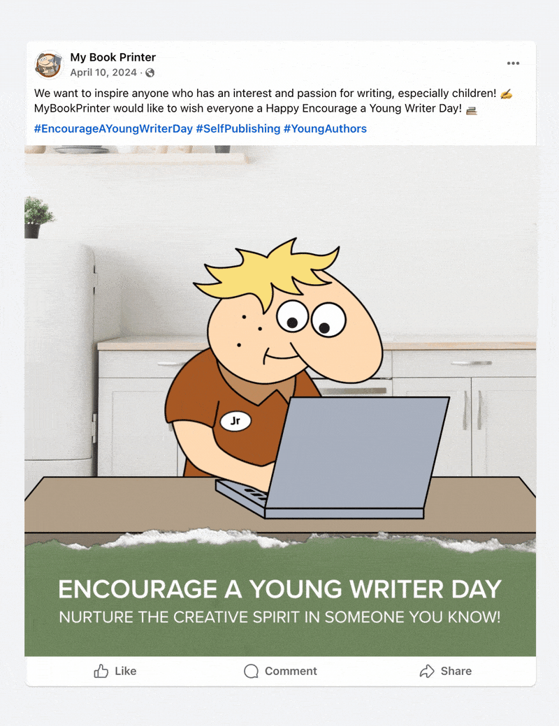
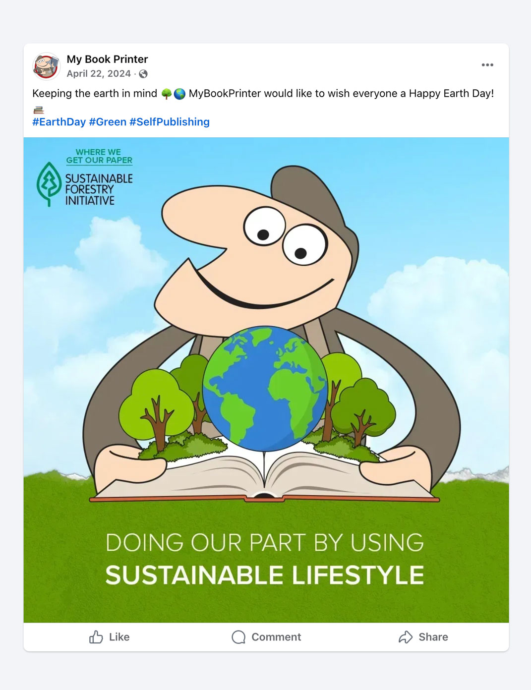
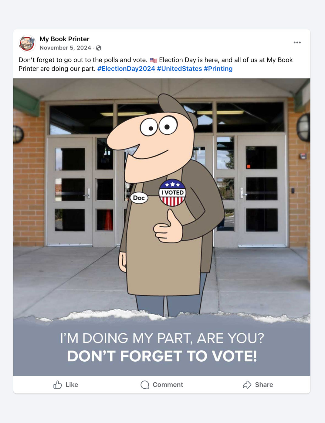
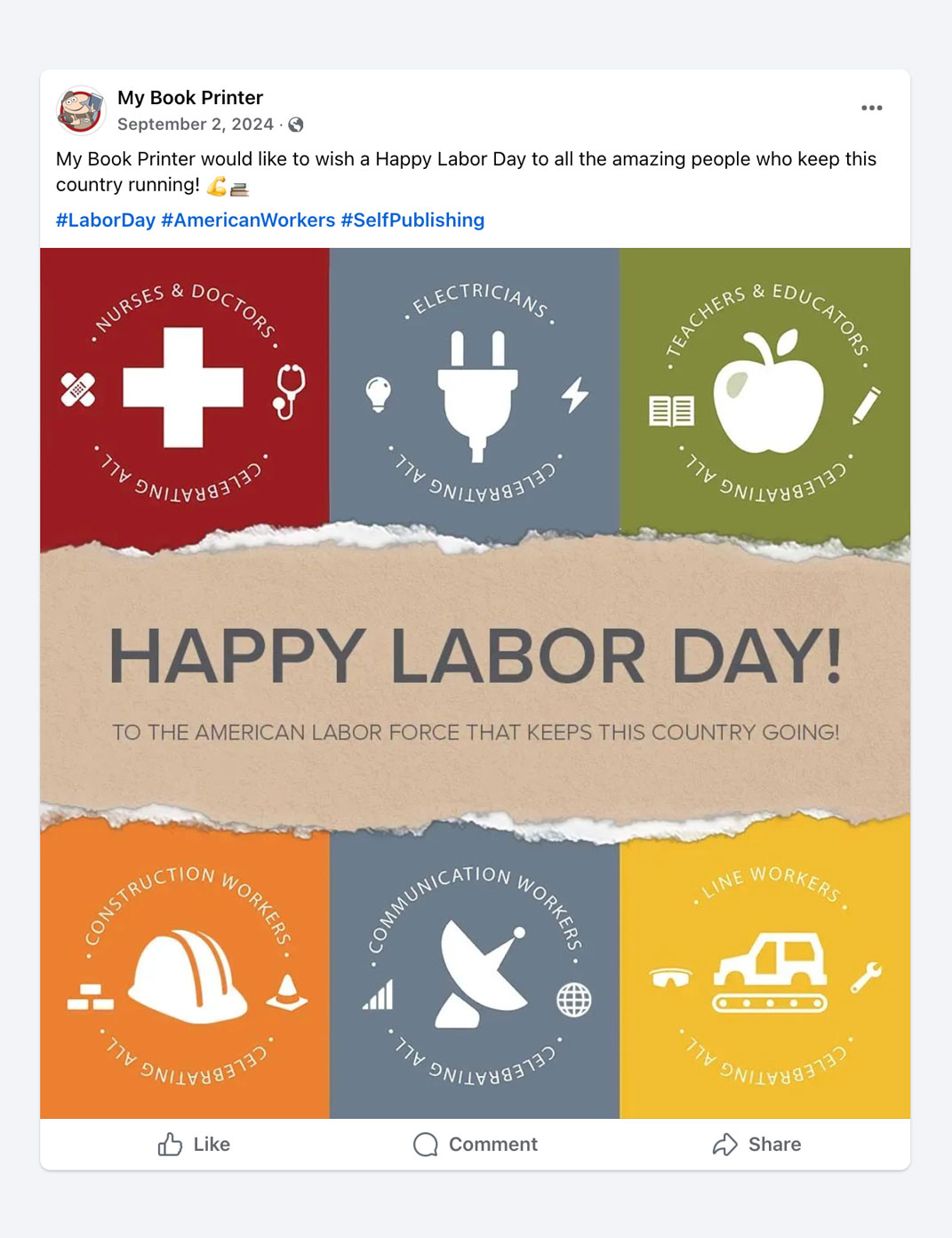
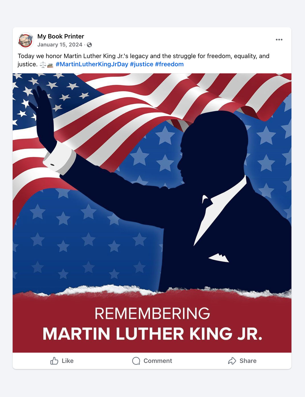
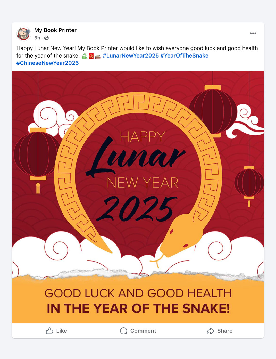
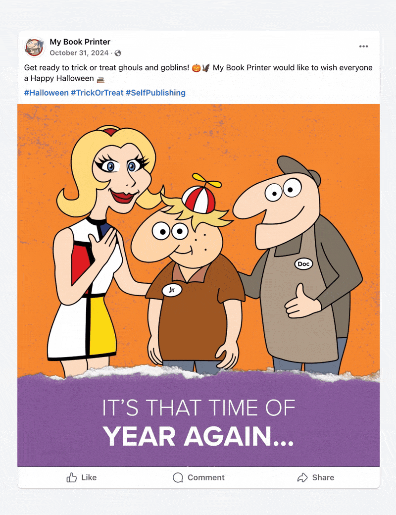
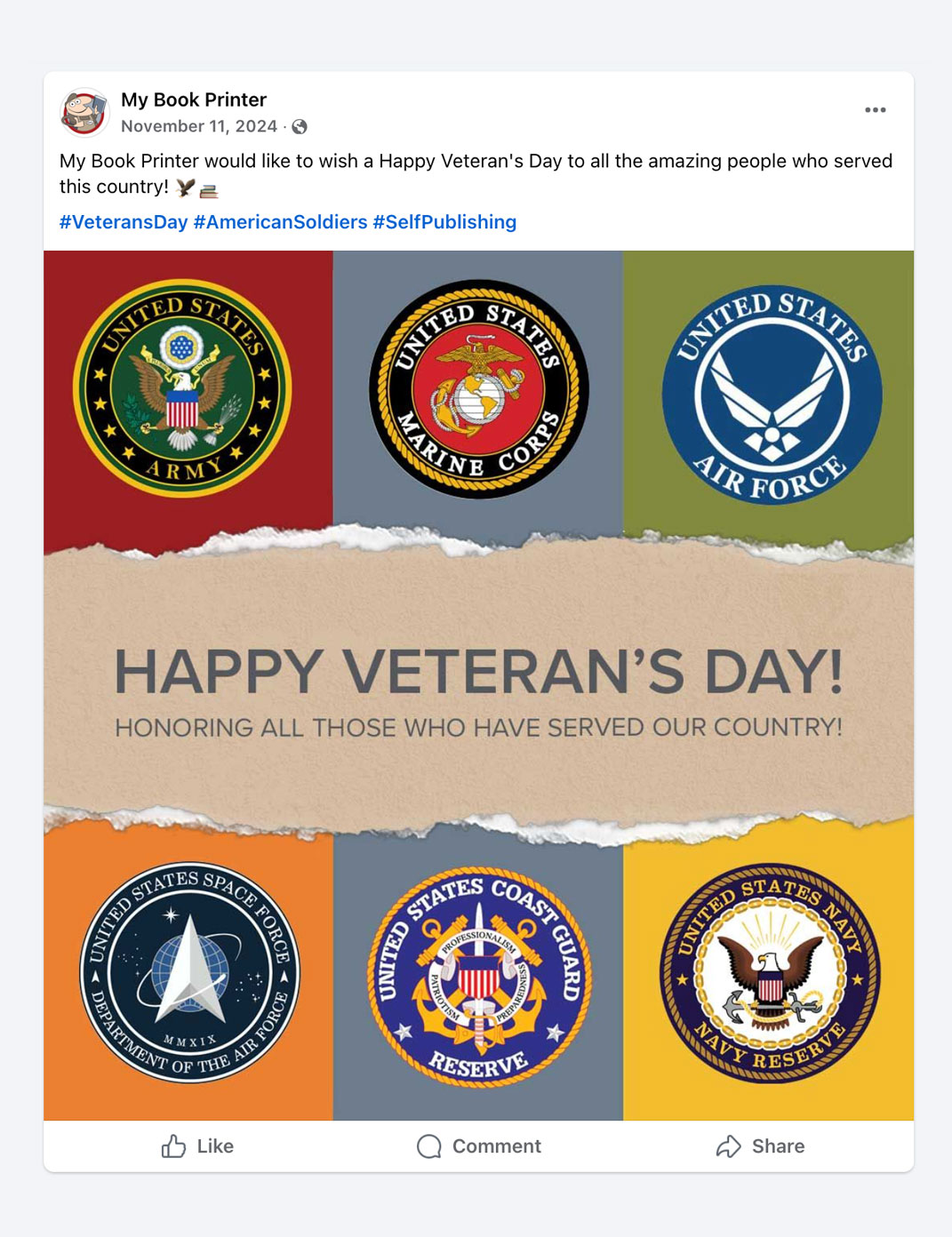
Maintaining and updating social media pages (X/Twitter, Instagram, and Facebook). Ideation and execution of special/holiday day posts.
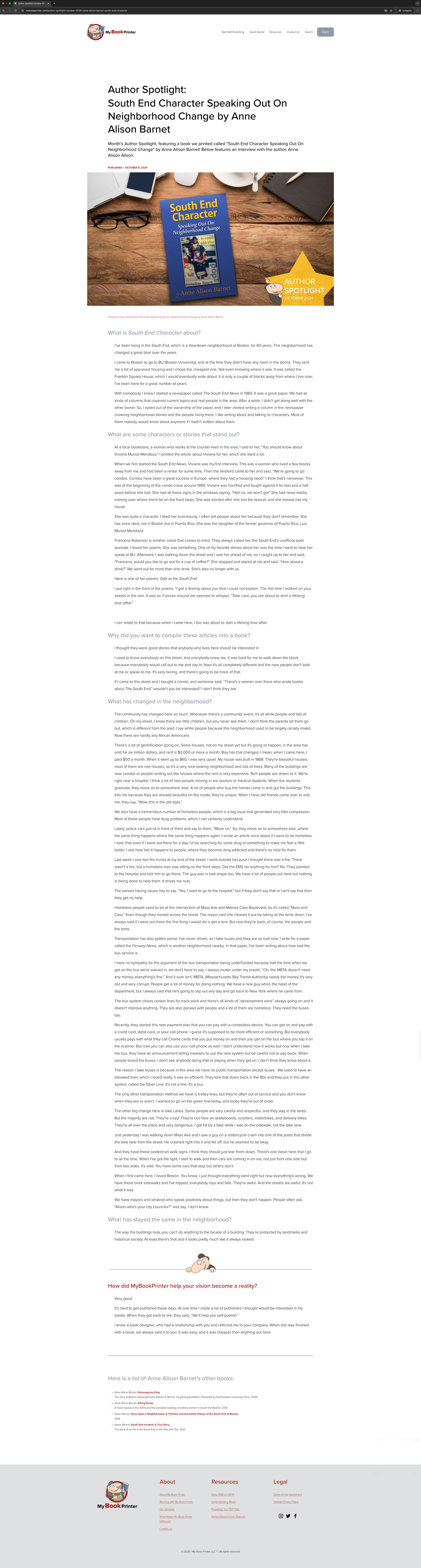
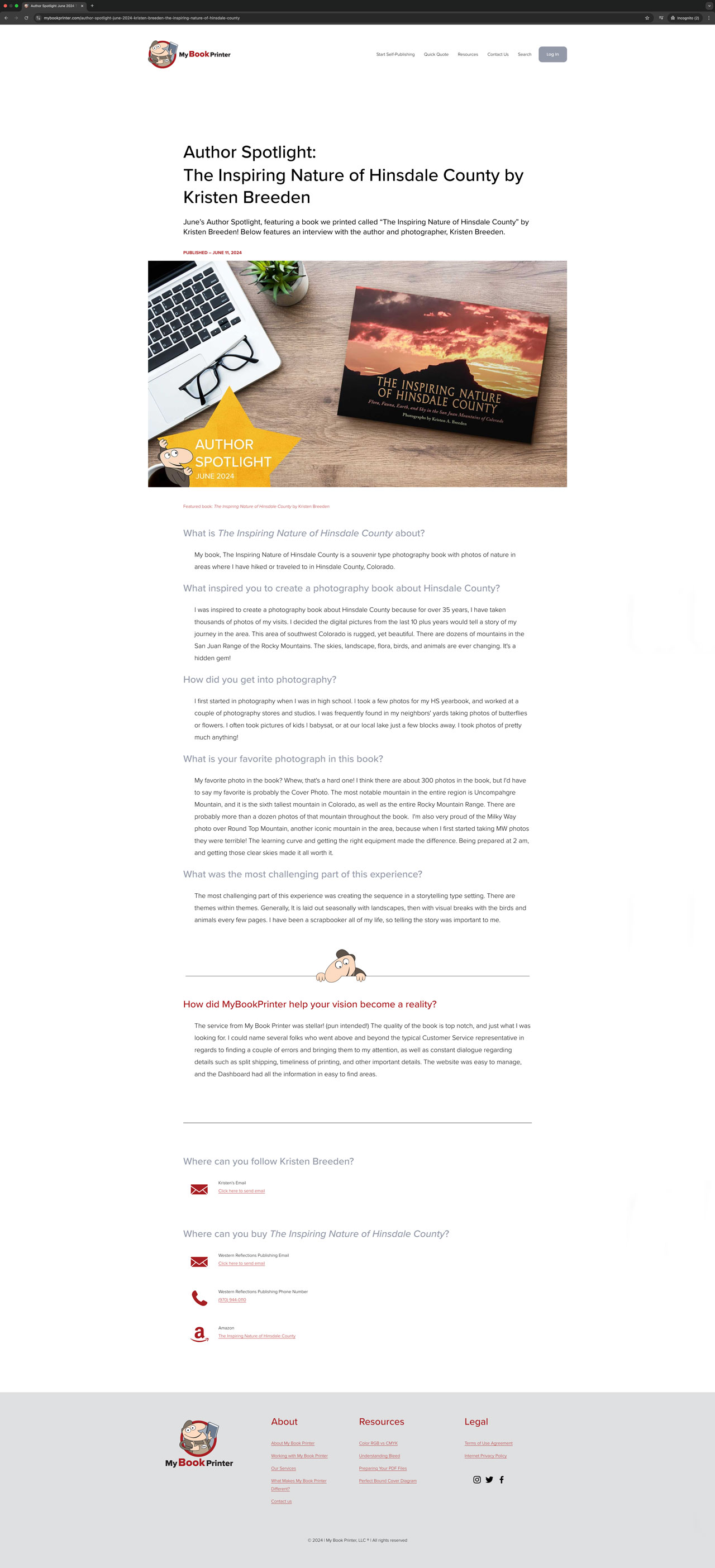
Maintaining and updating the website. This includes making new informational pages, articles exploring our services, and promoting our customers.
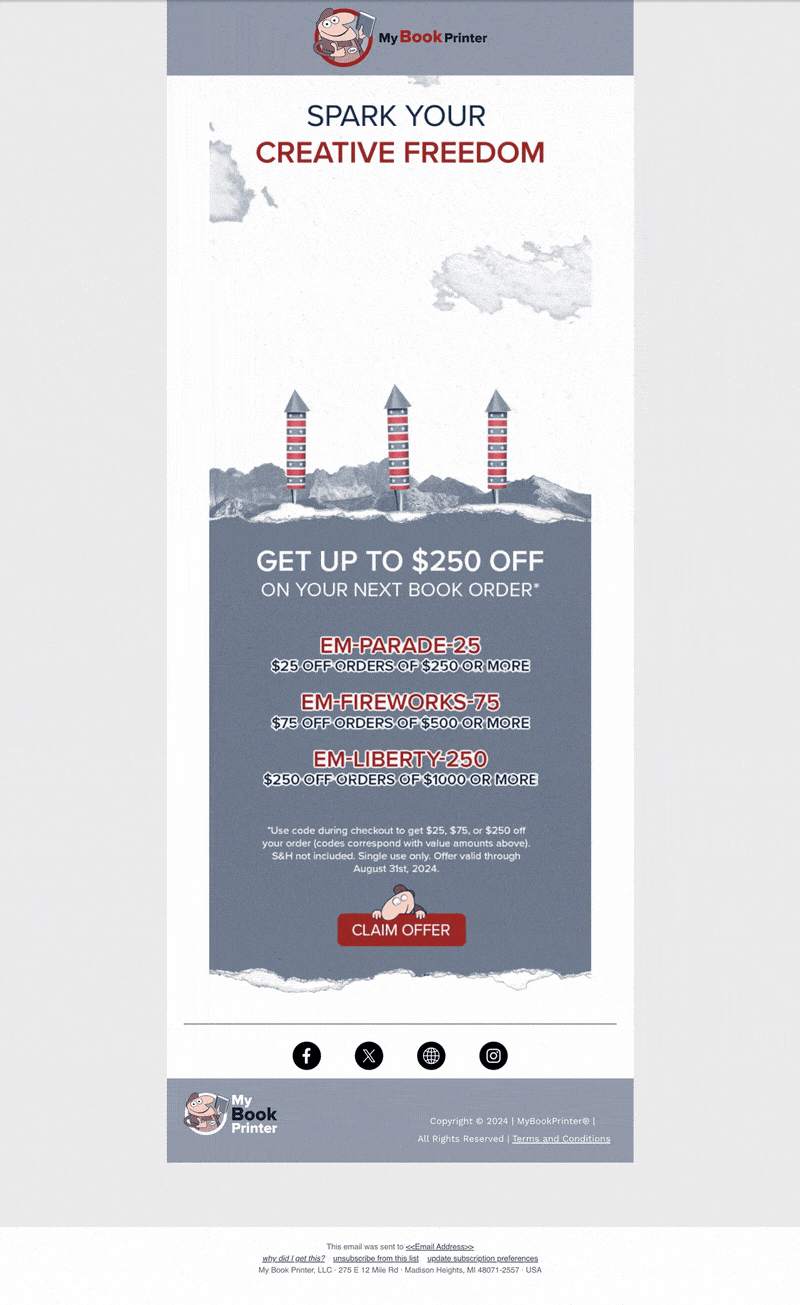
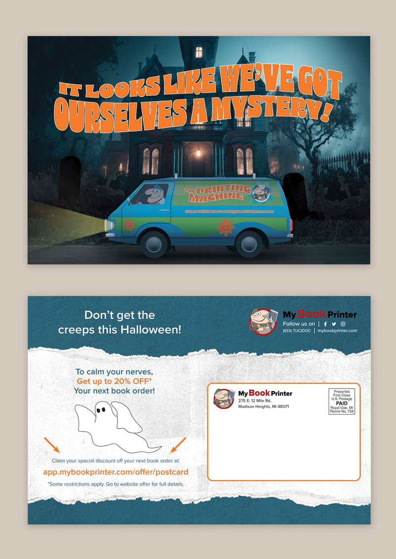
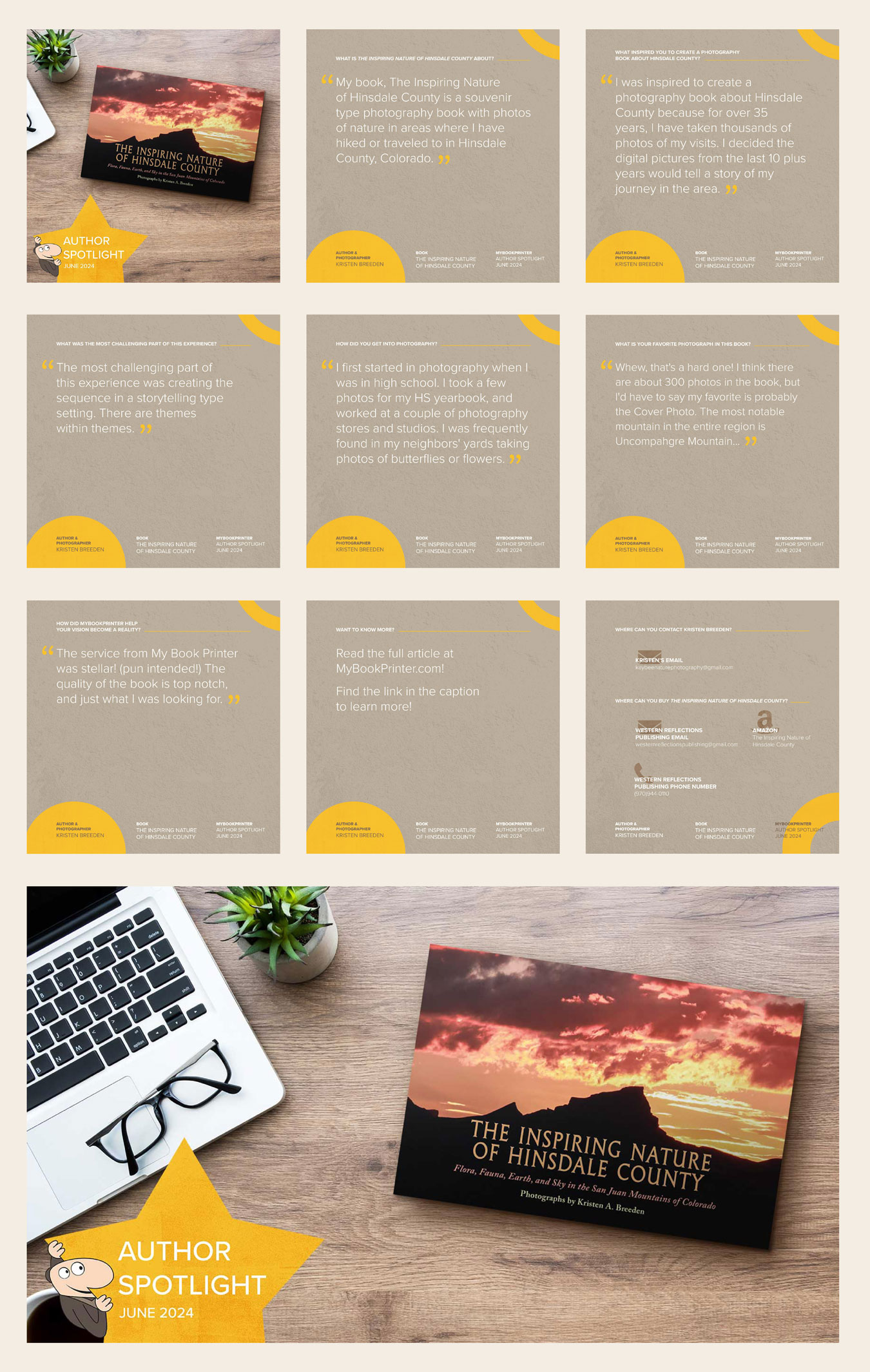
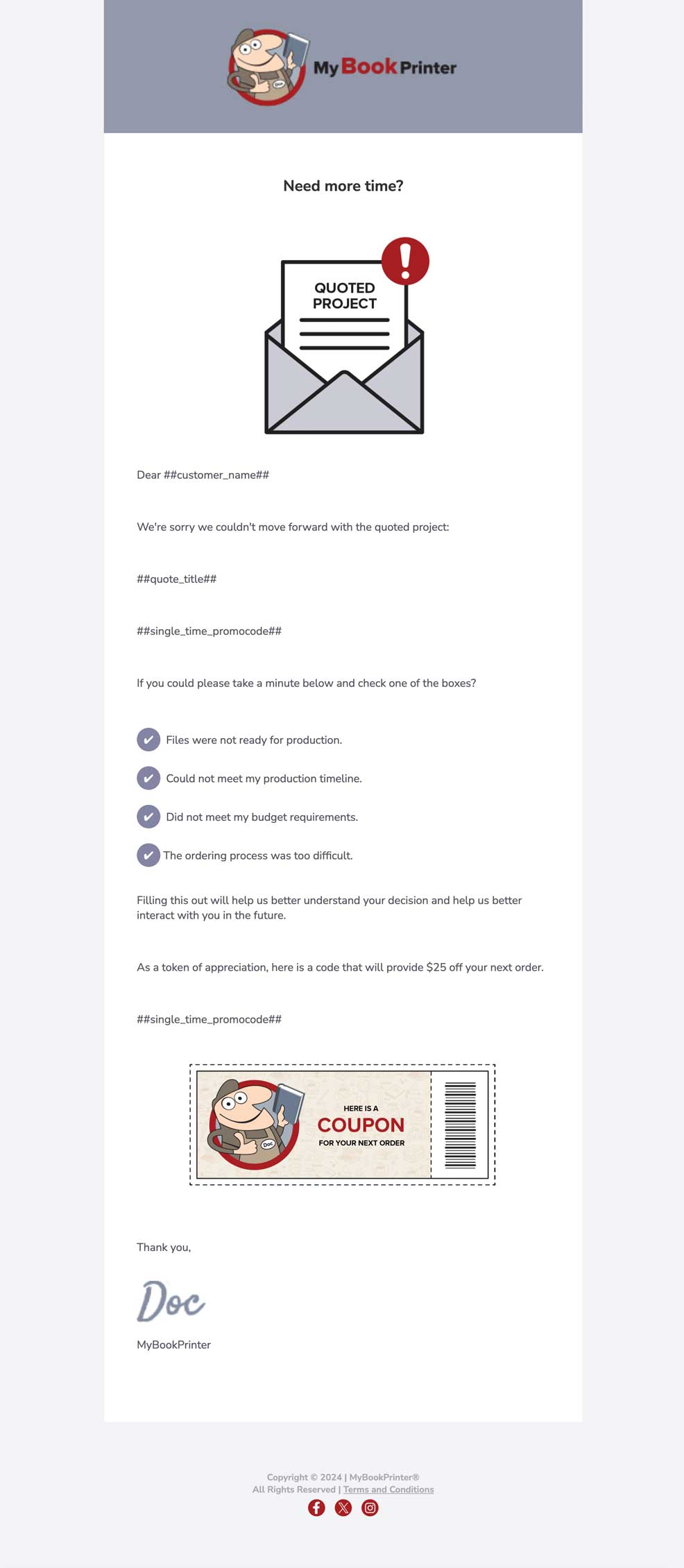
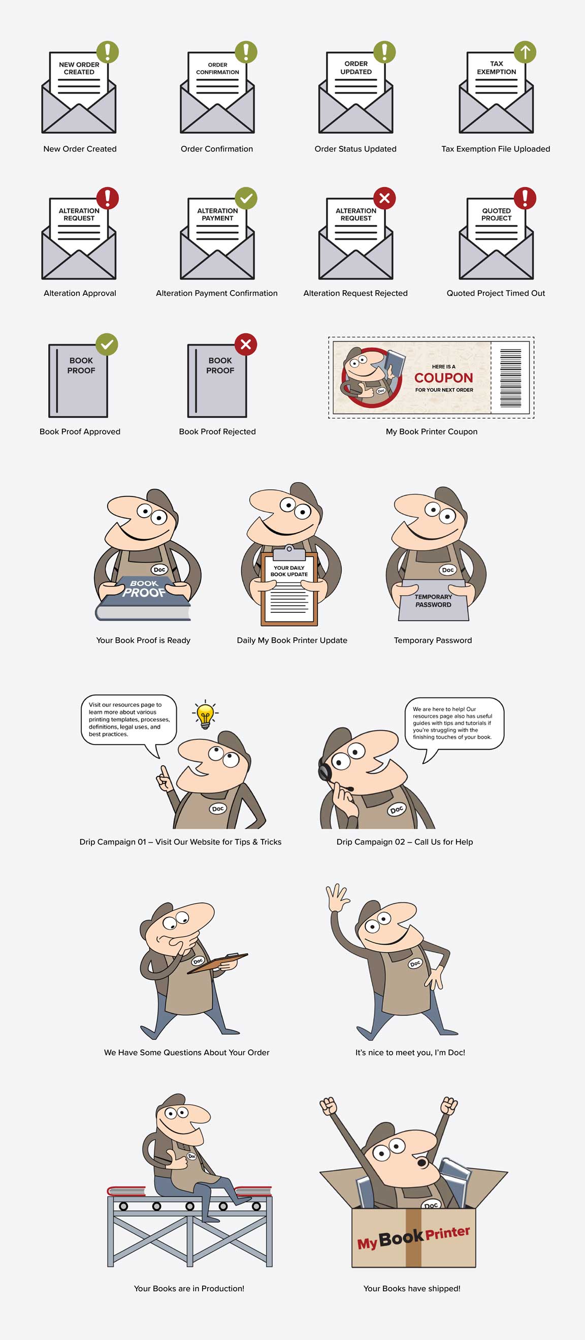
Ideation and execution of monthly marketing campaigns. Deliverables include social media posts (horizontal and vertical layouts depending on platform location), postcards, homepage pop-up messages, and email blasts.
All tasks above are collaborated with the direct supervisor, where corrections or suggestions are made by him and then executed by me.