Grant and Elena needed a wine label for their wedding favors. The biggest challenge of this project was the label had to be small enough to fit on a 187 mL bottle.
Creating a hierarchy of importance of the information to include so the finished product is clear and readable on a small label. Additionally, having the design match their theme, which was rustic outdoors. The label features a thank you message, their names, the date, and the location of the wedding. The tag on the neck of the bottle displays the wine flavor, this way the flavor stands out while not overcrowding the label.
Grant and Elena planned on handing out wine bottles as favors for their adult guests. The groom's parents made the wine and needed the labels designed. They enlisted my services to design their label, drawing inspiration from their wedding invitation.
The challenge with this design was the size of the label, which had to be 4 inches wide by 2 inches tall. Having a small working area, I needed to prioritize what information to place on the label.
Looking at the invitation, they had one stylized serif font and a clean sans-serif. I chose not to use the same fonts because the serif wouldn't have been easy to read on the small label. Going with the typeface The Seasons gave a similar feeling to the original serif font but is more legible. The second font for the labels is Contralto Medium to pair with The Seasons. Both fonts have similar x-height and a range in contrast with the letterforms but aren't drastic to cut into readability.
When approaching color, the brass from the invitation was the first color chosen. The second color was picked out from the bride's green sweater in their engagement photos. The final color is the background color on the invitation. The earth-tone color palette matches both their wedding invitation and their engagement photos.
Above features the front and back of their wedding invitation, which I used as inspiration.
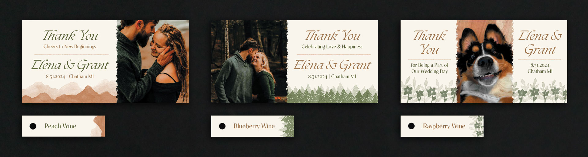
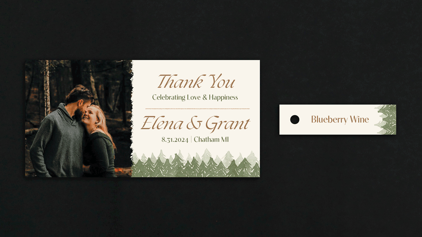
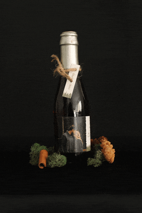
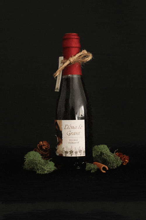
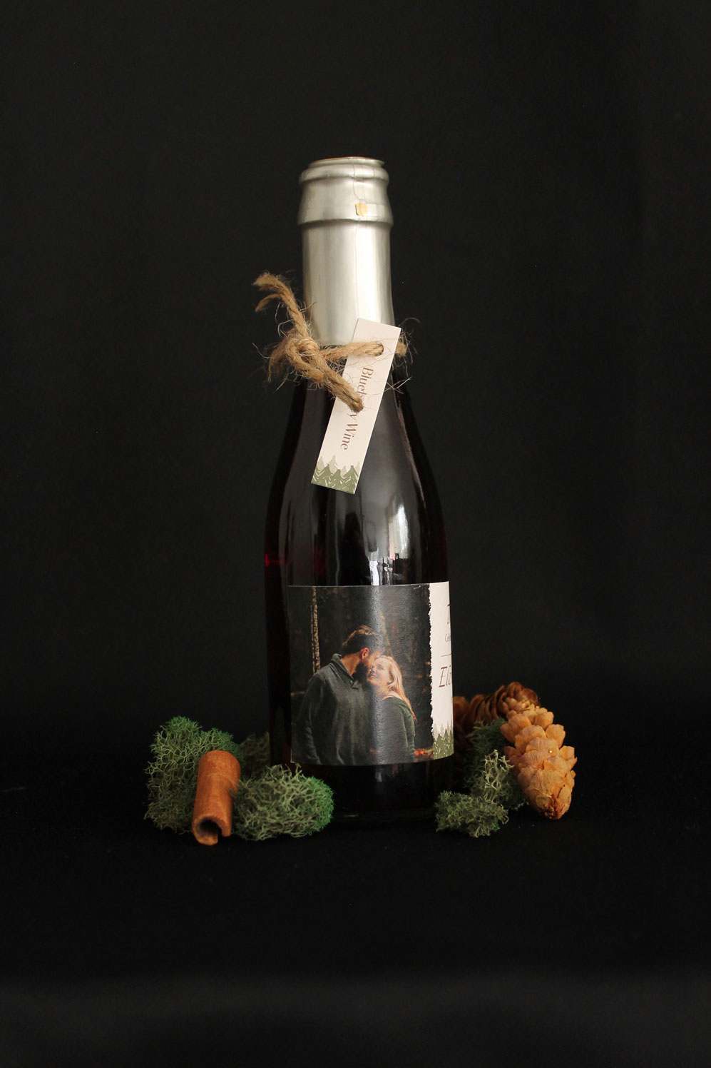
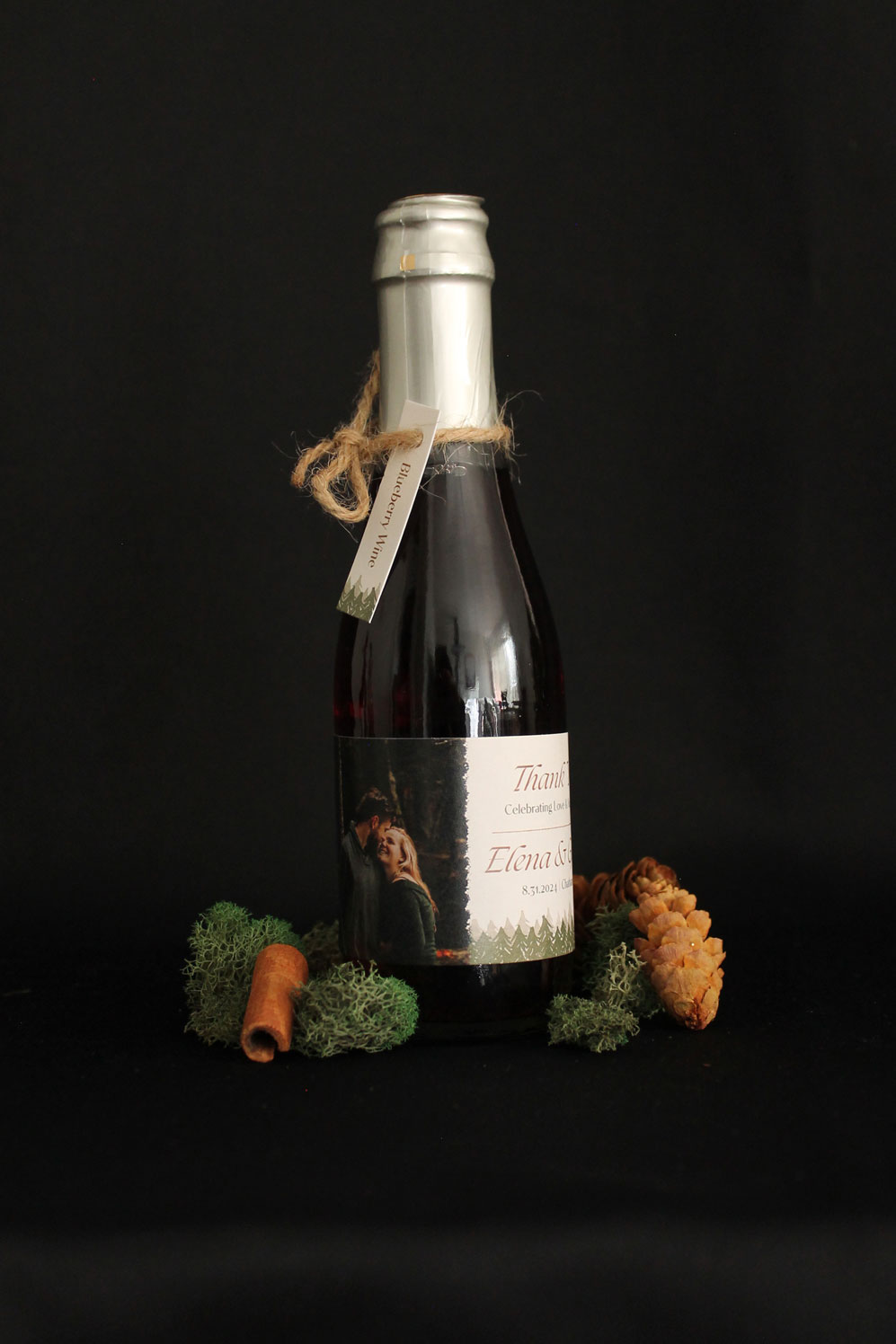
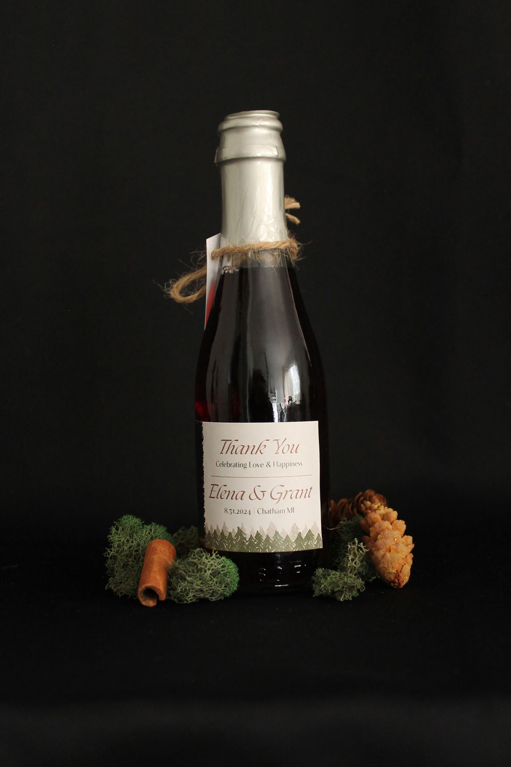
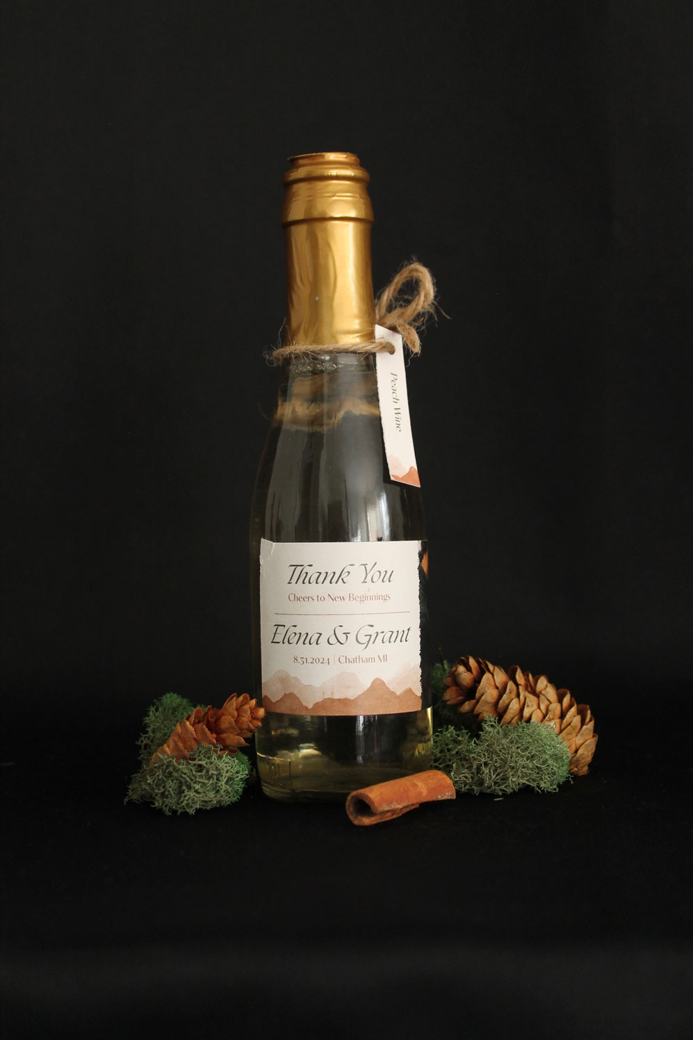
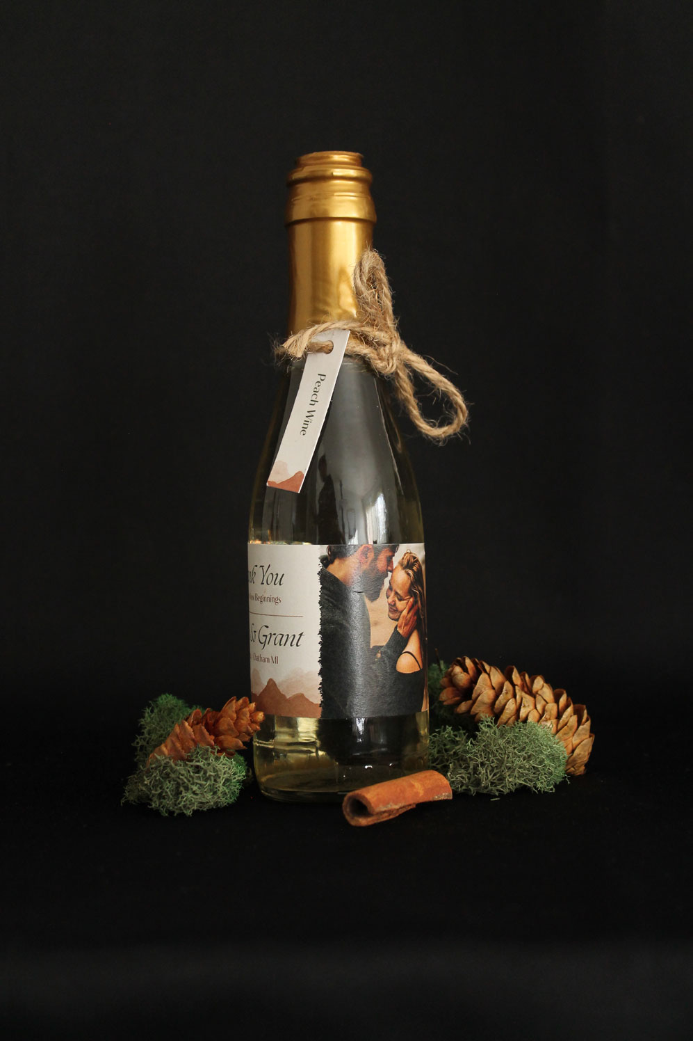
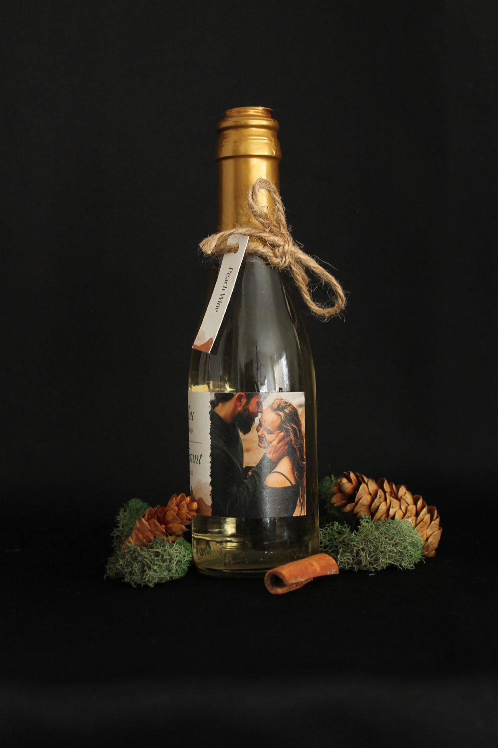
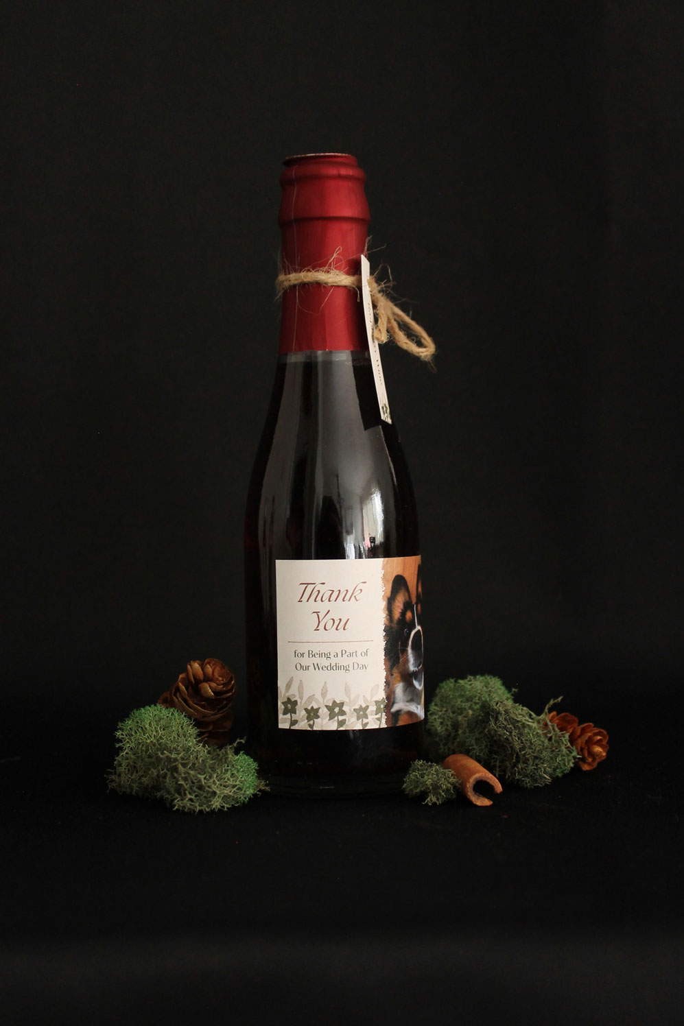
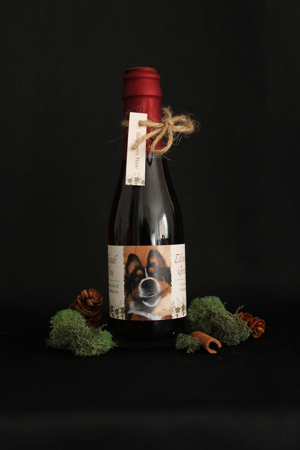
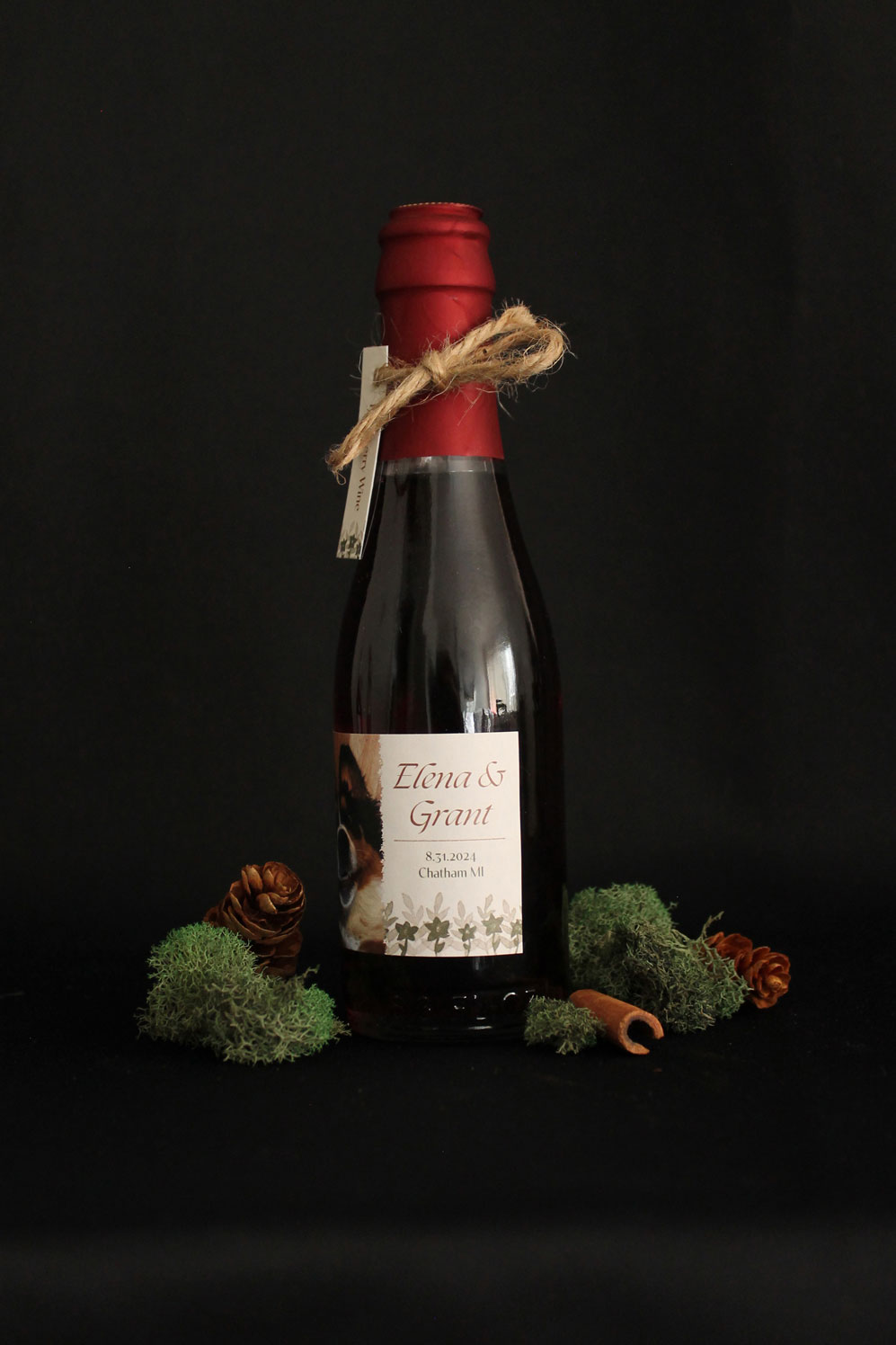
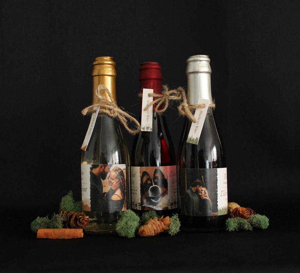
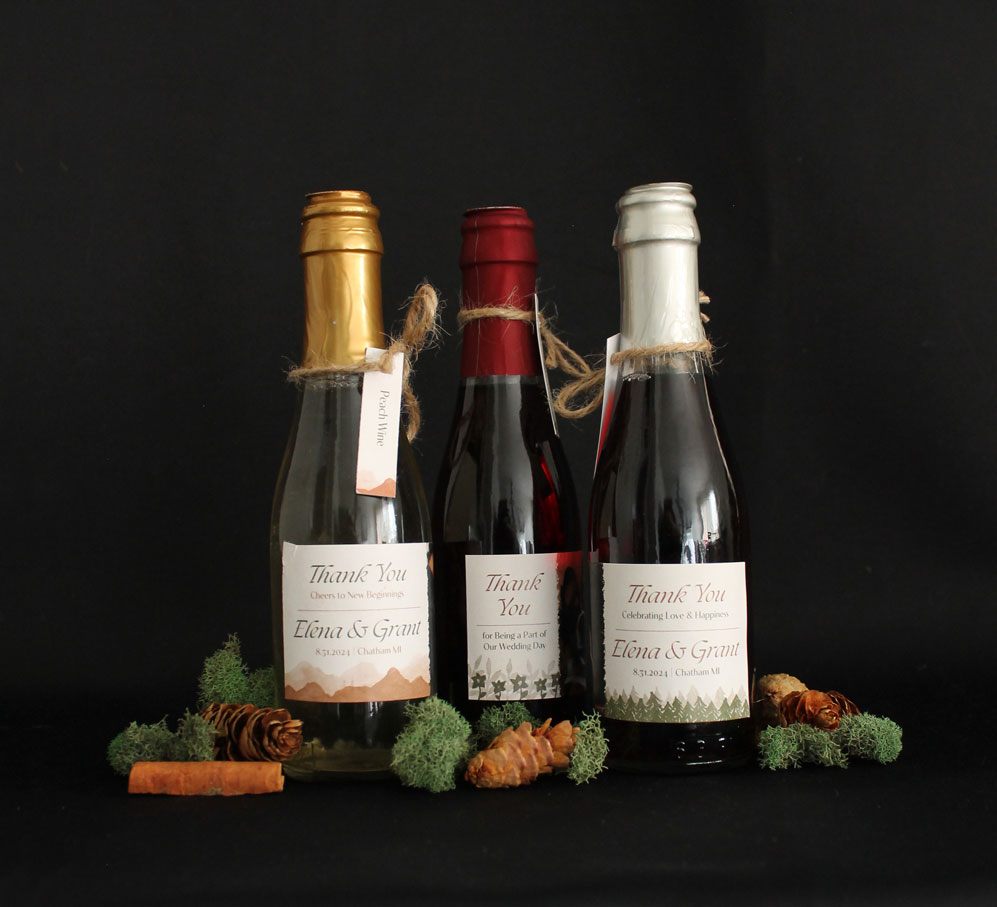
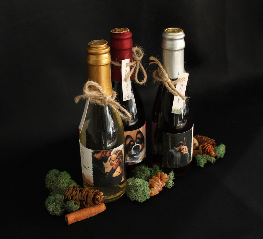
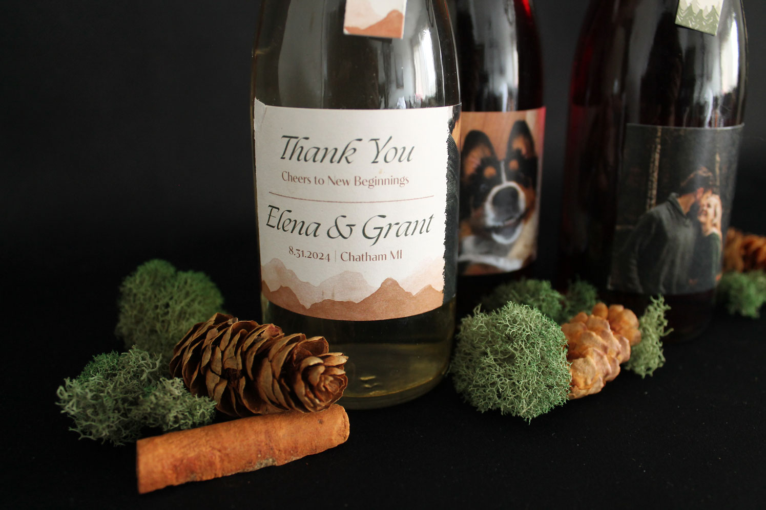
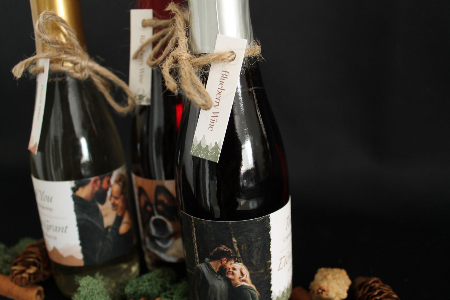
Working with the couple we determined that they wanted a photo, thank you message, their names, date, location, and the flavor of wine on the wine labels. Each flavor of wine has an assigned photo. Two photos are from their engagement photoshoot and the last one is of their dog, Ray. After reviewing the photos, I decided on a watercolor background for the labels.
The watercolor backdrops were made to reflect what was being displayed in the photos, trees for the forest, mountains in the color of the sand on the beach, and flowers because Ray brings the couple so much joy. Adding watercolor to the design helps the label feel more rustic and adds texture to the layout. To balance the dark photos, the watercolor images are two different transparencies to add a range of values. Creating these borders also helped frame and ground the text featured above.
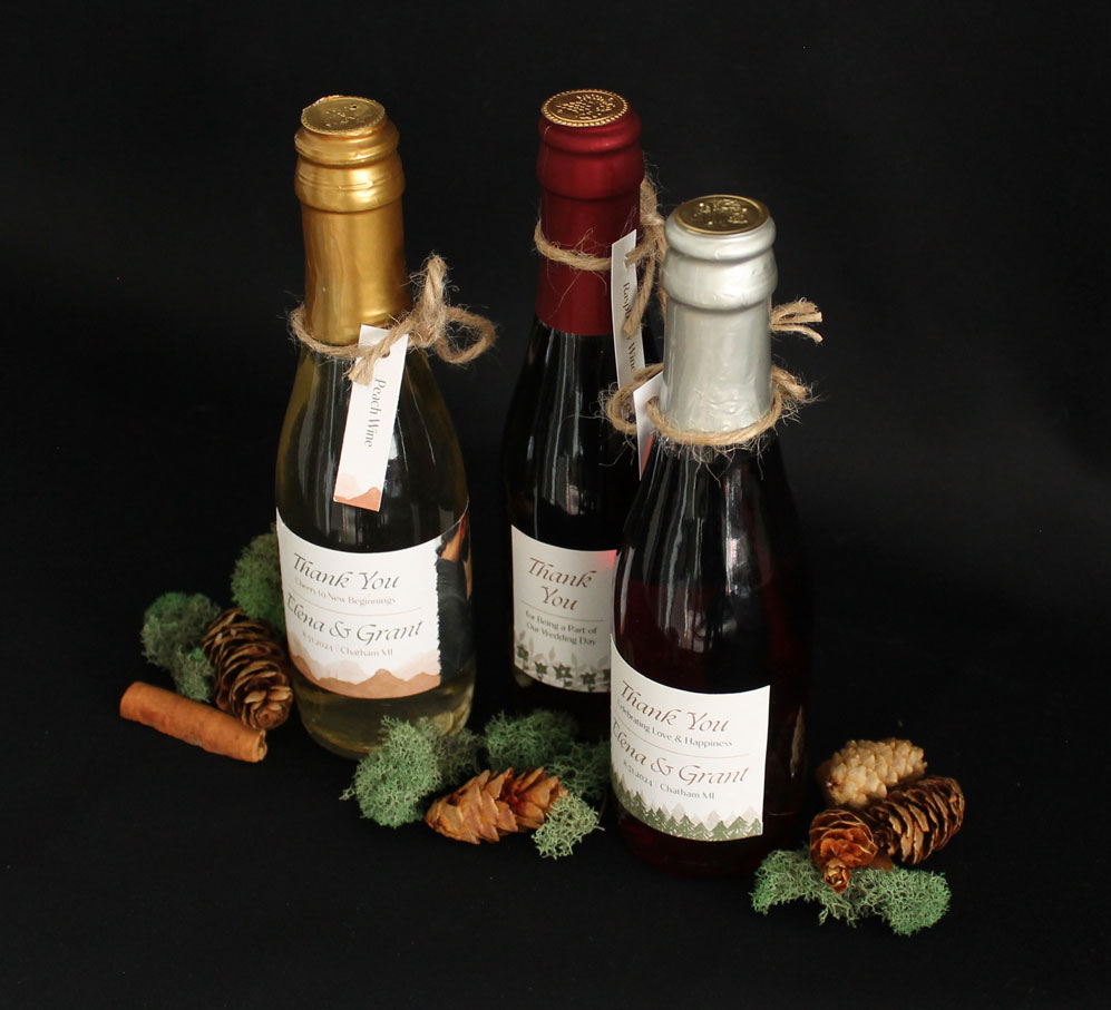
When framing the text, I wanted the guests to see "Thank You" and "Elena & Grant" first. Then they would read a small message of celebration under "Thank You." Each celebration message is unique to the photo accompanying the message. Under "Elena & Grant" is the date and location of their wedding. The hardest part of the design was where to fit the text for the wine flavor.
With the rest of the information nicely spaced out and balanced, I had a difficult time where to put the flavor of wine without making the text too small or seem out of place. That's when the idea of having a tag around the neck of the wine bottle came into play. This would add more interest to the wine bottle while being readable but not crowding the layout on the label. To complete the tag, I added a watercolor border at the bottom, to visually unite both elements.
Here are the finished labels and tags for the wine bottles.
The photos displayed on the rest of the page are the labels and tags packaged on the wine bottles. Click on the static images to get a closer look.
How to design small packaging. It can be a struggle to create a small deliverable while still having the packaging functional and, in this case, legible. Prioritizing the essential information helped me determine what to highlight first. That's when the idea for the tag came about, adding a playful touch to the design. Without the size restriction, I wouldn't have added the tag.
Drawing inspiration from an existing design and transforming it into a new asset was another valuable learning experience in this project. Creating a label that worked with and expanded on their invitation was a fun challenge. I did not keep the vector floral graphics, but adding the watercolor expanded the textures and contrast of their engagement photos. The couple felt the same way because they were thrilled with the outcome.
Similar Projects:
Frankenmuth Oktoberfest