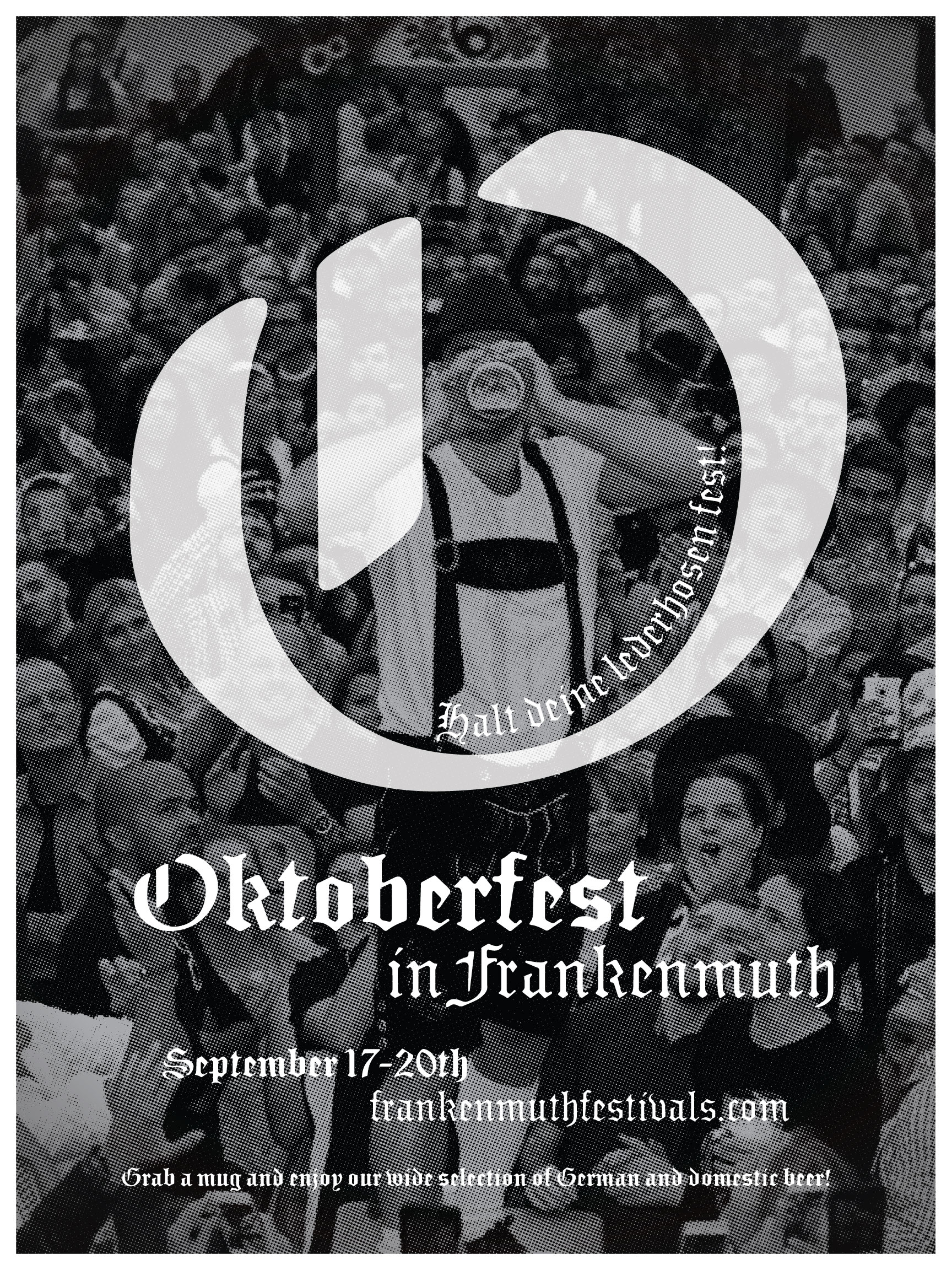
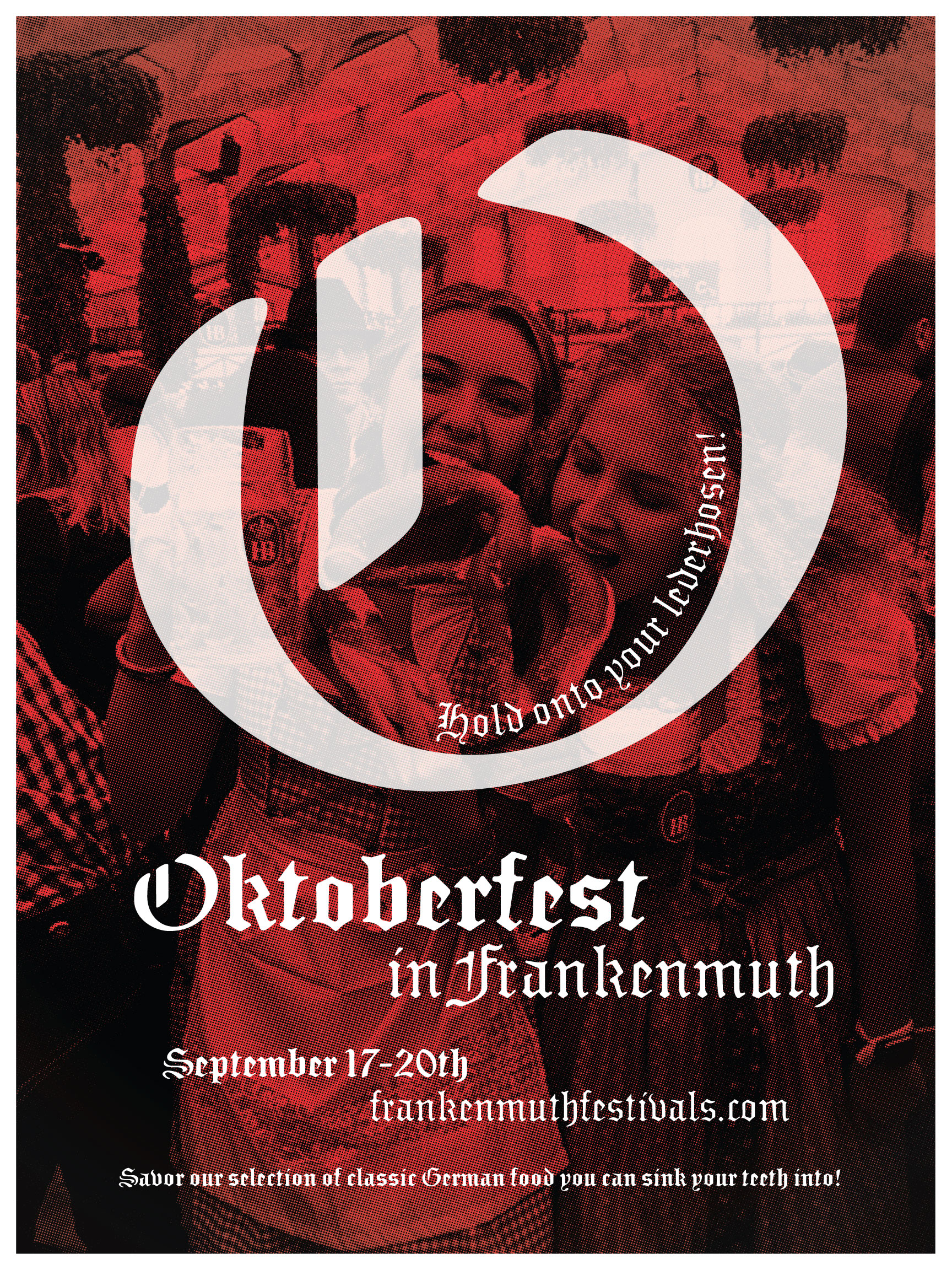
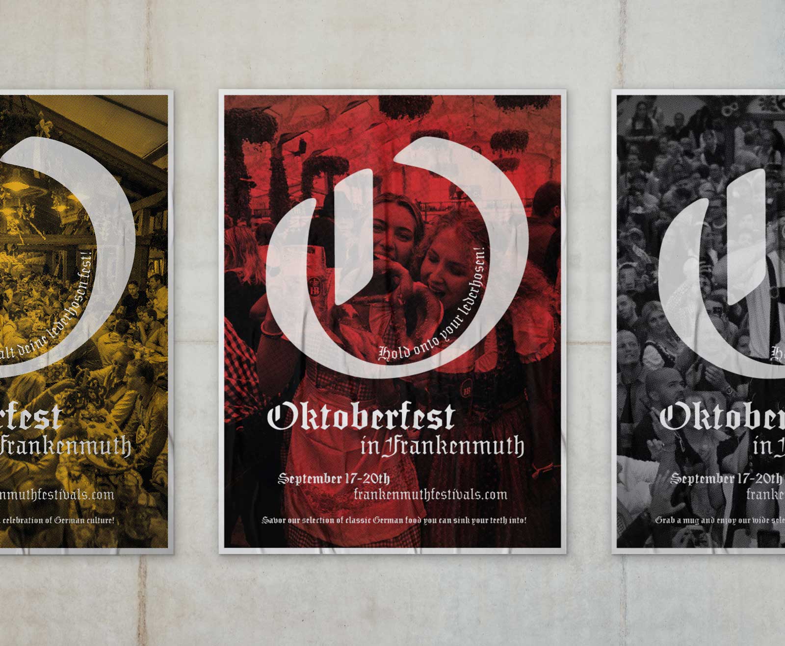
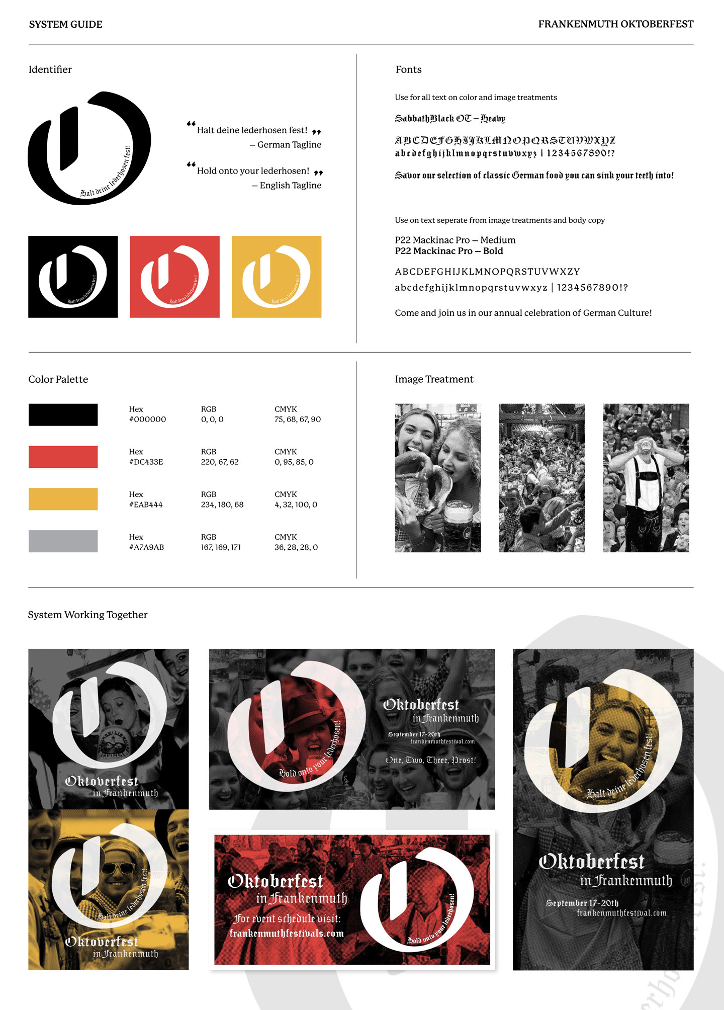
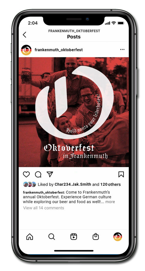
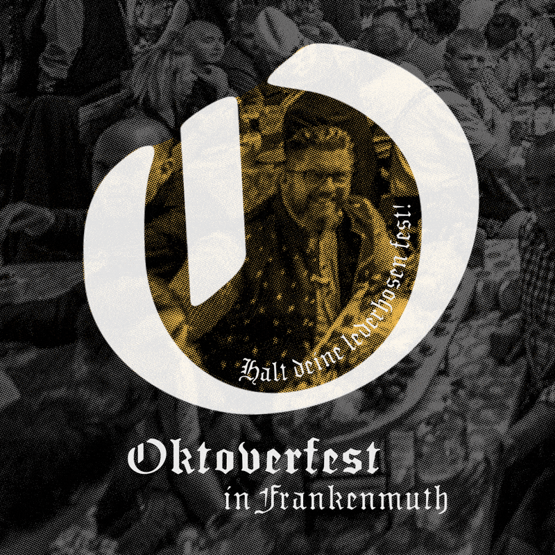
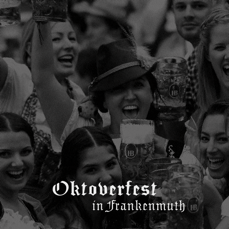
Frankenmuth Oktoberfest
EVENT DESIGN
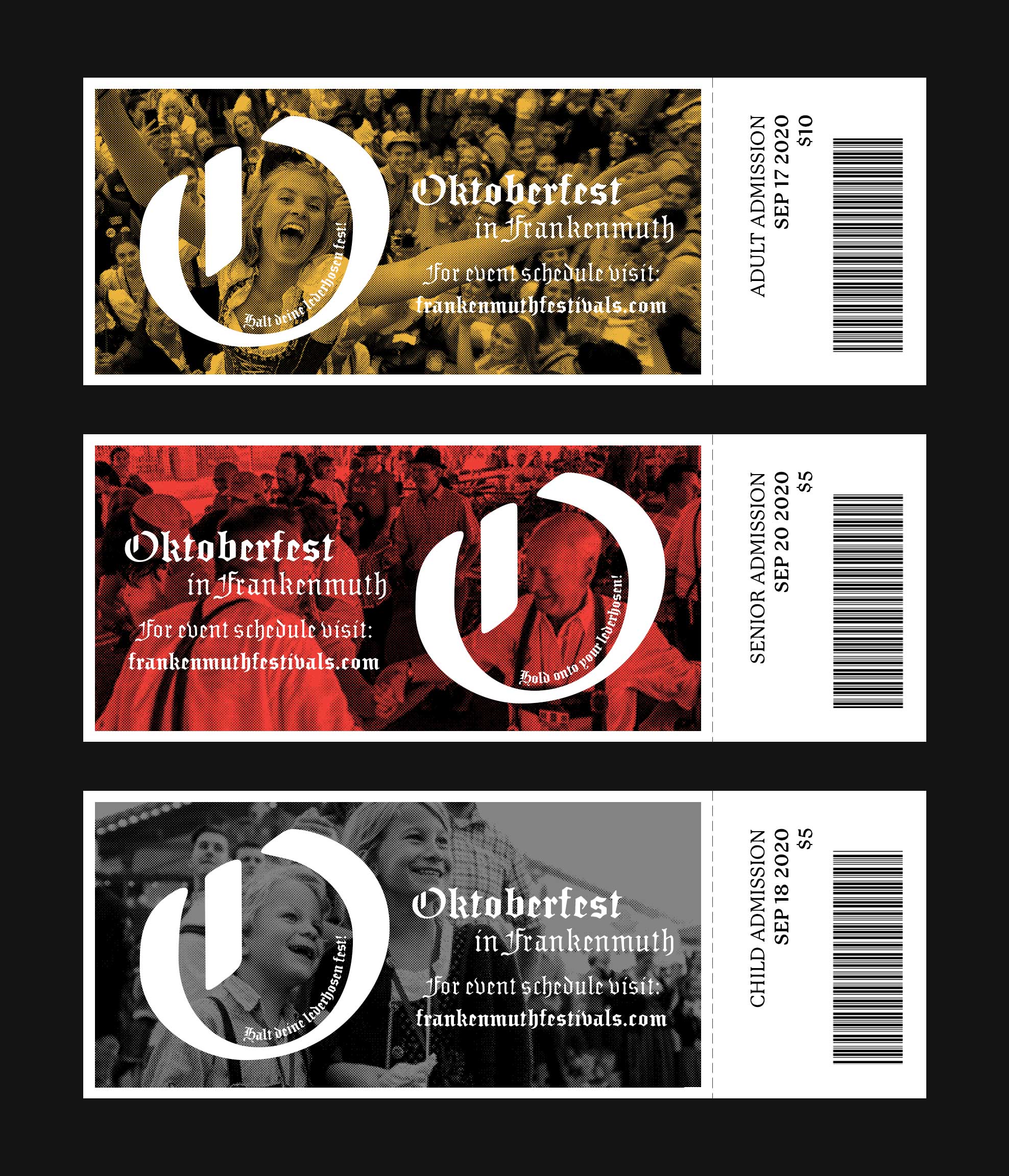
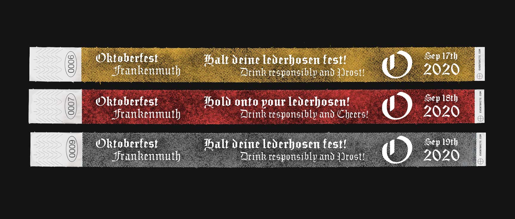
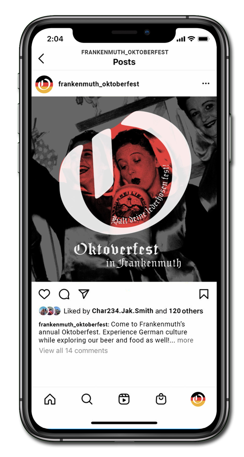
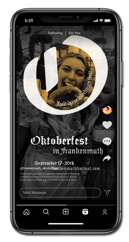
Problem
Create three posters for Frankenmuth's Oktoberfest in Michigan, a festival celebrating German culture through food, drinks, and activities. I aimed for the design to capture the lively, festive atmosphere and showcase the community's passion for German traditions in a way that appeals to all ages.
Solution
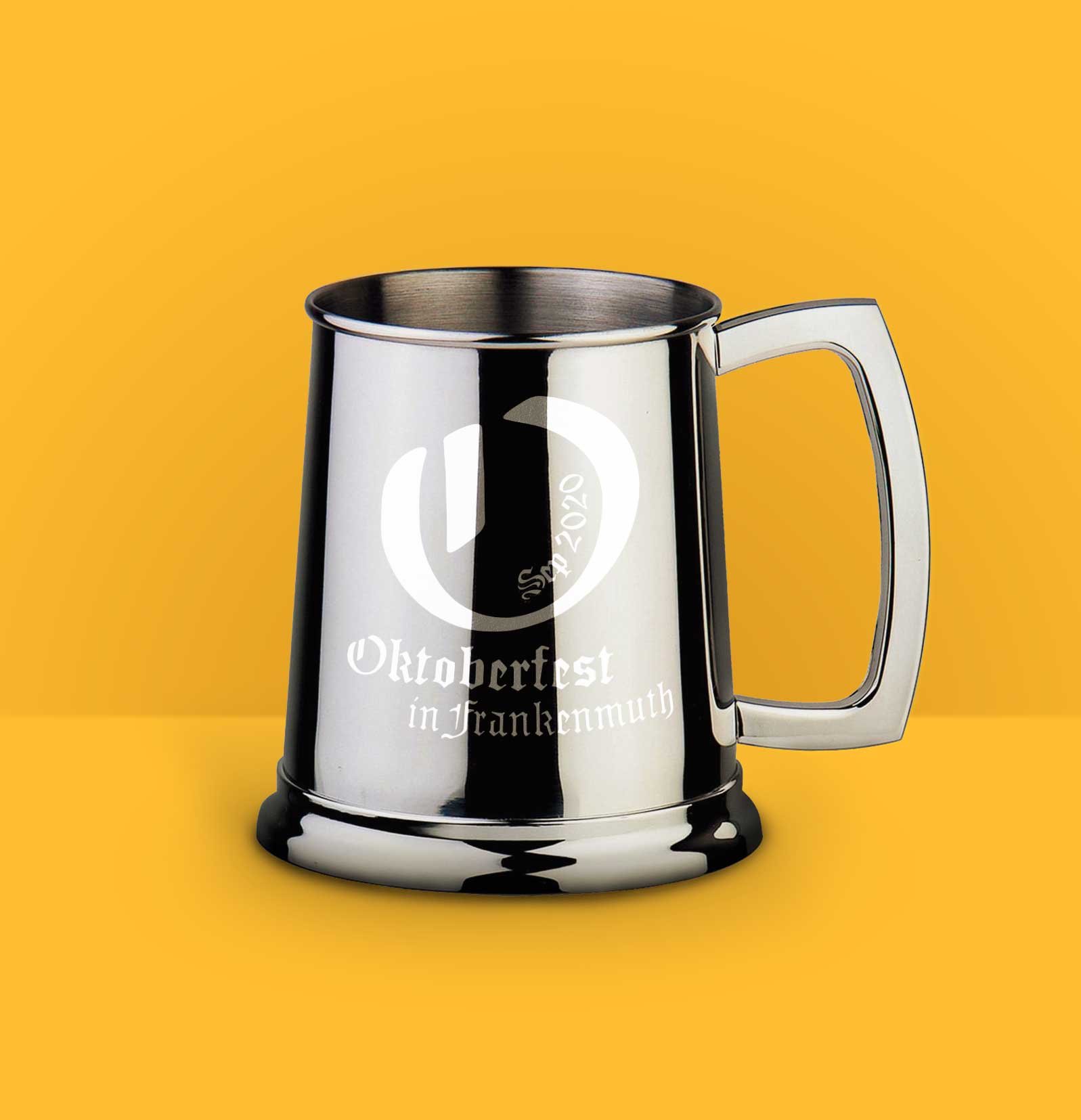
Focusing on images of people coming together to celebrate and participate in German culture, by selecting images of people enjoying themselves at Oktoberfest to show what they can experience while creating a focal point in the image with a large "O." After finalizing the design of the posters, I created more event deliverables you would encounter during the festival.